
TL;DR
- I build design infrastructure that saves teams time, improves UX quality, and keeps multiple products aligned
- Primary examples: Commune DS vNext (rebrand, tokens, interactive components, governance) and Microsoft Fabric (shared patterns at scale, implementation-focused craft)
- I work across tokens, components, and the design→code toolchain, including AI-assisted prototyping experiments to boost iteration speed
- I lead DS work by tutoring designers, aligning with front-end engineers on APIs and structure, and writing durable internal documentation
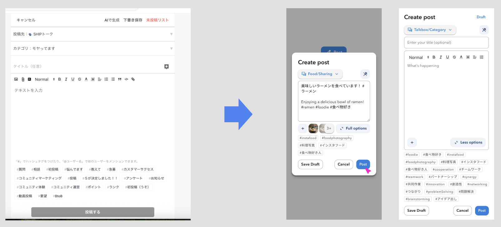
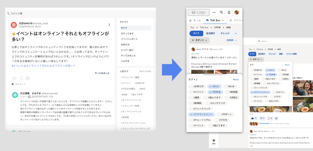
Note: a few legacy artifacts are in CN/JP. Captions summarize the takeaway, so you don’t need to read the labels
Contents
- Commune Design System (tokens, components, governance, and outcomes)
- Microsoft Fabric: shared patterns at scale (reuse, constraints, craft)
- Toolchain: Tokens Studio → Style Dictionary → Storybook, plus AI-assisted prototyping experiments
- Mobile systems: HUMA and LeetCode (localization and motion strategy)
Why I care about design infrastructure
Design infrastructure is valuable when it shifts time from reinvention to real UX improvement:
- Designers stop rebuilding the same patterns and spend more time improving user experience and aligning it to business goals
- Engineers get predictable component APIs and state behavior, which reduces implementation ambiguity
- Consistency, accessibility, and theming become defaults instead of per-team effort
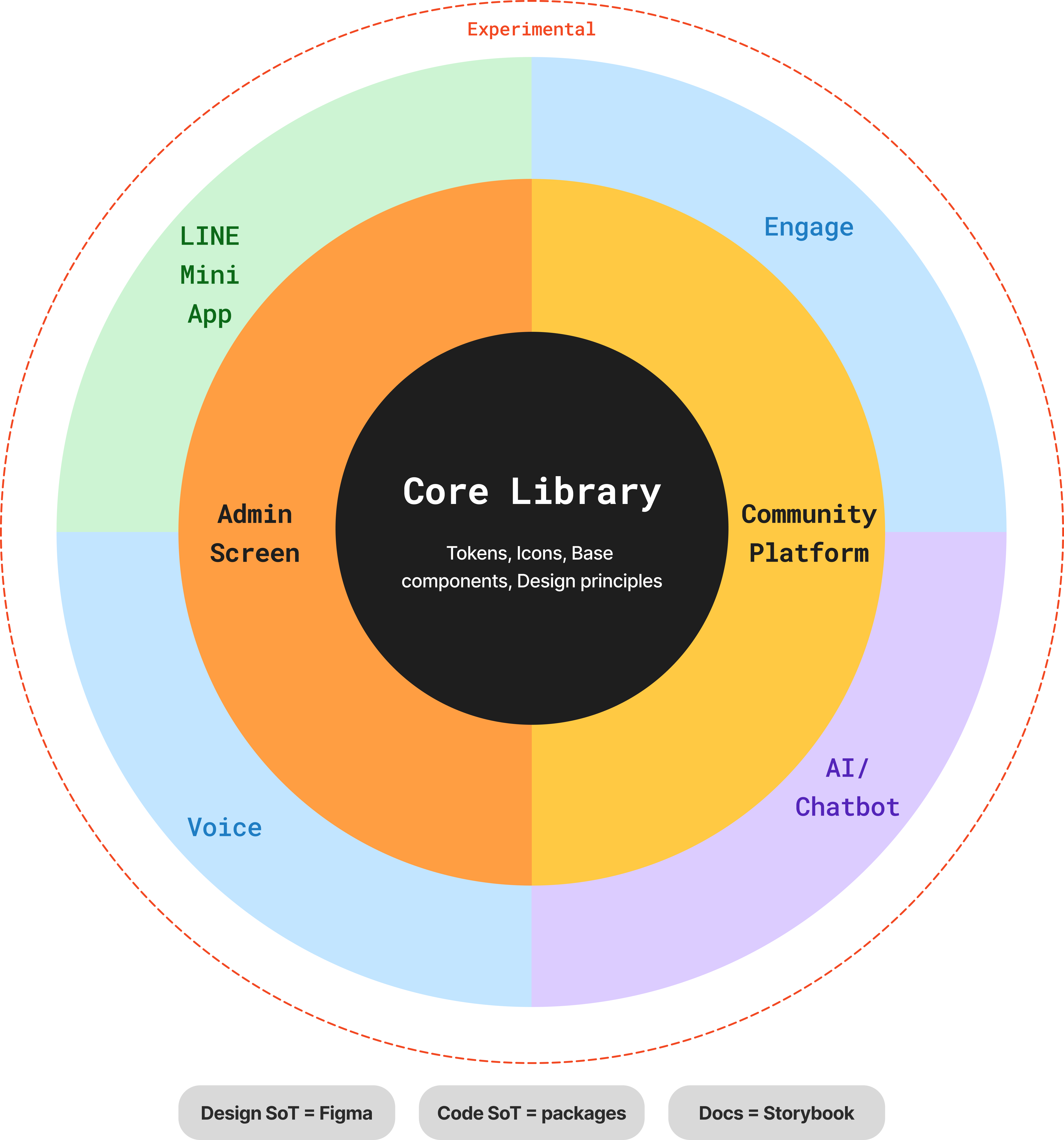
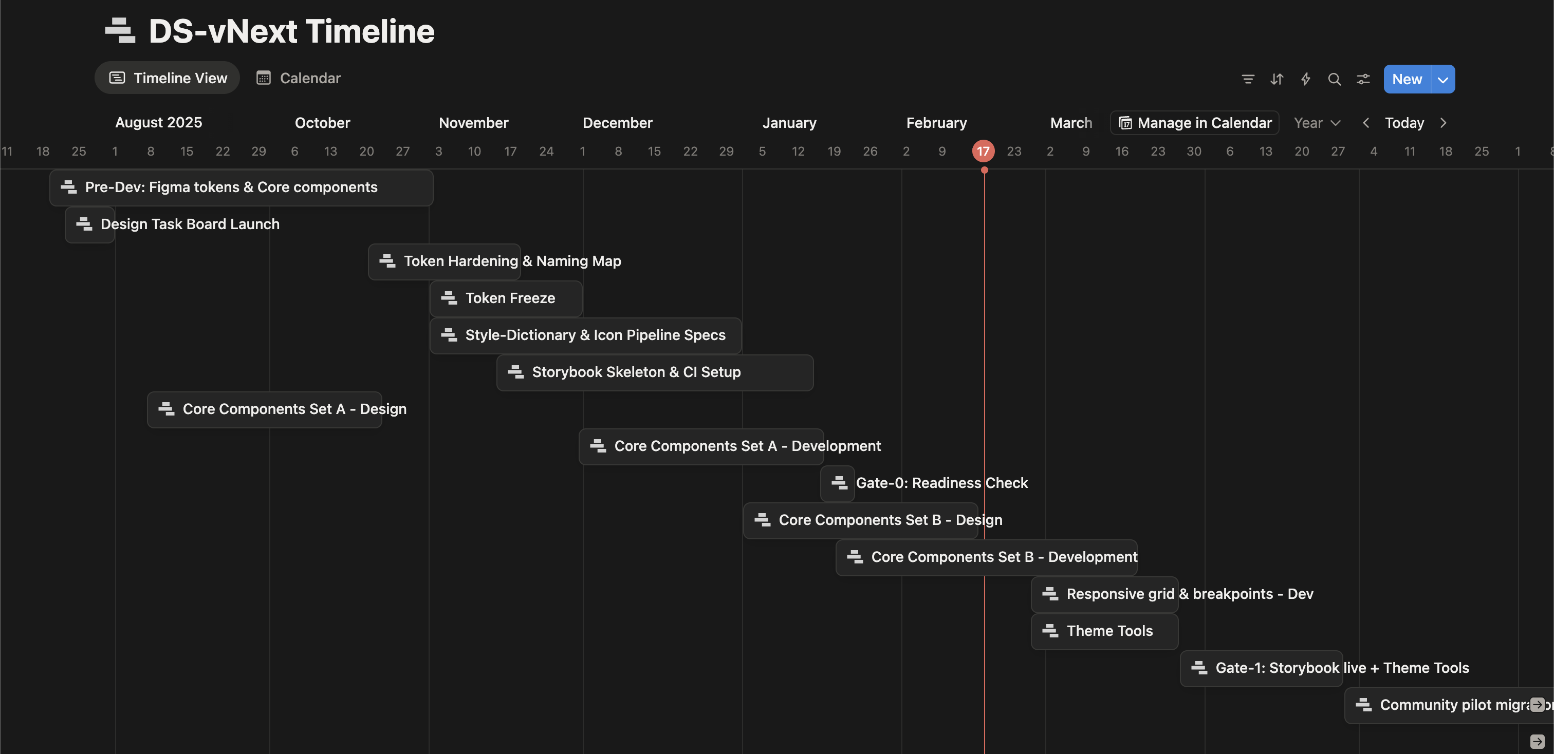
Commune Design System vNext
Context and scope
Commune is a multi-product SaaS suite (Community Platform, Admin, User Voice Analytics). As part of a rebrand, we built DS vNext from scratch with the visual design team, then scaled it into reusable product infrastructure
What changed because of this work:
- A shared token and component foundation that multiple product surfaces can reuse
- Faster, lower-ambiguity reviews because interaction states are encoded, not re-explained each time
- A clearer path to scale design work without scaling design overhead
What I owned end-to-end as the design lead for DS vNext:
- Token architecture and naming rules, including light and dark modes
- Component library strategy (primitives → composites → systems)
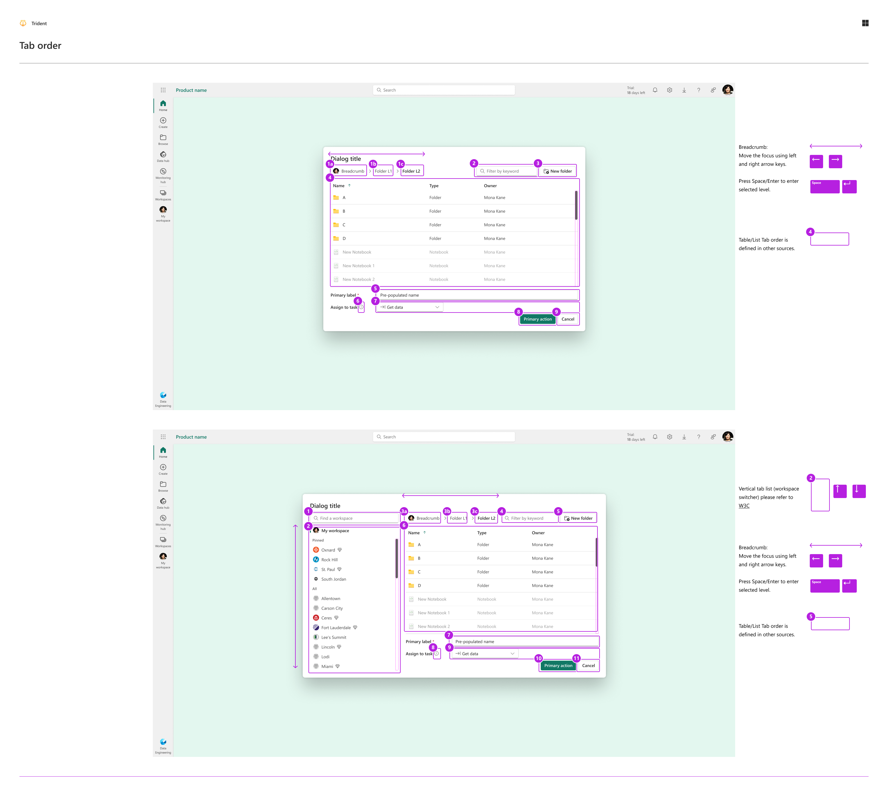
- Interaction patterns and state behavior (rest/hover/pressed/selected/disabled/focus-visible, plus special cases)
- Alignment with front-end engineers on component APIs and implementation constraints
- Mentoring 2 junior designers so component designs map cleanly to production code
- Building an internal knowledge base so decisions remain reusable over time
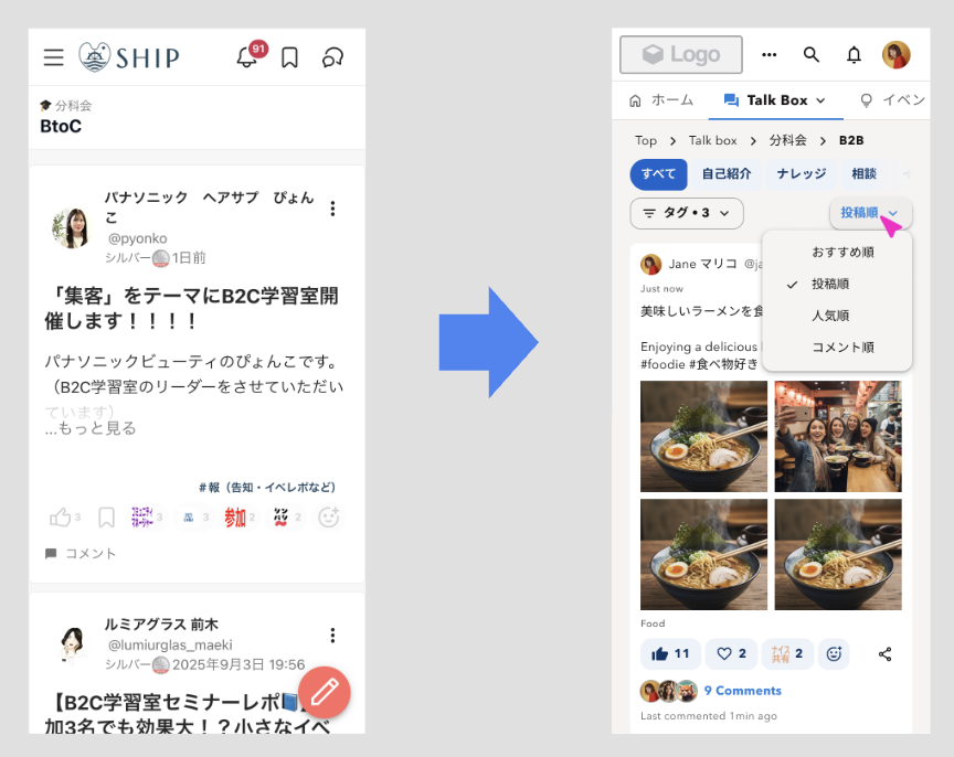
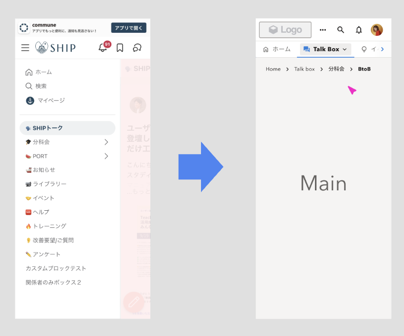
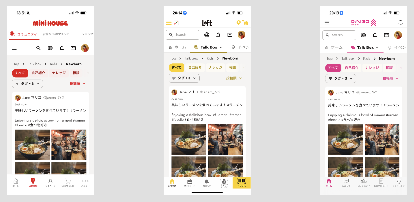
Before → After proof (homepage navigation redesign)
This is the clearest product-level example I can show today, because it demonstrates how design infrastructure translates into real UI outcomes
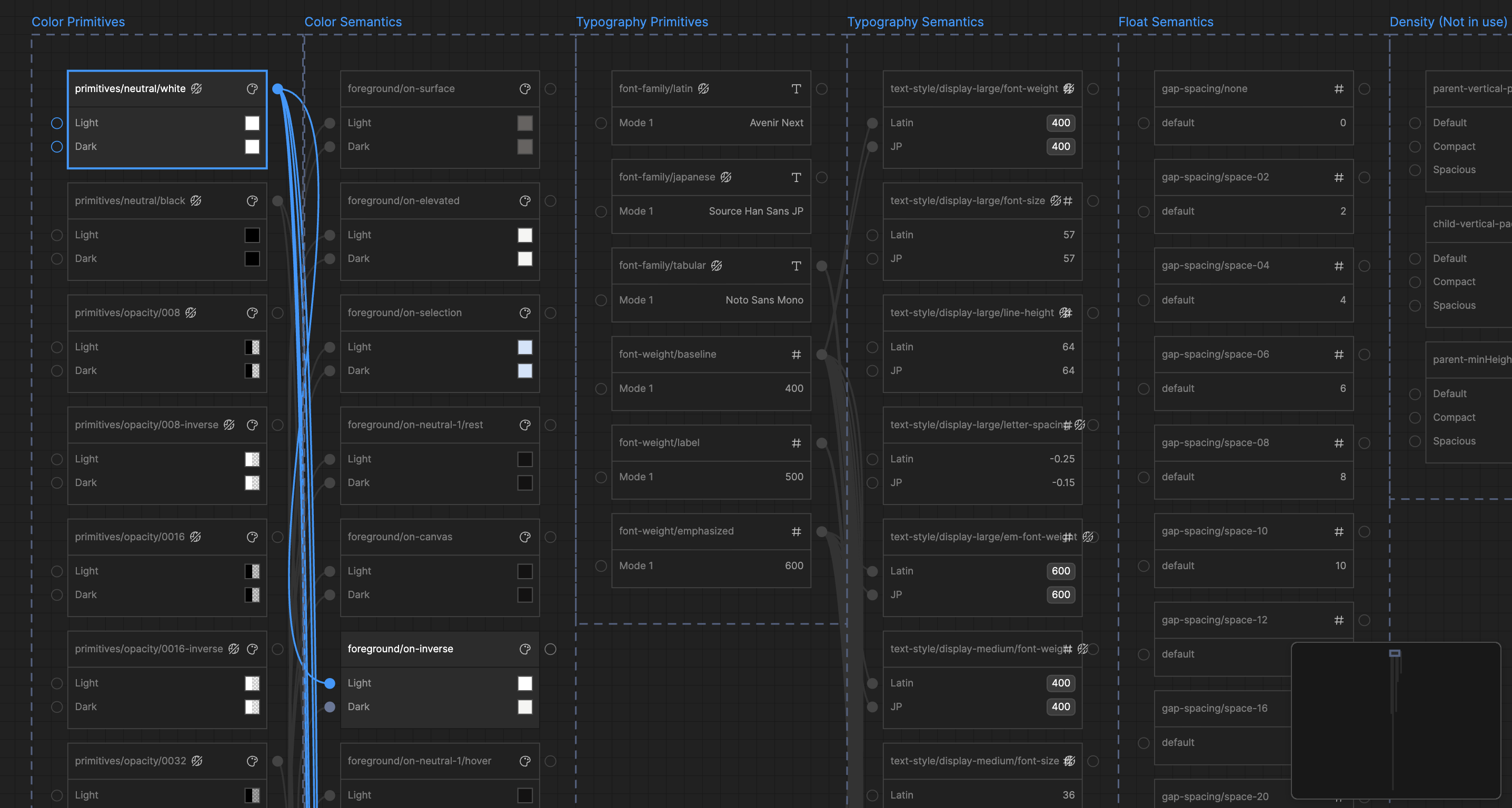
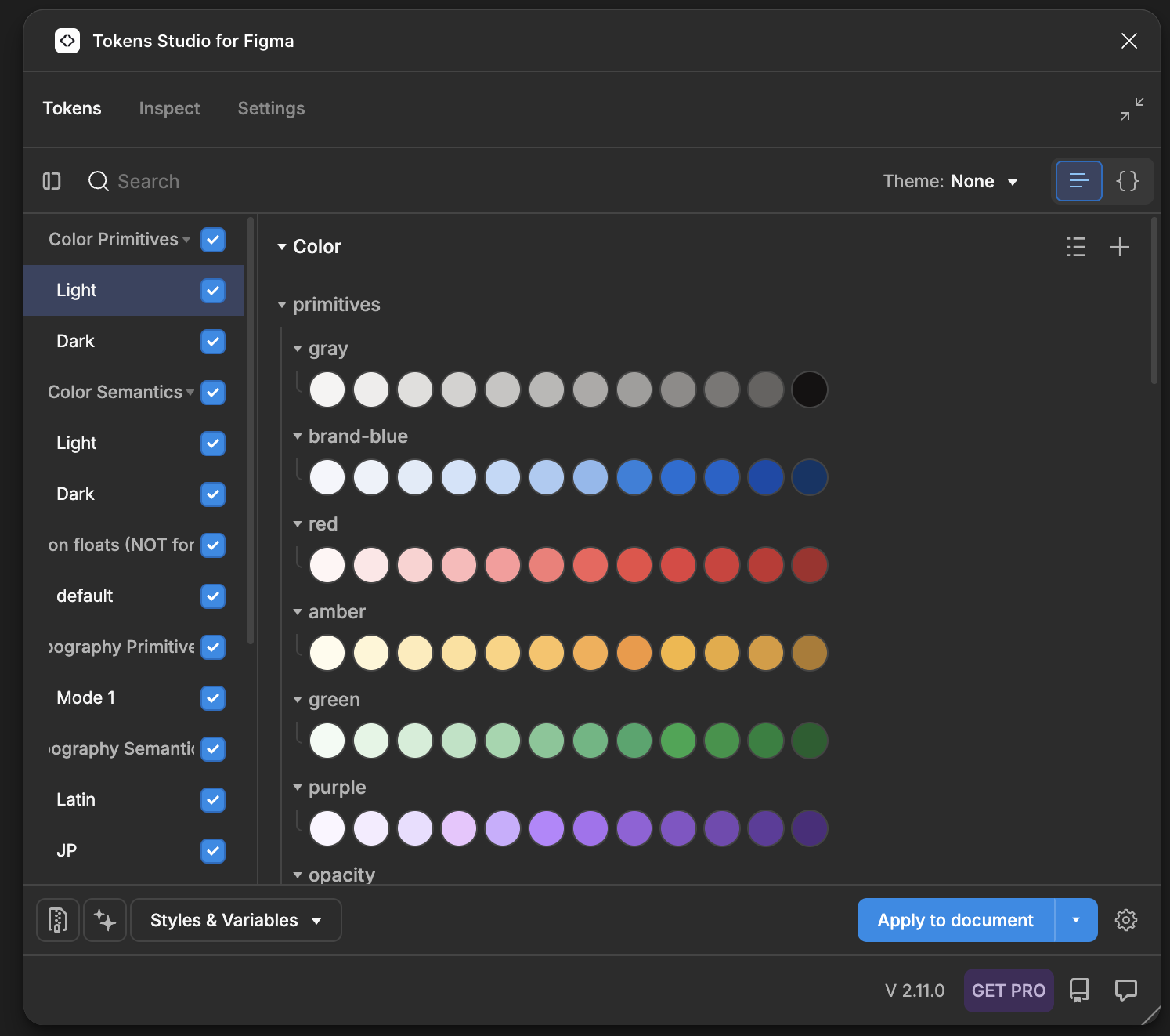
1. Token architecture: 2 layers × 2 modes
The foundation is a 2-layer structure:
- Primitives define raw values (palette ramps, typography ramps, base elevation, spacing)
- Semantics map intent to primitives (text-default, bg-surface, border-subtle, action-primary)
It supports 2 modes (light/dark) so the same semantic token resolves correctly without per-screen manual swapping
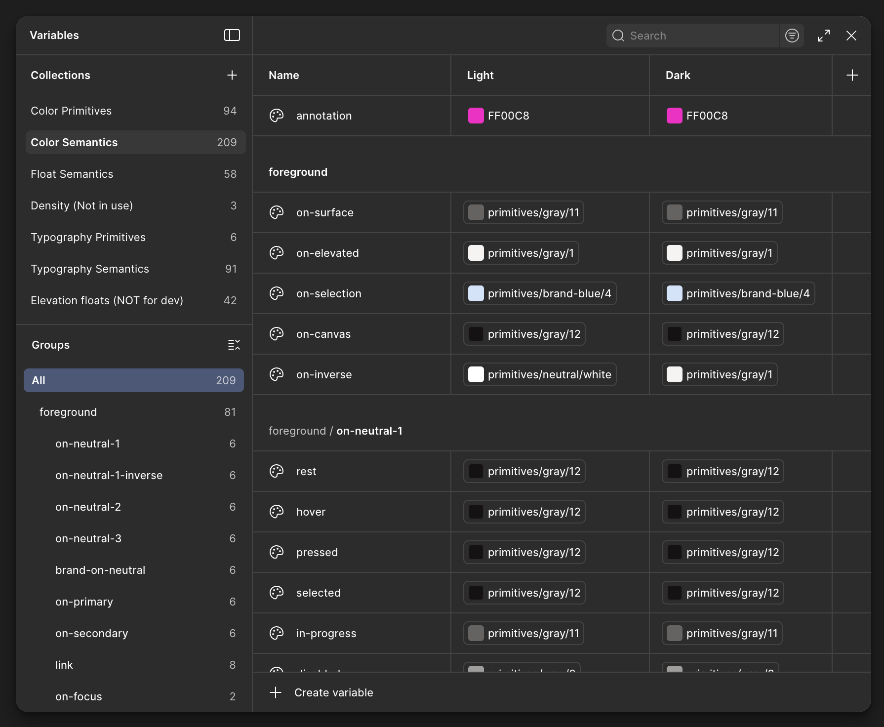
Token collections (current structure)
| Collection | Layer | What it’s for | Notes |
|---|---|---|---|
| Color Primitives | Primitive | Base palette ramps | Light + dark modes |
| Color Semantics | Semantic | Intent tokens for UI | Light + dark modes |
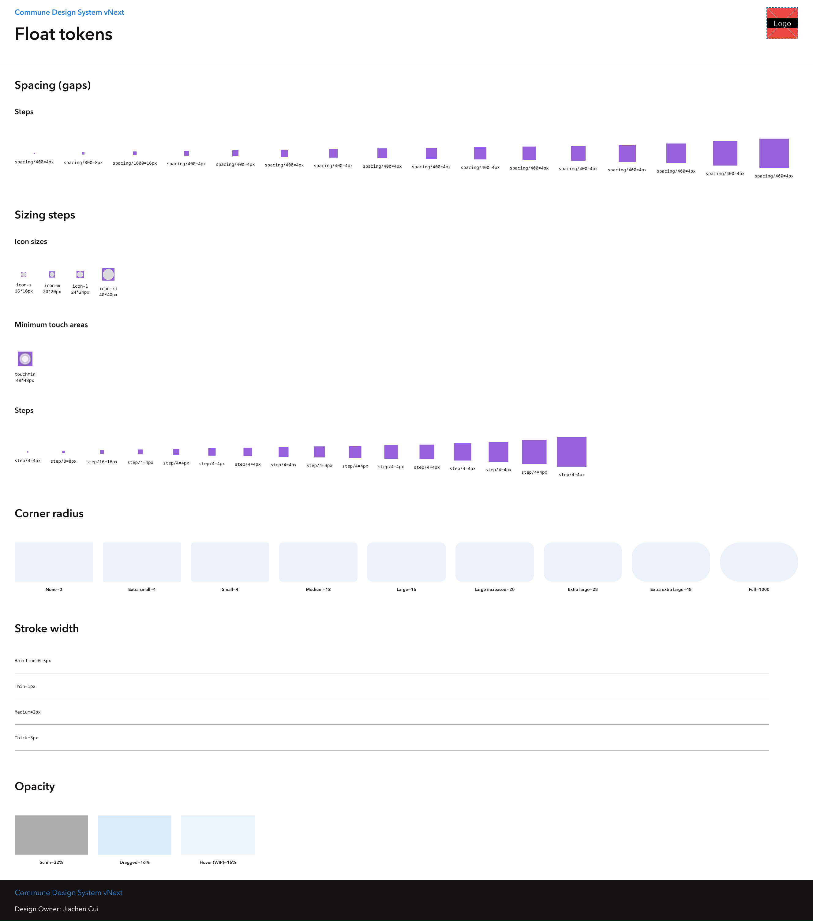
| Float Semantics | Semantic | Nemeric intent tokens | Used for spacing, sizing, width, radius, opactity |
| Density | Semantic | Spacing density presets | To reduce or increase spacing between elements |
| Typography Primitives | Primitive | Font family names and raw weight/size values | Latin, CJK and monospace (tabular) |
| Typography Semantics | Semantic | Intent tokens (body, caption, heading, etc.) | Latin + CJK modes |
| Elevation Floats | Semantic | Elevation and shadow for overlays | For Z-index visual hierarchy |
Naming hygiene (designed for humans and machines)
We keep naming predictable so tokens can be reliably consumed by code and tooling:
- Primitive tokens are value-oriented and contain hard-coded values
- Semantic tokens reflect intent and are role-based, for example
foreground/brand-on-neutral/rest
Advanced theming: role-based color tokens
Beyond basic theming, I explored role-based color tokens to support controlled customization without breaking the system
The key idea: user choices map to roles, then roles map into vetted semantic tokens so customization stays coherent and accessible
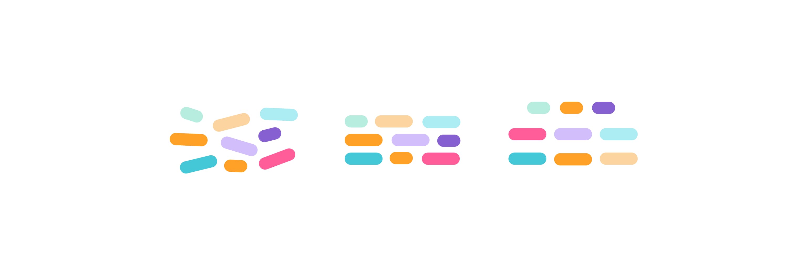
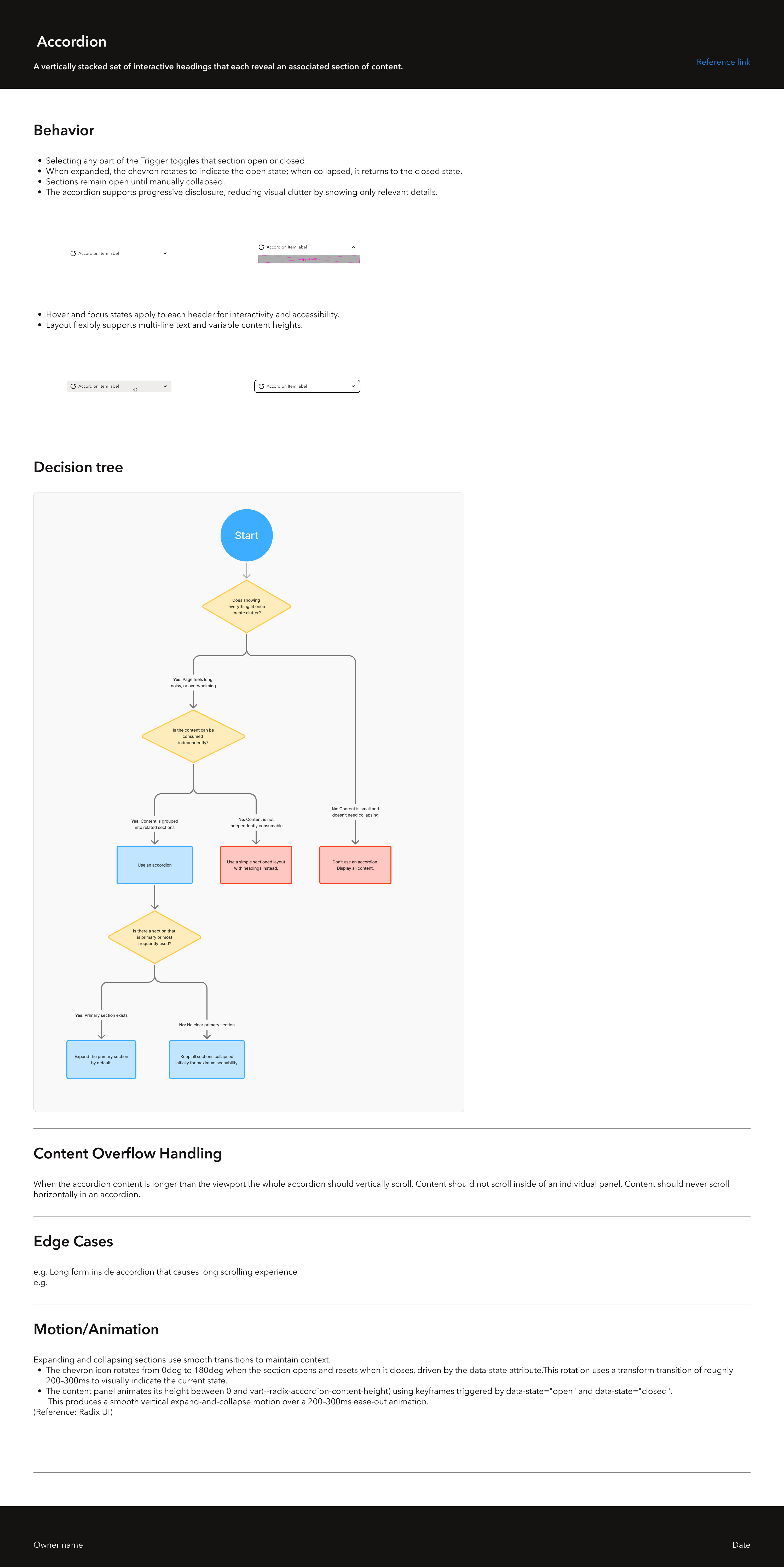
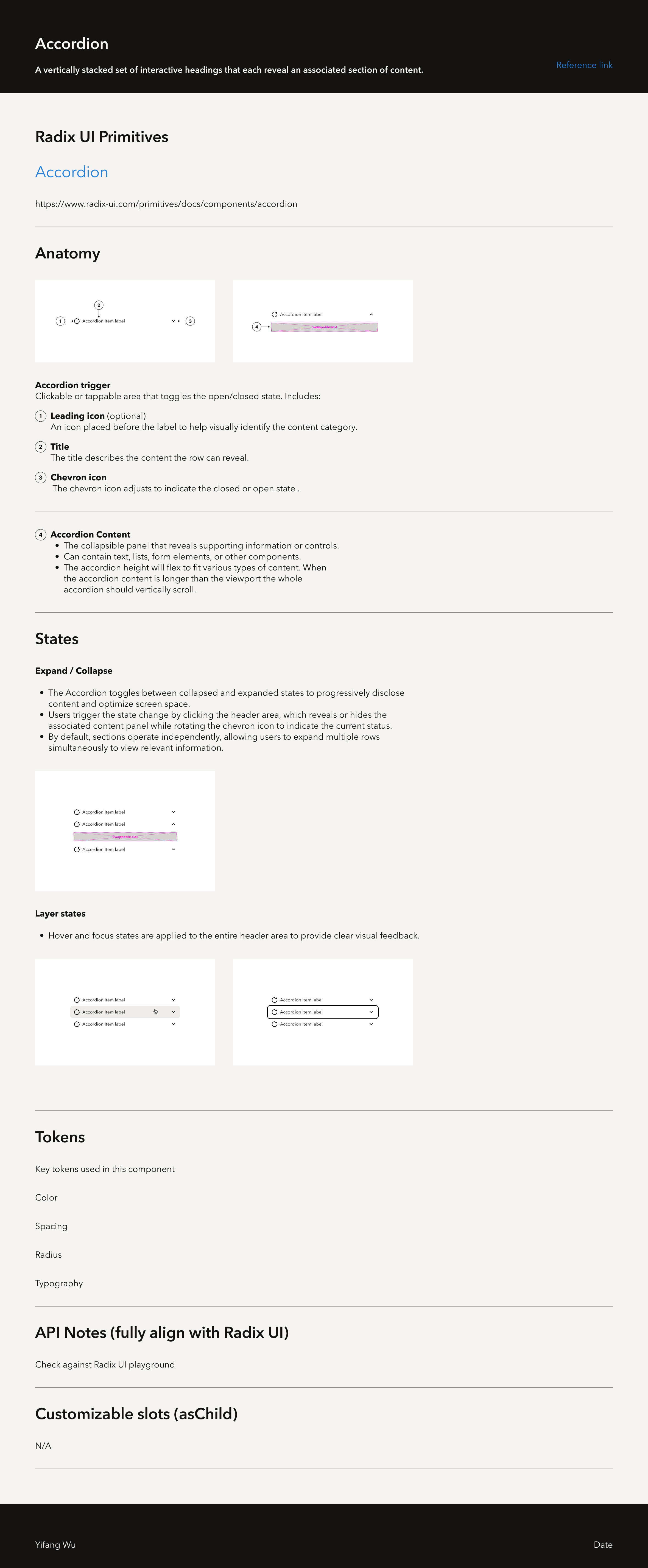
2. Component library: interactive by default
We built a component library designed to behave like code:
- 29 primitive components and 13 composite components (and growing)
- Components are token-bound, so light/dark mode switches reliably without manual overrides
- Most components are animated via prototype-linked variants so states are visible and reviewable in Figma
What “interactive by default” means in practice
For most components, I designed and documented:
- rest, hover, pressed, selected
- disabled, focus-visible
- special cases where behavior differs (progressive actions, single vs multi-select menu items, hover-card with disable-focus)
This reduces implementation ambiguity because state behavior becomes a reviewable artifact
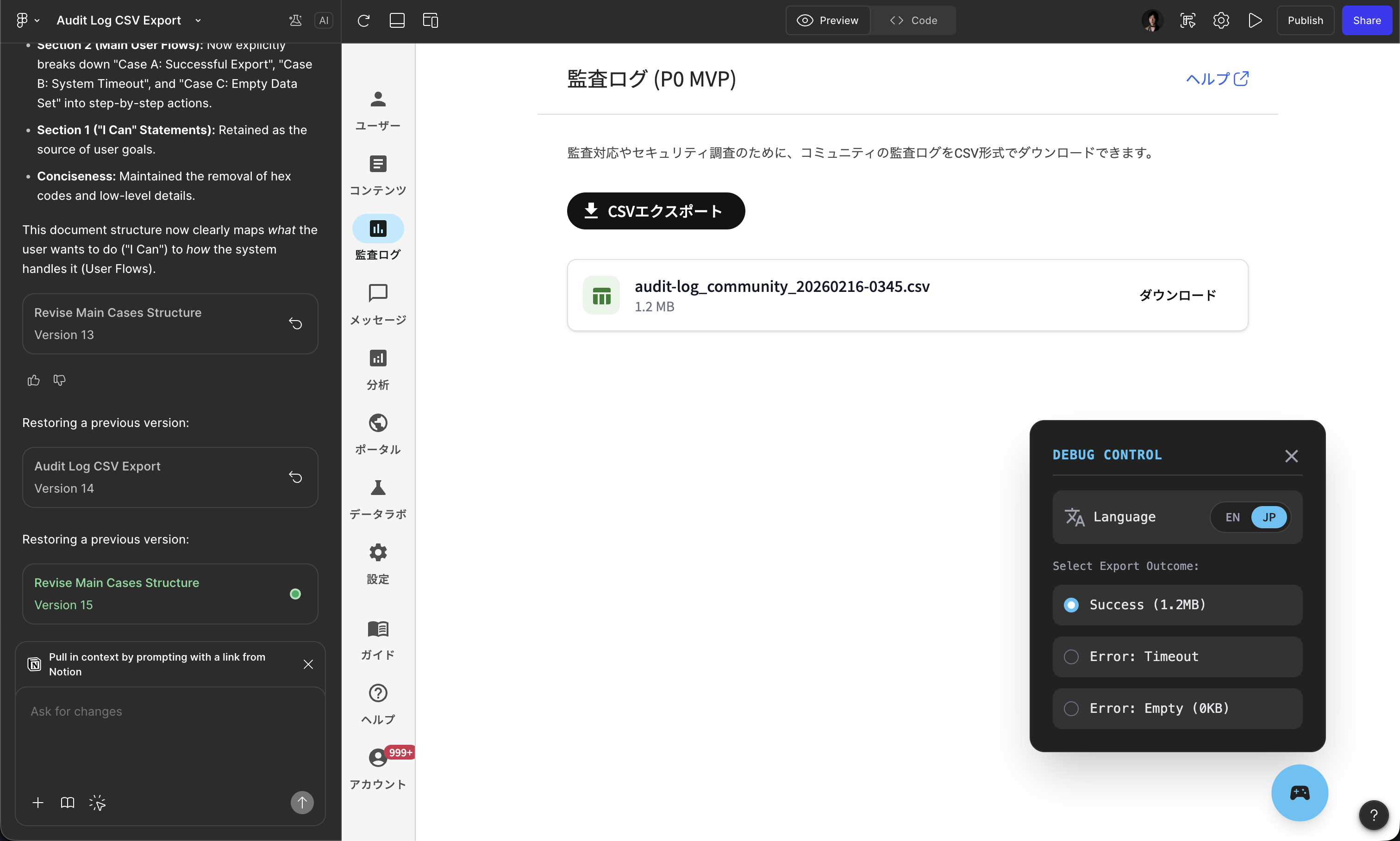
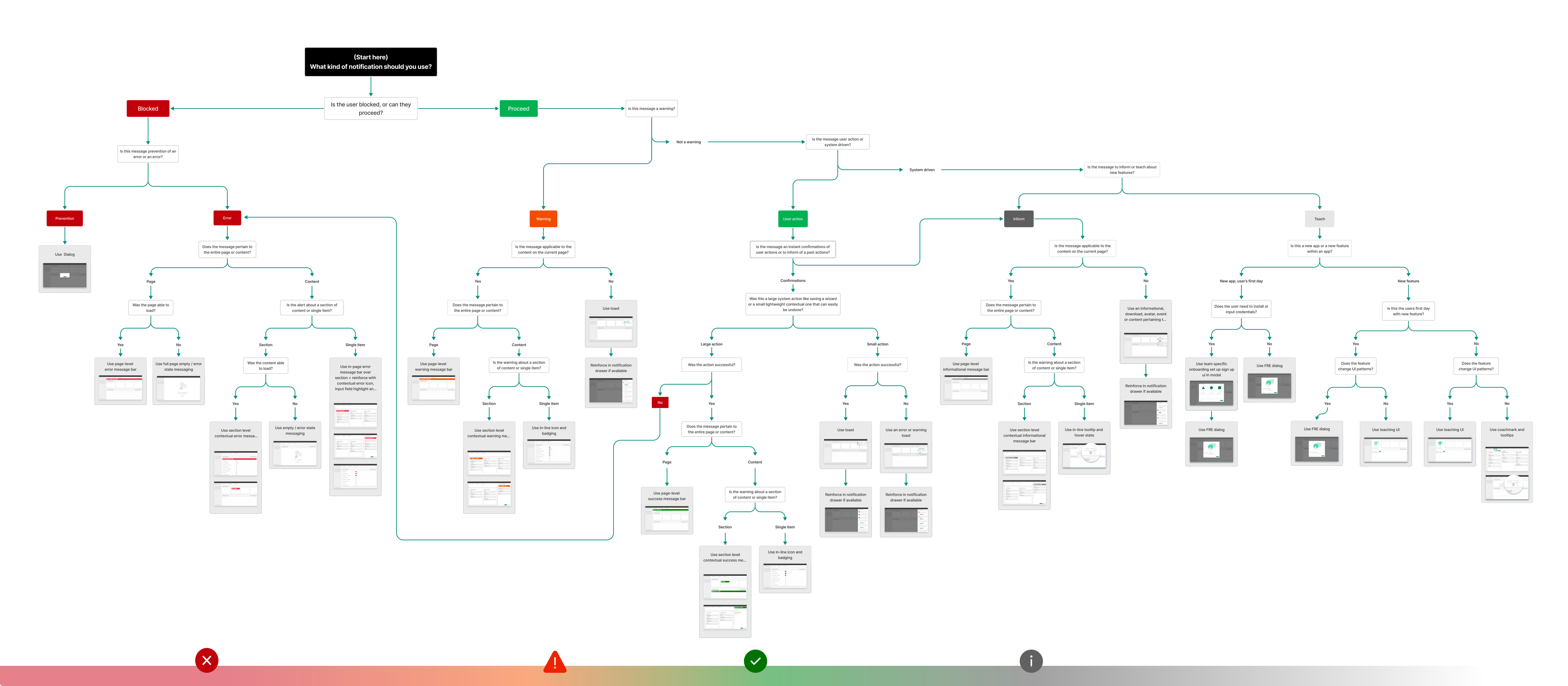
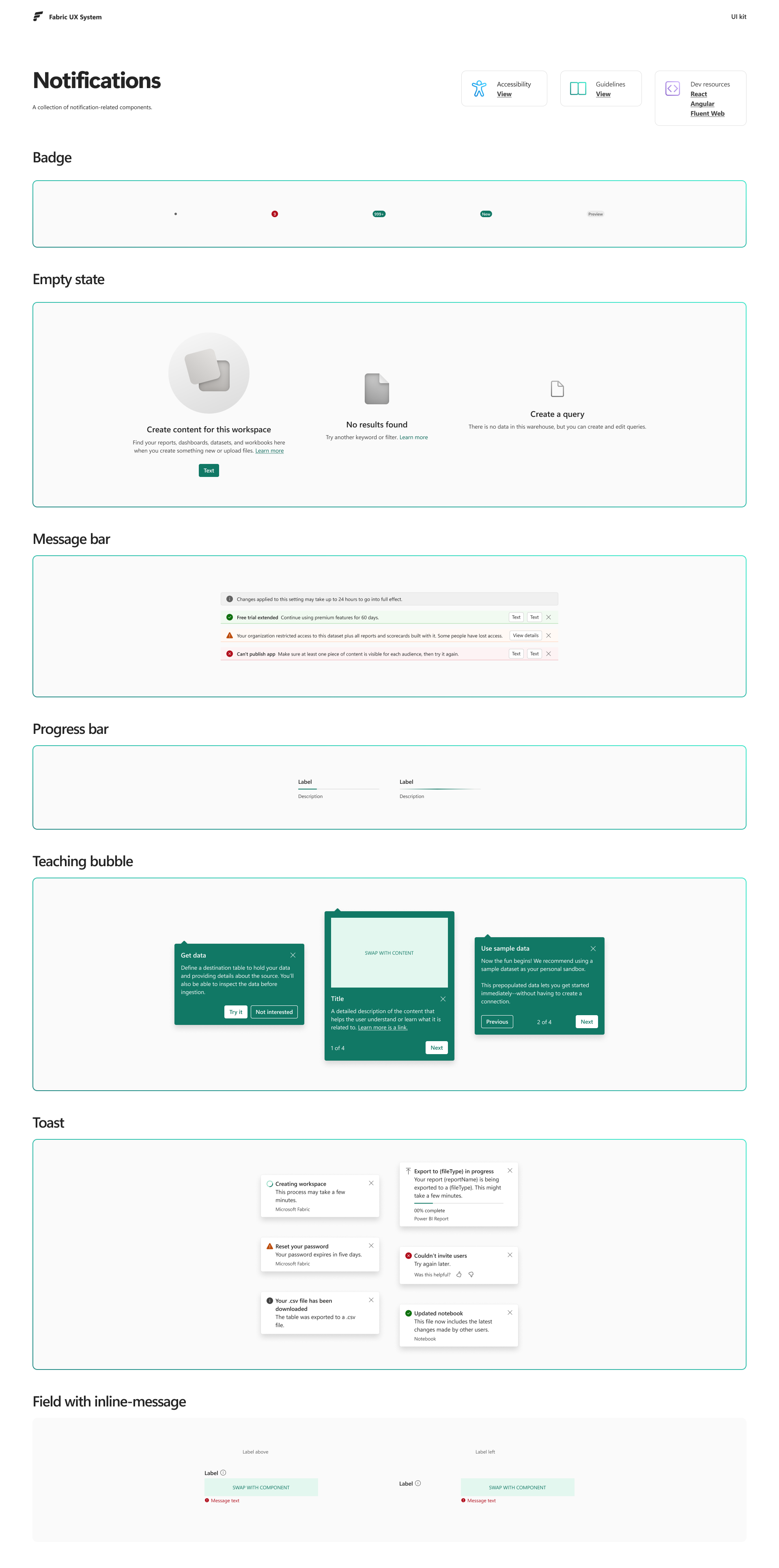
3. System complexity example: notifications (toast + snackbar)
Button still works as a simple “token → component → code” example, but notifications are where system complexity shows up clearly
We use both toasts and snackbars to deliver messages at different priority levels, with different information density, and with different triggers:
- Self-action triggers (feedback for a user’s direct action)
- System-action triggers (background events, status updates, or failures)
The 2 hardest parts of the system, and the ones I intentionally specified, are:
- Priority and interruption
- What can interrupt attention vs what must remain passive
- When to use toast vs snackbar based on urgency and user context
- Consistency across surfaces
- Rules that stay consistent across full pages, panes, and embedded surfaces
- Predictable behavior even when the same system runs inside different UI shells
4. Governance and leadership
I treat design infrastructure as an organization problem, not only a design problem
What I led or facilitated:
- Mentored 2 junior designers on designing components with code structure in mind (APIs, prop modeling, state modeling)
- Facilitated designer ↔ front-end engineer conversations to converge on naming, props, and implementation boundaries
- Built internal documentation so teams can reuse decisions instead of re-litigating them
- Ran lightweight review rituals (checklists, office hours) so work stays consistent without slowing teams down
Outcomes
Because this is infrastructure work, outcomes show up as speed, consistency, and fewer loops:
- Faster design iteration because teams reuse state-complete components instead of rebuilding
- Less visual drift across Community Platform, Admin, and User Voice Analytics
- Smoother collaboration with front-end engineering because components are designed with implementation structure in mind
- Faster onboarding and fewer repeated debates through internal documentation and shared review rituals
Microsoft Fabric: shared patterns at scale
At Microsoft Fabric, my systems work had a different shape: working within a central design language (Fluent 2) while enabling many teams to ship coherent UX at scale
What you’ll see here:
- Shared patterns that unblock many teams through reuse
- Craft decisions that survive real constraints (accessibility, performance, localization)
- Implementation-ready guidance, not only visual polish
1. Reuse in the wild: toast as a shared feedback pattern
Toast became one of the most widely used patterns across Fabric because it is versatile and supports real-time feedback without interrupting flow
What I contributed to make it reusable beyond my team:
- Clear usage rules (when toast is appropriate vs when a more persistent pattern is required)
- Predictable behavior (timing, stacking, dismissal)
- Accessibility expectations (screen reader and keyboard considerations)
- Visual structure that stays readable across dense enterprise UIs
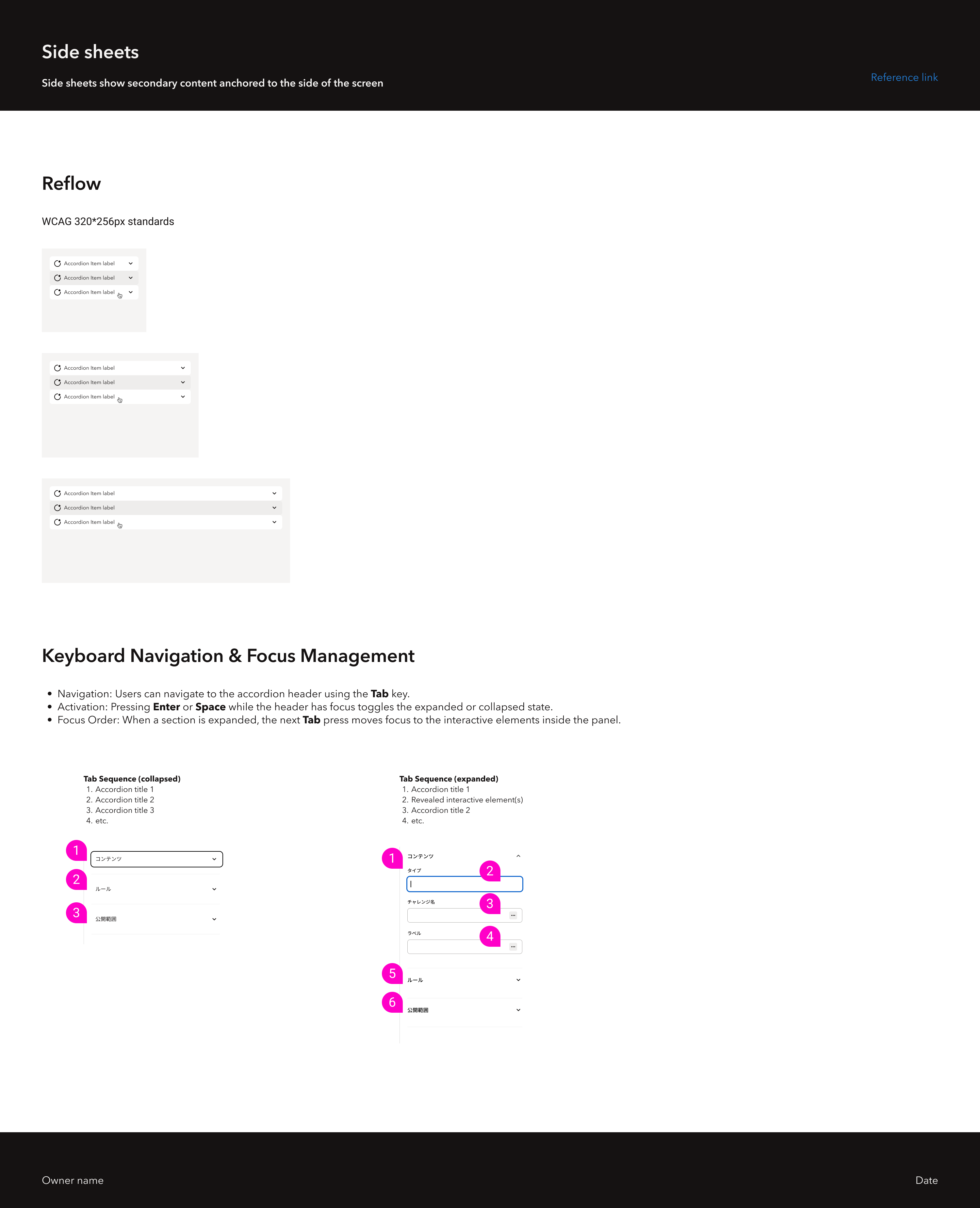
2. Predictable hierarchy across panes, panels, and navigation
Enterprise products often suffer from “same UI, different rules” across pages. I worked on standardizing pane and panel behavior, including clear hierarchy and coverage
3. Typography and localization under implementation constraints
I treat typography as UX plus implementation constraint:
- Type ramps that remain readable across dense layouts
- Localization considerations (string expansion, truncation strategies, mixed-script legibility)
- Implementation-friendly rules so engineers don’t guess
4. Interaction stability as a system constraint
For Fabric, I focused on interaction stability rather than motion design:
- Predictable transition behavior so users keep context while navigating dense enterprise surfaces
- Performance-safe interactions that avoid visual noise and reduce cognitive load
- Clear state changes for loading, feedback, and completion without relying on decorative animation
5. Precision craft: visually harmonizing corner radius
A small example that shows my detail-seeking approach: corner radius is not only a number, it’s perception
I’ve worked through rules for how radii should feel consistent across components and nesting levels, then translated that into implementable guidance
Toolchain: tokens → code → interactive documentation
Design infrastructure stays healthy when design artifacts and production code stay aligned. Our toolchain is a small-team-friendly, executable pipeline
Tokens Studio → Style Dictionary → CSS variables
- Export Figma variables to JSON using Tokens Studio
- Use Style Dictionary to generate CSS variables for web
- Keep the pipeline platform-ready so the same token source can scale to native iOS and Android in the future
Storybook as an interactive source of truth
We document components in Storybook so teams can see and test:
- props and variants
- accessibility expectations
- interactive states and behavior
It complements Figma: Figma shows design intent and interaction choreography, while Storybook shows executable behavior and code-facing APIs
AI-assisted prototyping: Figma MCP → Cursor → Vercel (tested)
We tested connecting Figma MCP to Cursor to quickly build product ideas that follow our visual identity
To make the system readable to tools and easier for humans, we tightened Figma hygiene:
- Token naming: primitives are values, semantics are role-based, for example
background/primary/hover - Container naming: no “Frame 11238”, avoid groups, avoid absolute positioning
- Auto layout and constraints: layout behavior is explicit and predictable
We now use dedicated agent skills and long-term memory patterns for token-related work, so AI assistants produce outputs that are more predictable, reliable, and consistent with our design system principles
This workflow is still experimental. We use it to deploy and validate new ideas faster, not to ship production-ready features yet
Mobile systems: HUMA and LeetCode
HUMA: mobile system work shaped by localization
At HUMA, localization shaped system decisions, not just copy. I focused on typography and layout rules that scale across languages, and used Lottie (vector animation) to keep motion scalable and compatible across mobile contexts
LeetCode: OS-native motion and precision craft
At LeetCode, I treated dark mode and interaction states as system concerns. Motion design ownership in this portfolio belongs here: I leaned on OS-native patterns (iOS and Android) for performance and visual stability, and translated those decisions into implementable rules. This work also reinforced my precision craft, translating visual consistency into rules engineers can implement
Self-reflection
- Design infrastructure creates the most value when it buys back time for teams to focus on UX quality and business outcomes
- My highest leverage work is aligning tokens, components, and governance so teams can ship without re-litigating basics
- Interactive component states are a small investment that prevents expensive ambiguity during implementation
- I try to earn trust by making decisions legible, reusable, and easy for both designers and engineers to adopt