
Reconstruct and visualise automations
You can right-click “Open Image in New Tab” to zoom in
右键“新窗口打开”可以放大查看图片
TL;DR
- Designed a web-based automation dashboard for greenhouse IoT devices and their control strategies
- Worked as the product designer, covering information architecture, key flows, and visual design with the founder and firmware team
- Turned a board-level, hardware-centric setup into a farm-based mental model (programs/projects/devices) and split expert vs everyday workflows
- Used system-level flows and a small set of representative screens to move fast and keep engineers aligned in a short engagement
- Focus of this project in my portfolio is system-level IA and complex interaction design for a hardware-heavy product
Language note
UI text in screenshots is in Chinese because the product targeted Chinese-speaking operators. Descriptions and captions explain layout and behaviour in English.
Project background and my role
The client provides agricultural solutions based on IoT devices. Their main product is a control board that connects:
- Sensors (temperature, humidity, light, etc.)
- Controllers (heaters, irrigation, film rollers, and more)
Automation strategies run on top of these devices to keep conditions within range and alert staff when something deviates.
My role as product designer was to:
- Design a web-based UI for this automation system
- Create a dashboard that integrates information from many control boards across multiple greenhouses
- Work closely with the founder (domain expert) and firmware engineers
Given the short timeline, we prioritised:
- Getting the core structure right
- Designing a few representative flows and screens that could be extended later
- Documenting key user journeys as flows so engineers could implement reliably
Key constraints that shaped the design
From early conversations and quick UX discovery, several constraints emerged:
- Different user groups
- Electronics engineers create presets and strategies
- Farm workers pause, override, or tweak parameters in the field
- Two levels of complexity
- Engineers need advanced controls
- Farm workers need simple, safe workflows
- Batch operations
- Devices are deployed in bulk; registration and checks must scale
- Dashboard as primary monitoring and communication surface
- Used by operators, visitors, and sometimes regulators, mainly for monitoring and visualising data, not heavy interaction
Design highlights
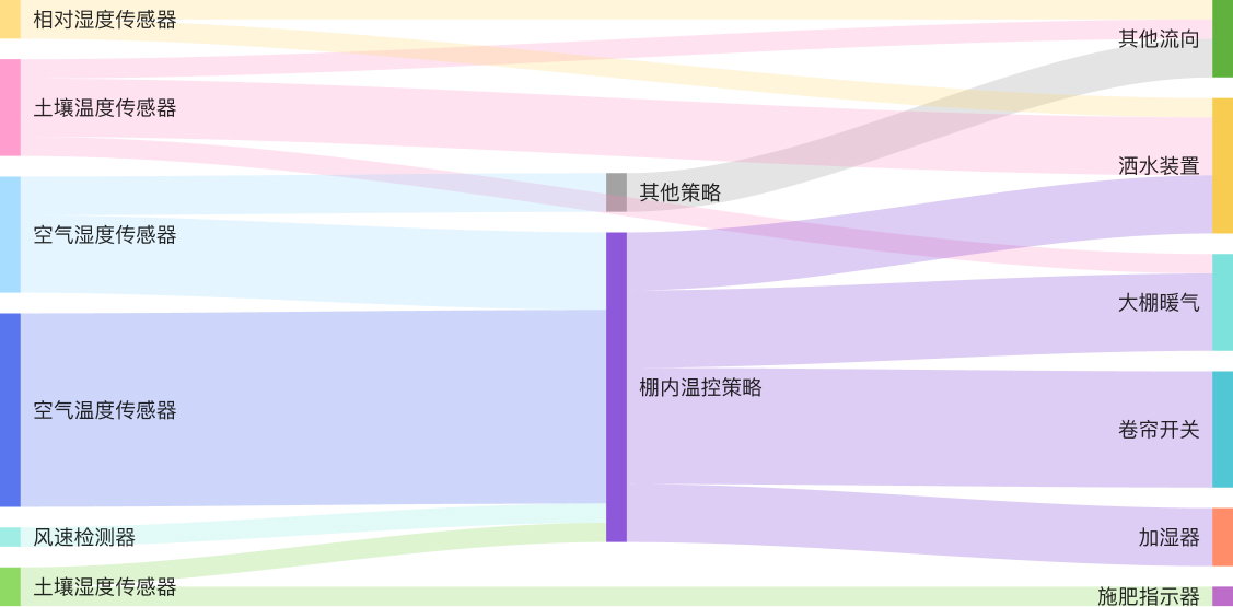
1. Clarifying the system mental model (IA and navigation)
Problem
The initial model was hardware-centric: devices identified by board IDs, with strategies attached directly to them. This worked for engineers, but not for farm workers who think in terms of greenhouses, crops, and projects.
Design
I introduced a simple hierarchy:
- Programs – overall deployments or larger initiatives
- Projects – specific greenhouses, crops, or experiments
- Devices – the boards and sensors installed within each project
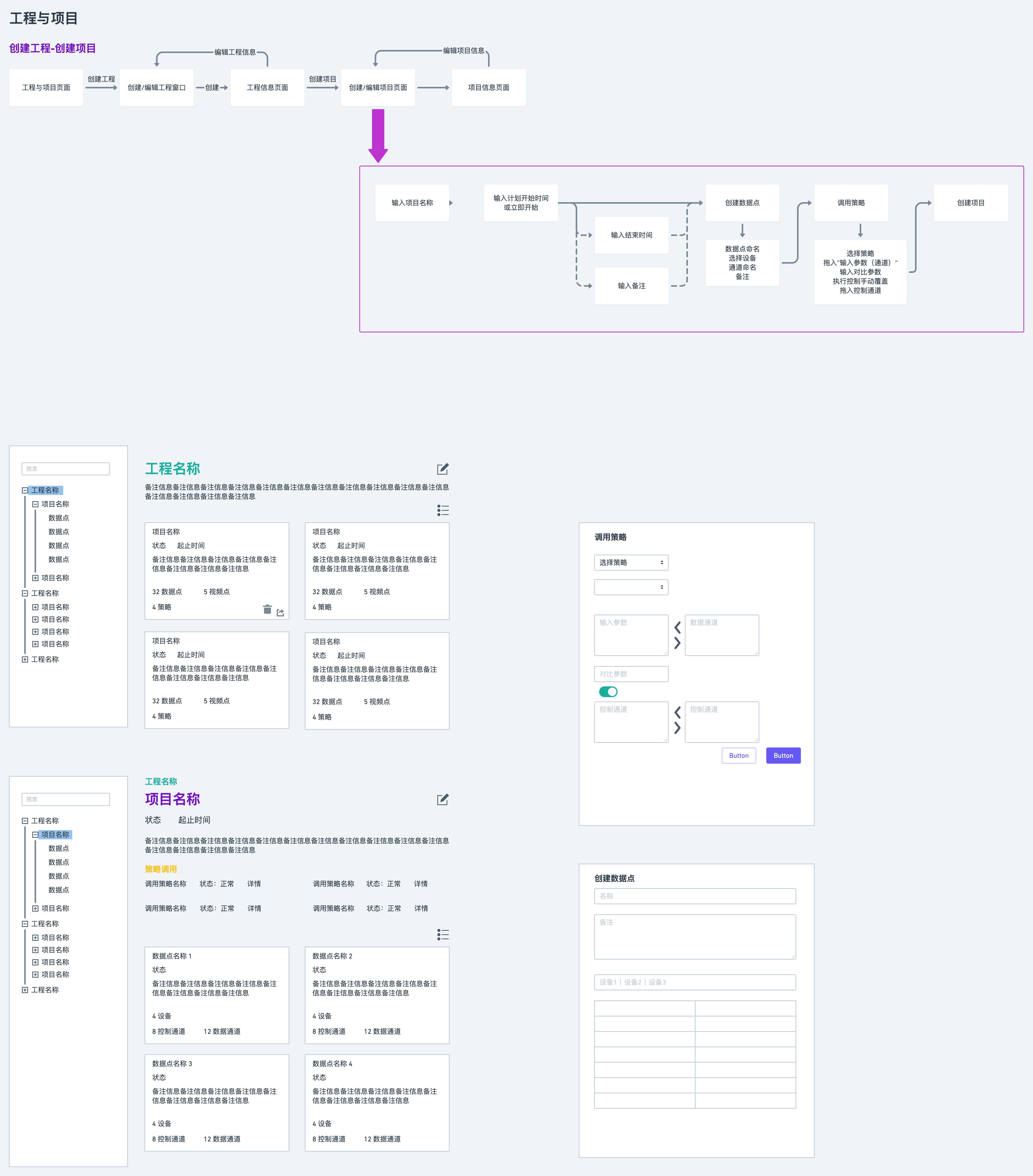 System-level flow diagram showing how programs, projects, and devices map to real farms and greenhouses
To make this concrete, I designed a tree view that mirrors this hierarchy:
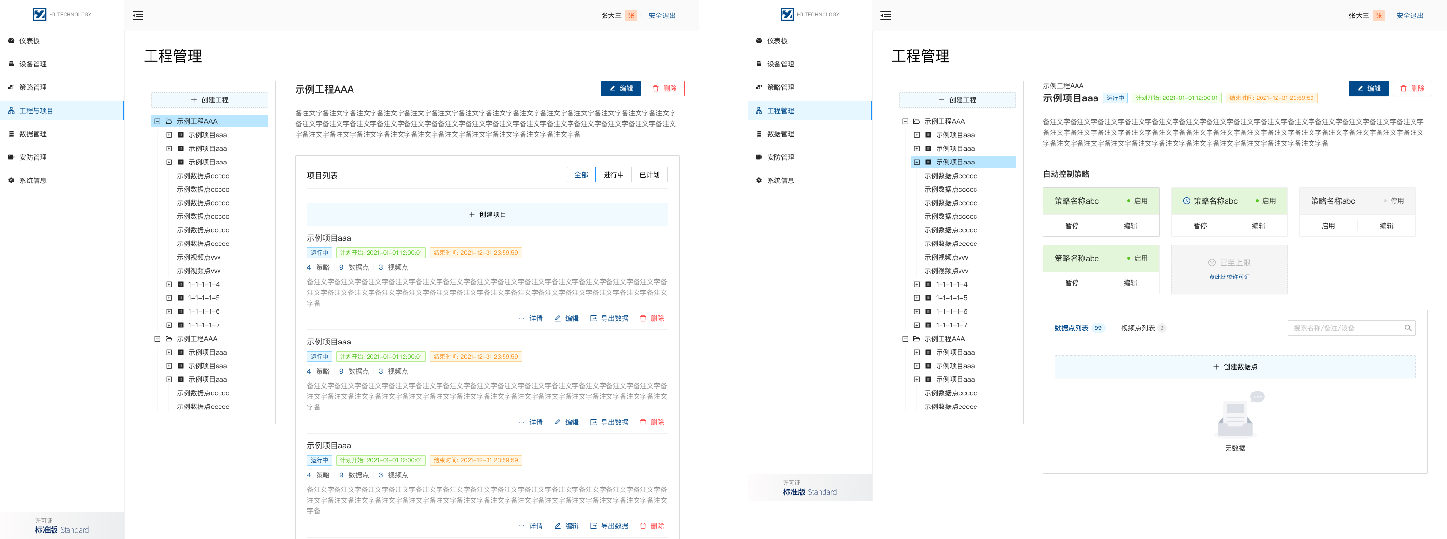 Application tree view that lets users browse from farms and projects down to individual devices and strategies
This gave everyone a shared mental model:
- Engineers can still see devices and strategies
- Farm staff can start from “Greenhouse A – Tomatoes” rather than “Device #0321”
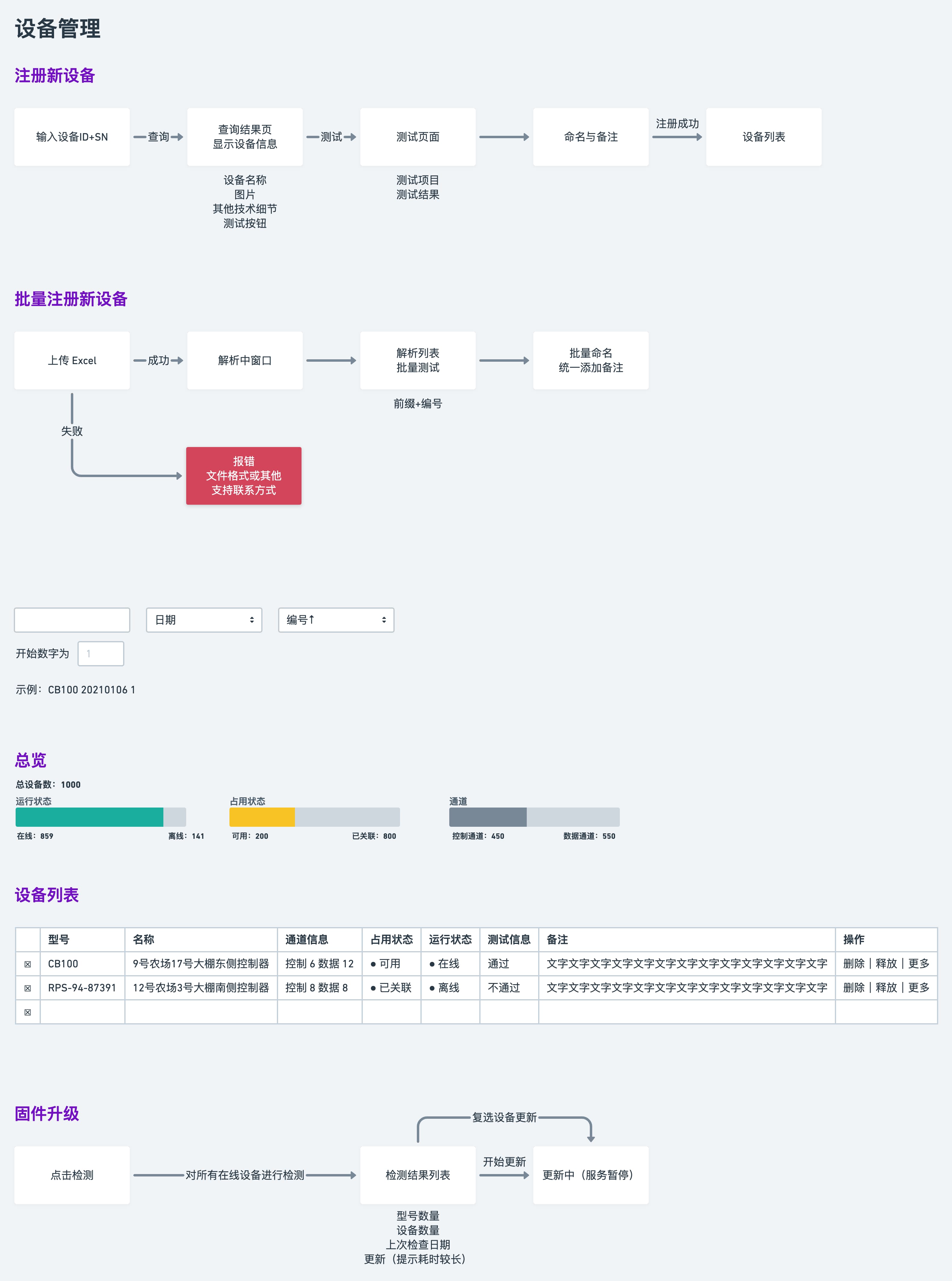
2. Scaling device onboarding (single and batch)
Problem
New deployments often involve dozens of devices. Doing everything manually for each board is slow and error-prone.
Design
I designed two flows:
- Single-device registration for small setups and quick tests
- Batch registration for larger rollouts
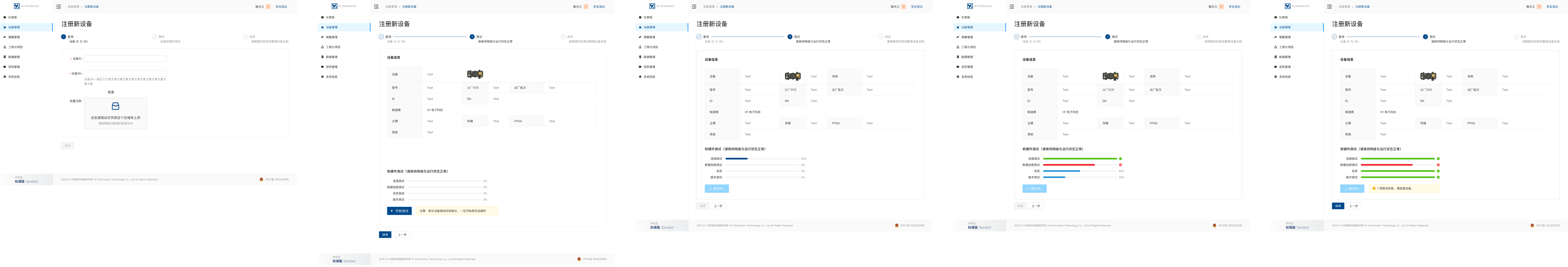 Single-device registration screen with clear fields, validation, and tags so devices stay searchable later
 Batch registration screen for importing multiple device IDs, running self-checks, and applying naming and tagging rules at once
Key decisions I made:
- Encourage consistent naming and tagging so devices are easier to find in the tree
- Add batch self-checks so operators can verify connectivity in one go
- Make it clear where each device will appear in the program/project structure
Result (qualitative)
- New greenhouses could be brought online with fewer manual steps
- The device list became cleaner and easier to navigate, which helped later when assigning strategies
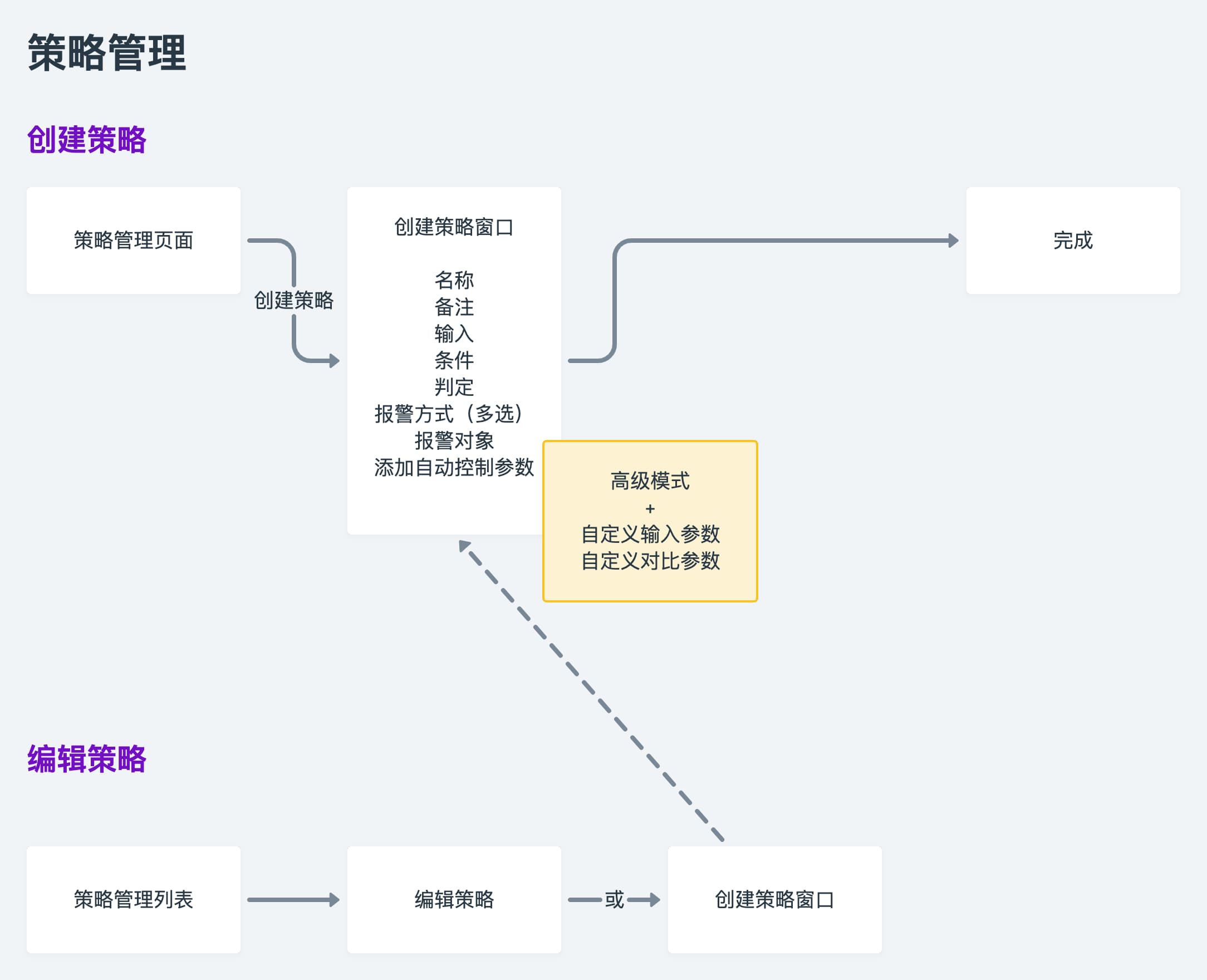
3. Strategies for experts and everyday operators
Problem
Strategies are the core of the system (“if temperature > X and humidity < Y, then open vents and start irrigation”). But:
- Engineers need full control over logic
- Farm workers just need to run safe presets and adjust a few parameters
Mixing these needs in one UI risked misconfiguration.
Design
I separated authoring vs usage into a few focused screens:
-
Creating basic strategies for common scenarios, with guided fields and safe defaults
 Basic strategy editor with predefined inputs and safe defaults aimed at non-expert users
 -
Creating advanced strategies for engineers with more complex logic and variables
 Advanced strategy editor for engineers to build more complex automations with custom logic
 -
Invoking strategies in projects, where farm workers attach presets to a real greenhouse or project and tweak only the allowed parameters
 Invoke screen for attaching a predefined strategy to a project while exposing only safe parameters for day-to-day adjustments
Design choices I led:
- Use basic vs advanced editors instead of a single, overloaded screen
- Keep structural logic read-only in the “invoke” step for non-experts
- Highlight which values are safe to change (e.g. thresholds) and which are locked
4. Dashboards for monitoring and communication
Problem
The dashboard has to work for:
- Operators in a control room
- Visitors and stakeholders walking past large displays
- Sometimes regulators looking at how conditions are tracked
Design
I created a modular dashboard with variants for different views:
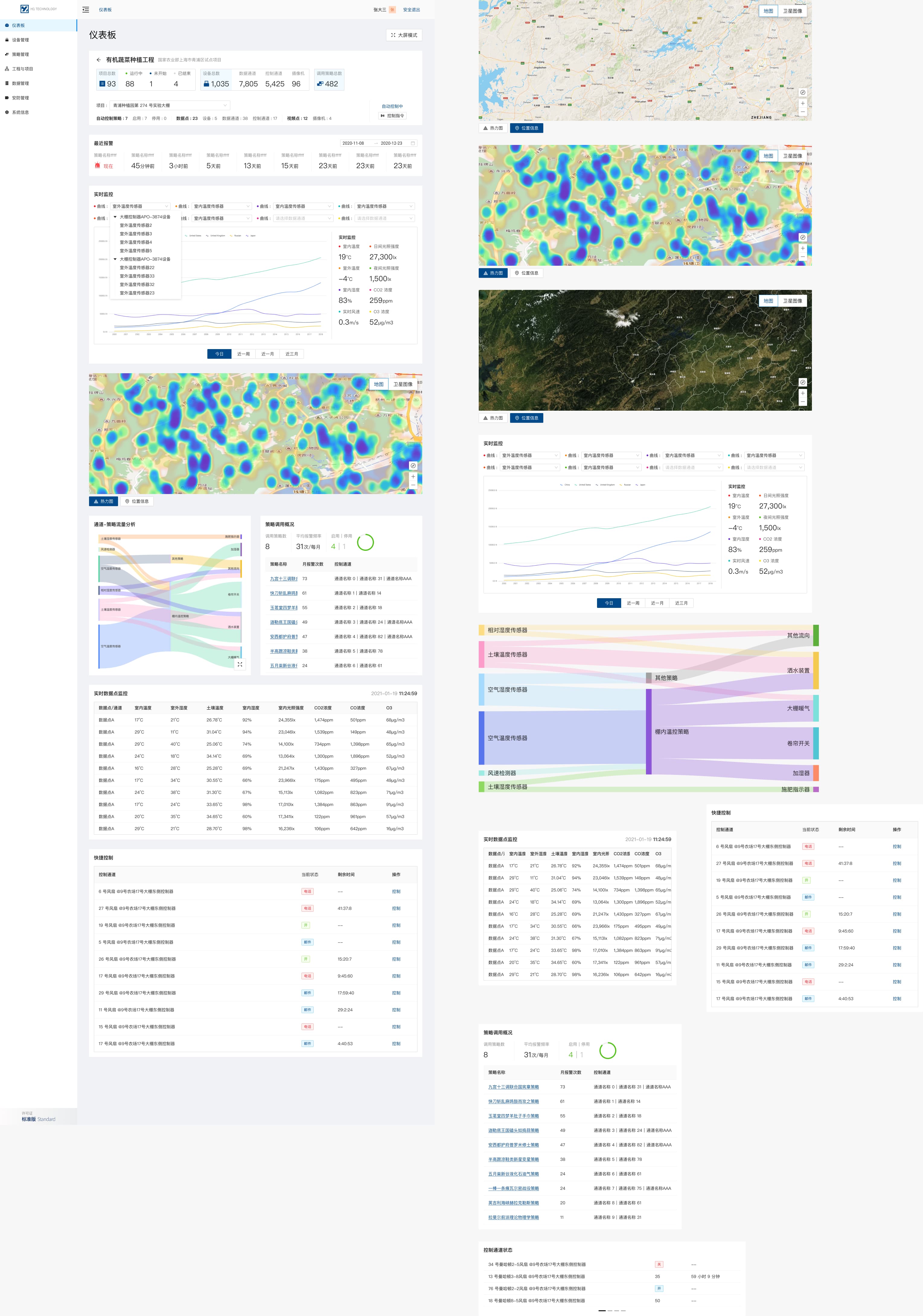 Dashboard layout concepts exploring different arrangements of status, alerts, and trend components
For control rooms, we designed a fullscreen mode:
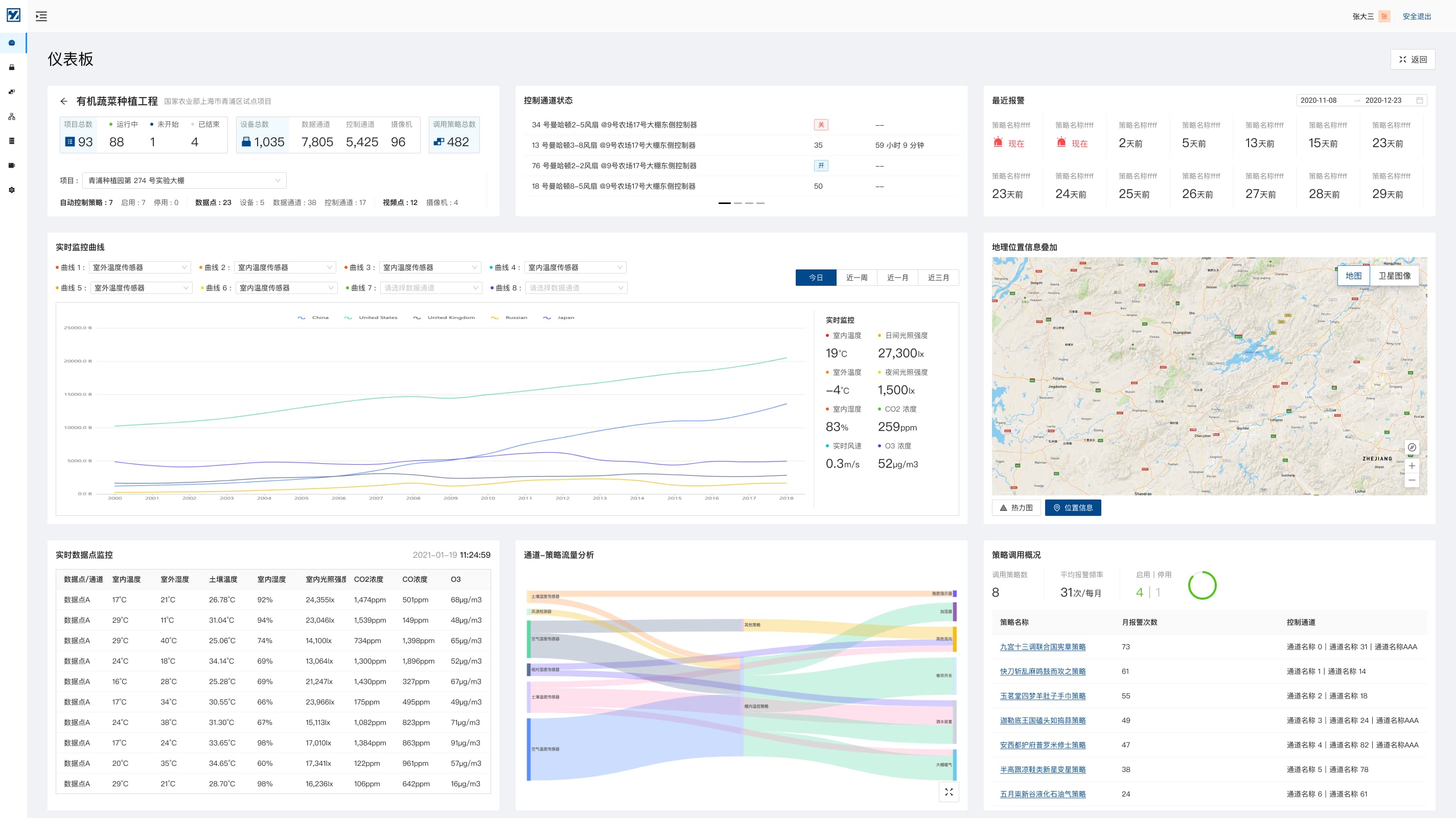 Fullscreen monitoring view optimised for large displays, emphasising alerts and overall system state
The visual design aimed to:
- Use a neutral, low-noise appearance in normal conditions, so that alerts clearly stand out when something is wrong
- Use typography and layout that remain legible from a distance
- Avoid unnecessary controls on this screen, since it is mostly for monitoring rather than frequent action
Design workflow and system flows
Even though the project was relatively small and fast, I still needed a clear way to align with engineers on how the system should behave end to end.
I created a set of system flows that:
- Describe the user journeys behind the main screens (device management, strategy management)
- Capture edge cases and state transitions that are hard to see from static mocks
- Help engineers and the founder confirm we had the same understanding before implementation
 User flow diagram for device registration and management, used to align on end-to-end behaviour and edge cases
 User flow diagram for strategy lifecycle, showing how strategies are created, applied, updated, and retired across projects
These flows were part of my design workflow: start from the IA, map real user journeys, and then design screens that fit into that bigger picture
Outcomes (qualitative)
Because this was a relatively small, quick project, we didn’t set up full analytics. But from client feedback and rollout, we saw:
- Clearer mental model
- People started referring to programs and projects (greenhouses, crops) rather than only board IDs
- Smoother onboarding
- Operators used batch registration flows for new deployments instead of copying settings device by device
- Safer daily operations
- Engineers created strategies once; farm staff used presets and invoke screens to work within safe ranges
- More convincing demos
- The dashboard and fullscreen view made it easier for the client to explain the system to visitors and potential partners
Self-reflection
- The clearest strengths of this project are the information architecture and the split between expert workflows and everyday operation
- If I revisited it, I would add basic telemetry and better strategy simulation so impact and safety are easier to validate
- Lightweight system flows were an effective way to communicate my design workflow and keep implementation aligned with engineers
- Next time I would bring measurement and mobile-friendly alert experiences into scope earlier, especially for on-site operators