
TL;DR
- HUMA is a mobile health app that helps patients record vital signs and treatment data at home so clinicians can adjust care between visits.
- I led UX research and interaction design for key patient flows: glucose, blood pressure/heart rate, and GHD-related tasks, in a regulated medical context.
- This case study focuses on how I combined domain-expert research with detailed interaction design to balance patient effort with clinical data quality.
- Pilot releases showed higher completion for glucose and BP/HR flows and more standardised data that clinicians reported as easier to interpret (exact numbers under NDA).
Context & my role
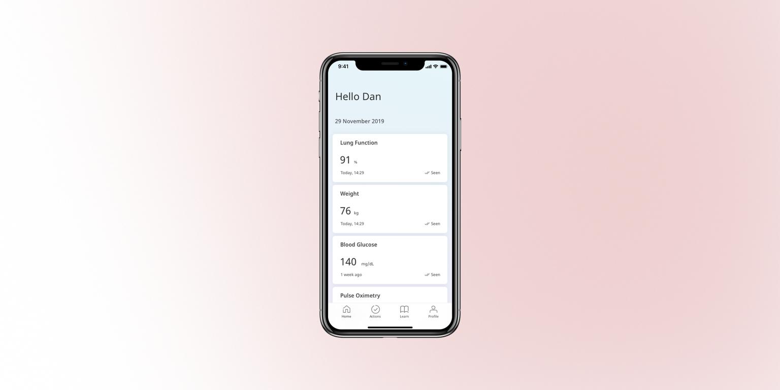
HUMA’s patient app is used by people living with chronic conditions to log information such as:
- Vital signs like blood glucose, blood pressure, and heart rate
- Treatment events including medication, injections, and X-ray results
- Symptoms and daily notes that give doctors context between appointments
Because this is a regulated medical product, we can’t “just ship and tweak later”. Every change can affect adherence and clinical decisions, so each release requires careful research, design, and validation with clinicians.
In this work, I led interaction design for several key modules, ran lightweight research with medical experts and internal testers, and translated their input into flows and micro-interactions that patients can realistically keep up with.
Selected focus 1 — Glucose tracking for daily life
Research inputs
From conversations with diabetologists and internal clinical specialists, I learned that:
- Glucose needs to be tracked many times a day, often 4–6.
- A single value is not enough; it needs context like “after breakfast” or “before bed”.
- Some patients use smaller phones, so jumping between multiple screens feels heavy and error-prone.
Internal focus-group testing with colleagues then surfaced concrete interaction issues:
- The native time picker was easy to overshoot when spun quickly.
- Filling multiple fields didn’t feel like one continuous flow.
Interaction decisions
I redesigned the glucose module around three ideas.
-
One-screen flow with a clear finish and rhythm
All inputs (value, time, eating status) sit on a single, vertically ordered screen that mirrors how patients describe the event when talking to a nurse: “I measured X, at Y time, after Z meal.”
At the end of the sequence, patients see a short “Completed, thank you” state with a checkmark animation. This adds a sense of closure and makes a repetitive medical task feel more like a small win instead of “just another form”. On Android, I chose an animated icon from Google’s native Material symbol set rather than a fully custom animation, so the completion moment feels familiar, lightweight to implement, and aligned with the platform’s motion language.
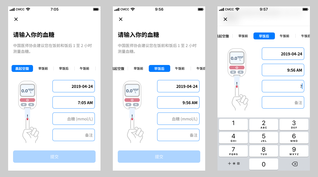 Glucose Module (Old)
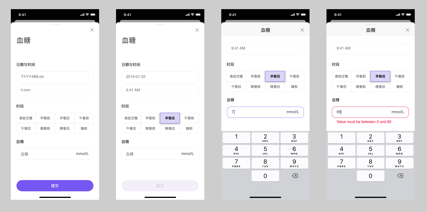 Glucose Module (New)
 -
Keyboard-driven input with accessible numerics
To reduce time errors and make the flow feel more “typed” than “fiddly”:
- Swapped the spinner for a numeric keypad for time and value input.
- Adopted a monospaced font for all numeric entry so similar digits are easier to distinguish and align visually.
- Rolled this typography choice out across other numeric fields in the app as a global pattern to improve accessibility, not just in this module.
The keyboard’s action key is set to Next, so patients move smoothly through the fields; on the last field, the keyboard collapses and the primary action is ready.
 Keyboard-driven numeric input and “Next” flow
 -
Reviewing shortcuts with domain experts before shipping
My first idea was to auto-pair eating status and time of day (for example, selecting “after breakfast” would suggest a morning time) to reduce manual edits.
In design reviews with clinicians, they flagged a serious risk: they rely on the precise combination of time and eating status to interpret patterns, and any hidden automation could blur that signal.
Based on their feedback, I removed the automation and required patients to set both fields explicitly. This made the flow a little slower, but it protected data reliability. It also reinforced a habit for me: treat domain experts as core design partners, not just approvers.
Result
- Patients in our pilot found the interaction faster and more straightforward than the previous multi-screen version.
- Clinicians received more explicit entries (time plus eating status) and fed back that trends were easier to interpret over time.
- The input pattern, success state, and monospaced numeric style became a reusable template in other vitals flows.
The same emphasis on reducing friction in repetitive data entry also shaped adjacent modules such as the medication tracker, where patients can search, filter, and add multiple medicines at once:
![]() Medication tracker and search using compact list layout and fuzzy search
Medication tracker and search using compact list layout and fuzzy search
Selected focus 2 — Standardising blood pressure & heart rate
Research inputs
From discussions with our in-house medical experts, I learned that blood pressure and heart rate are extremely sensitive to conditions:
- Time of day, recent activity, and stress levels
- Whether the patient is talking during the measurement
- Posture and level of relaxation
Doctors told us that inconsistent measurement conditions were one of the biggest sources of “noise” in their dashboards, making it hard to tell whether a change was clinical or just “bad measurement hygiene”.
During a broader rebrand from Medopad to HUMA, I redesigned the blood pressure module’s UI to bring it in line with the new visual language while keeping the validated interaction patterns and posture guidance intact:
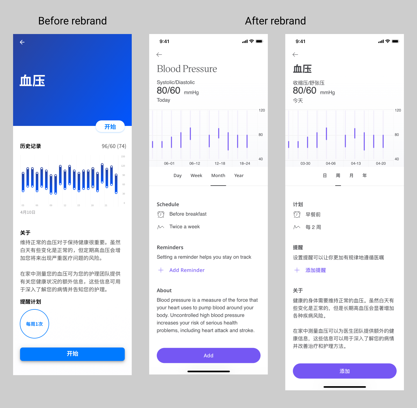 Blood pressure module overview after the HUMA rebrand
Interaction decisions
-
Sitting-posture animation that turns protocol into a clear mental model
Clinicians defined what “correct posture” means in practice: feet flat on the floor, back supported, arm at heart height, no talking. My role was to turn that protocol into something patients could follow without reading a dense list.
I designed a simple visual sequence and worked with a motion designer to produce a lightweight vector animation that shows the person gradually moving into the correct sitting position. The animation loops slowly so patients can compare their own posture to the target one, even on a small screen.
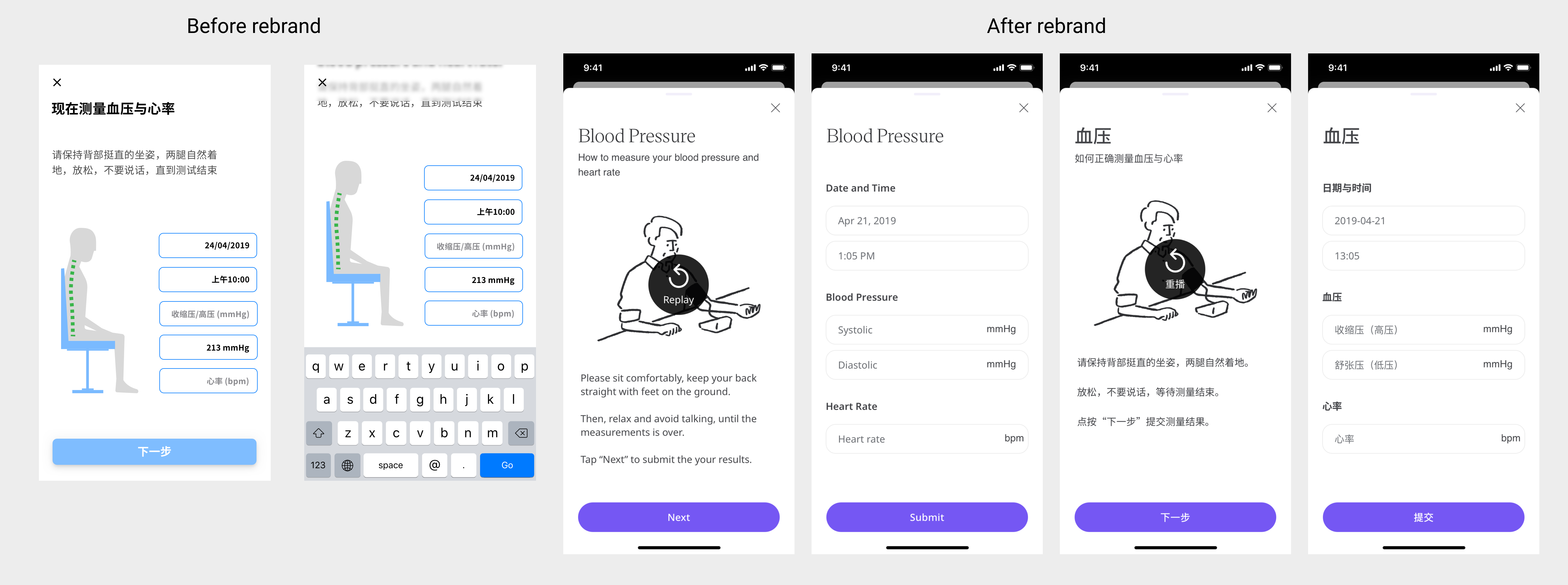 Blood pressure & heart rate posture guidance
 -
Exploring sound as part of the UX
Many health apps focus only on what’s on the screen. I wanted to treat sound design as part of the interaction, especially for anxious patients who look away while the cuff inflates.
To introduce voice guidance, I proposed adding spoken prompts even before they were requested, drafted short scripts that matched the clinical protocol in plain language, and started with a text-to-speech implementation to test the idea. Once we saw that the robotic voice felt distracting and cold, I recommended moving to a professional voice actor to make the experience calmer and more human.
In feedback sessions, patients used phrases like:
“It feels like a nurse guiding me step by step.”
“The calm voice makes me less worried I’m doing it wrong.”That was a strong signal that the audio layer was doing real UX work, not just decoration.
Result
- Clinicians reported that readings became more consistent between visits, because more patients followed the same posture and rest sequence.
- Patients felt more guided and less afraid of “messing it up”, which is crucial when you’re asking them to keep measuring week after week.
- The project reinforced for the team that motion and sound are legitimate design tools in clinical UX, not just visual extras.
Selected focus 3 — Making X-ray uploads workable in the real world
For children with Growth Hormone Deficiency (GHD), doctors track growth using a combination of height measurements, X-rays, and medication adherence. Ideally, X-rays would flow directly from hospital systems into our platform, but at the time we faced real-world constraints:
- Privacy policies that limited direct integration with hospital imaging systems
- Variable, often low-resolution phone cameras
- Home environments with poor lighting and reflections on the film
Families were being asked to photograph X-ray films using their phones, and clinicians were understandably sceptical about whether those images would be usable.
Research inputs
Through repeated sessions with our medical experts, I learned:
- X-ray films are designed to be read on light boxes, not captured by cameras.
- Common failure modes included glare on the critical bone area, angles that distorted proportions, and images where part of the bone was cropped out.
- Doctors were worried they would receive a large volume of images that were clinically unusable, with no way to educate families on how to improve.
The high-level flow below summarises how we moved from the ideal (direct integration) to a second-best path based on patient-taken photos and in-app guidance:
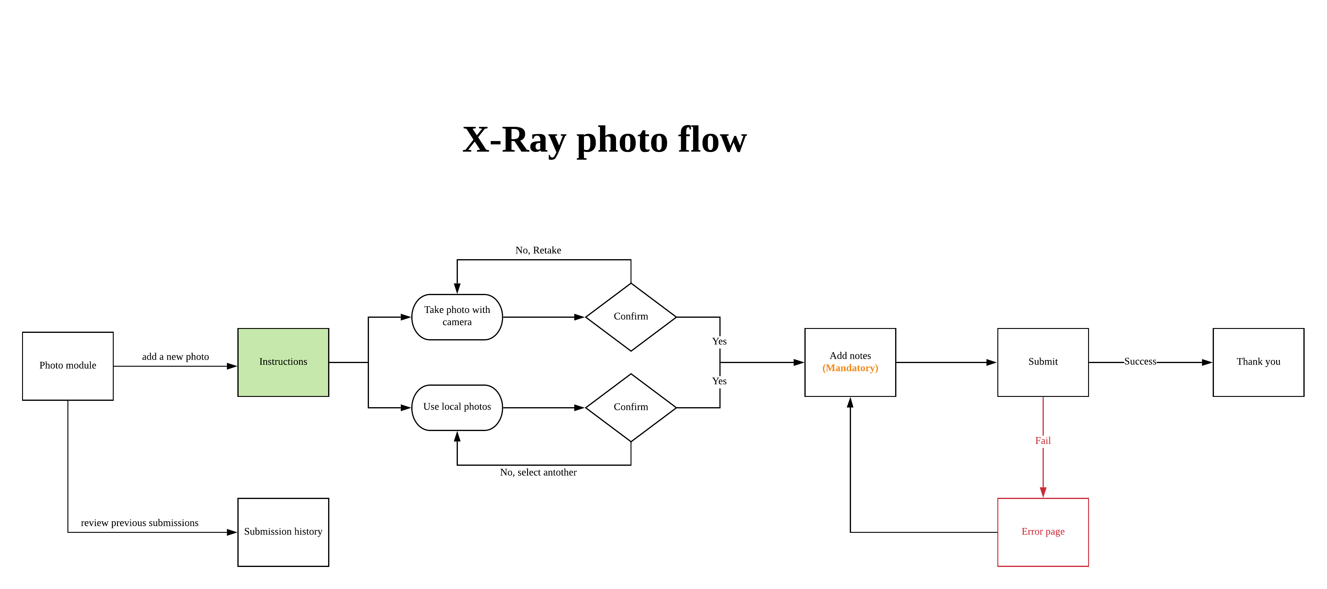 User flow for X-ray photo capture, from ideal integration to second-best mobile photo path
Interaction decisions
-
Guided capture with before/after examples
I designed a capture flow that:
- Shows “good” examples next to common “bad” examples such as “too dark”, “cut off at the wrist”, or “reflection across the growth plate”.
- Explains in one line why each type of error is a problem from the doctor’s perspective.
- Encourages patients to retake the photo when it clearly doesn’t match the good example.
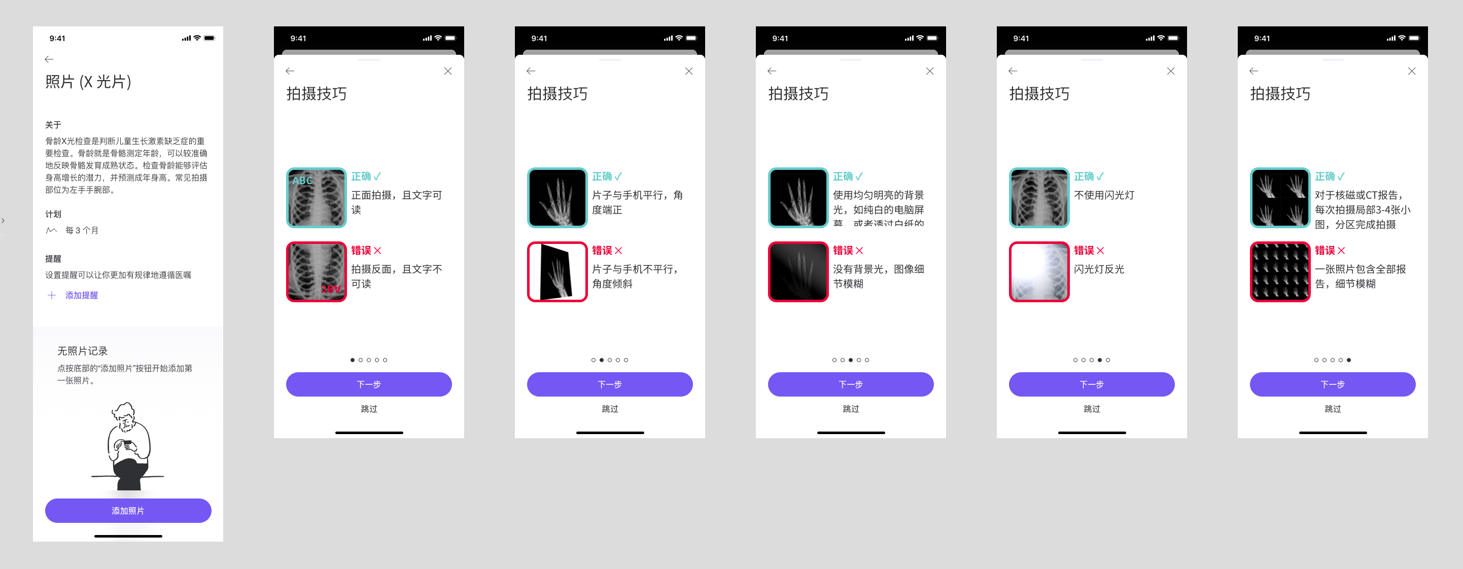 Instructions for taking photos of X-ray films
 -
Markup tools for clinicians to teach patients asynchronously
Early pilot results confirmed clinicians’ fears: more than half of the submitted photos were still unusable. Instead of accepting that as a fixed limitation, I proposed a markup-based feedback loop:
- Clinicians can circle specific areas on the X-ray that need a clearer zoomed-in shot.
- They can add short comments such as “Too much glare on the bone here” or “Please include the entire wrist joint.”
- The next time the family uploads an image, they see this guidance inside the app, not buried in a phone call or letter.
The markup concept allowed doctors’ expertise to flow back into the product, even though we still had to respect privacy rules and hardware limitations.
Result
Within the constraints of privacy policy, phone cameras, and home lighting, we moved from “attach a random photo” to a guided and educative process that:
- Helps families understand what a clinically useful X-ray photo looks like
- Gives clinicians a structured way to coach patients over multiple cycles
- Opens a path for future automation (for example, basic image-quality checks before submission) once legal and technical foundations are in place
Outcomes & what I’d change
Across these focus areas we saw:
- Higher completion rates for glucose and BP/HR modules compared with earlier versions.
- More standardised vitals thanks to consistent posture guidance and clear measurement sequences.
- A more realistic yet usable approach to X-ray uploads, with a feedback mechanism that lets clinicians teach families over time.
If I revisited this work now, I would:
- Define target metrics per module (for example, completion rates and percentage of unusable X-rays) upfront and instrument them earlier.
- Prototype the clinician markup flow sooner, even with low-fidelity tools, to validate both workflow and patient comprehension.
- Explore more personalised patterns for reminders and measurement schedules based on each patient’s habits.
Self-reflection
This project sharpened how I design in clinical contexts:
-
Research doesn’t always mean talking to end users first.
In several cases, medical experts were the most effective proxy for patient behaviour and constraints, especially when real-world patient access was limited. -
Collaboration across teams is a core design skill.
Reviewing flows with domain experts, listening carefully when they push back, and translating their concerns into concrete interaction changes helped me avoid mistakes that could have damaged data reliability. -
Interaction design and data quality are tightly linked.
Small choices — from numeric typography to whether fields auto-update — can be the difference between nice-looking UI and data that doctors can genuinely trust. -
The need to trade convenience for reliability when stakes are high.
In both glucose tracking and X-ray uploads, I consciously chose slightly more deliberate steps to protect long-term clinical value.
This is a project to show how I handle UX research, interaction design, and medical collaboration in a high-stakes mobile medical app.
System design, telemetry, and detailed documentation from this work live in a separate case study on design systems and infr.