

Shared UX, design systems, and cross-product patterns
Some images are unavailable for general public
TL;DR
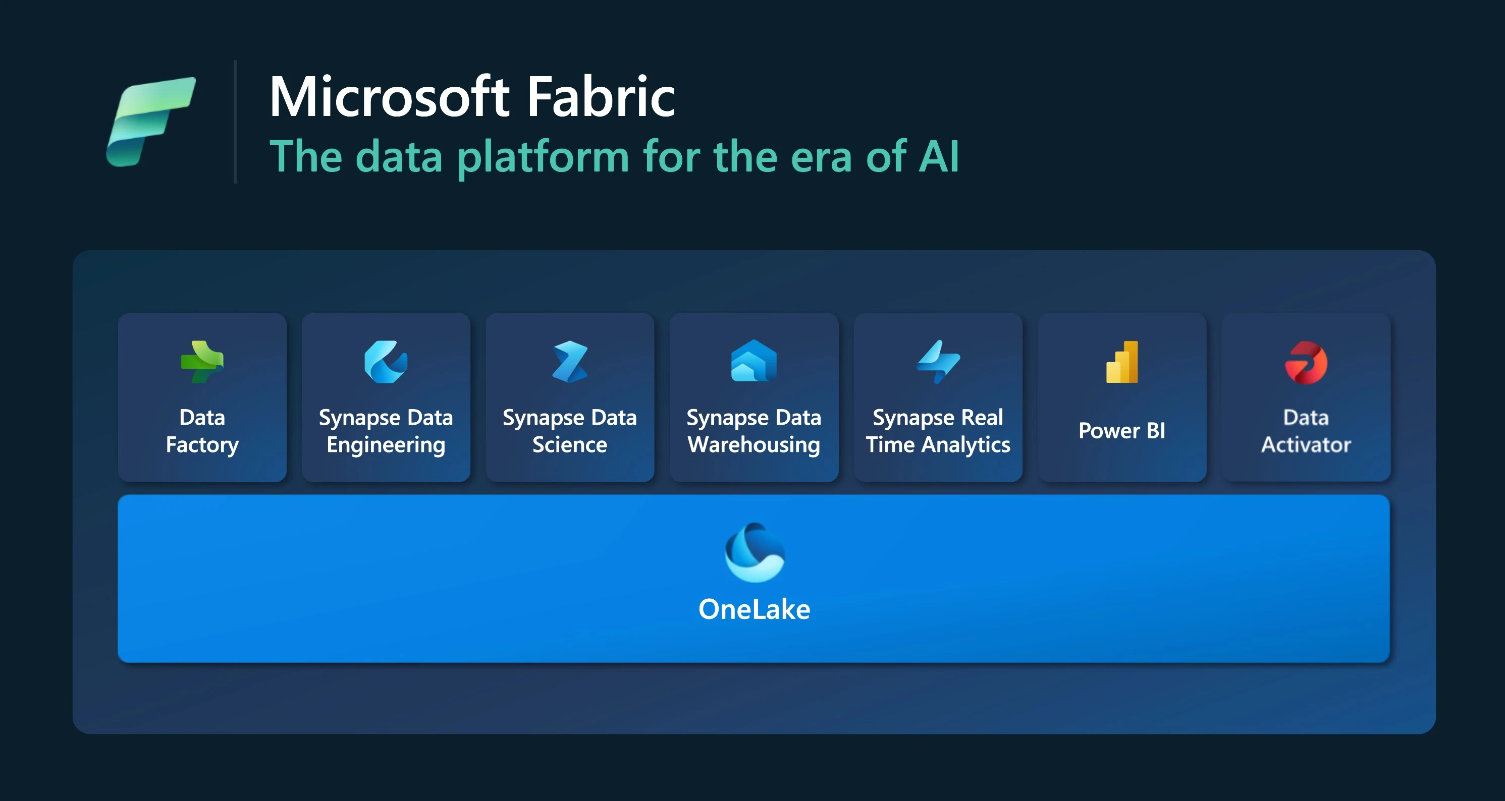
- Microsoft Fabric is an end-to-end analytics SaaS platform that unifies data movement, engineering, warehousing, real-time analytics, data science, and BI in a single experience on top of OneLake.
- On the Shared UX team, I work at the platform layer: cross-product navigation and information architecture, shared patterns, and accessibility, so dozens of teams feel like one coherent product.
- I contribute to Fluent 2 components (Tree, dialogs/drawers, date and time pickers, file explorer) and extend them into Fabric-specific patterns for workspaces, workflows and folders, notifications, monitoring, contextual menus, and settings.
- These patterns are used by more than ten workloads across Azure and Fabric experiences, and several components I worked on are part of Fluent 2 and Fabric’s core design system.
- This work unblocked key features such as the Monitoring hub and workspace workflows/folders, reduced UX inconsistency, and gave teams decision trees and guardrails so they can ship faster with fewer one-off solutions.
Context and my role
Microsoft Fabric is an enterprise-ready, end-to-end analytics platform that unifies data ingestion, transformation, real-time analytics, warehousing, data science, and business intelligence in a single SaaS experience. All workloads share OneLake, a unified data lake that behaves like “OneDrive for data” across the organisation.
For users, this means:
- One place to work with data, from raw ingestion to dashboards.
- Persona-optimised workloads in an integrated UI.
- Central governance, monitoring, and security.
For the Shared UX team, it means:
- We have the chance to make Fabric feel like one product, not a bundle of tools.
- We also carry the risk that if each workload team designs in isolation, UX becomes fragmented and hard to learn.
In this team, I focus on:
- Cross-product information architecture, navigation, and hierarchy.
- Shared patterns and components built on Fluent 2, Microsoft’s design system.
- Consistency, scalability, and accessibility across workloads.
The main tensions in this role:
- Keeping UX standards high across many teams with different roadmaps.
- Balancing a single pattern set with the flexibility needed for edge cases.
- Communicating decisions so designers, PMs, and engineers see UX guardrails as an enabler, not a blocker.
Design-system foundations: Fluent 2 and Fabric design system
Contributing to Fluent 2 primitives
Fluent 2 underpins many Microsoft products and provides primitives such as Tree, dialogs, drawers, and pickers. I worked with the Fluent design system team and Fabric product teams to ensure these primitives fit complex, real workloads, not just simple examples.
Tree and hierarchical structures
In Fabric, hierarchical data appears everywhere: workspaces, folders, artefact collections, job groups. I helped analyse real usage and define Tree behaviour, including drag and drop and non-editable areas.
A representative edge case: a user drags a pipeline from a shared, read-only workspace into a personal workspace and tries to drop it between two items that belong to a protected system folder.
This scenario touches multiple behaviours:
- The drop target must clearly communicate that the source workspace is read-only.
- The Tree must distinguish between valid and invalid drop zones within the same visual list.
- The user must understand what happens when moving an item across workspaces, including any implicit permission changes or limitations.
By working through cases like this with engineers, I helped define how the Tree component handles valid moves, blocked moves, and disabled drop targets in a way that is predictable for users and reusable for other products.
This Tree work feeds into Fluent 2’s Tree component, so other products can reuse the same interaction model without re-solving these edge cases.
In addition to Tree, I contributed to richer dialogs and drawers and to the behaviour and visual refresh of date and time pickers, aligning them with Fluent 2 while keeping them usable in dense enterprise layouts.
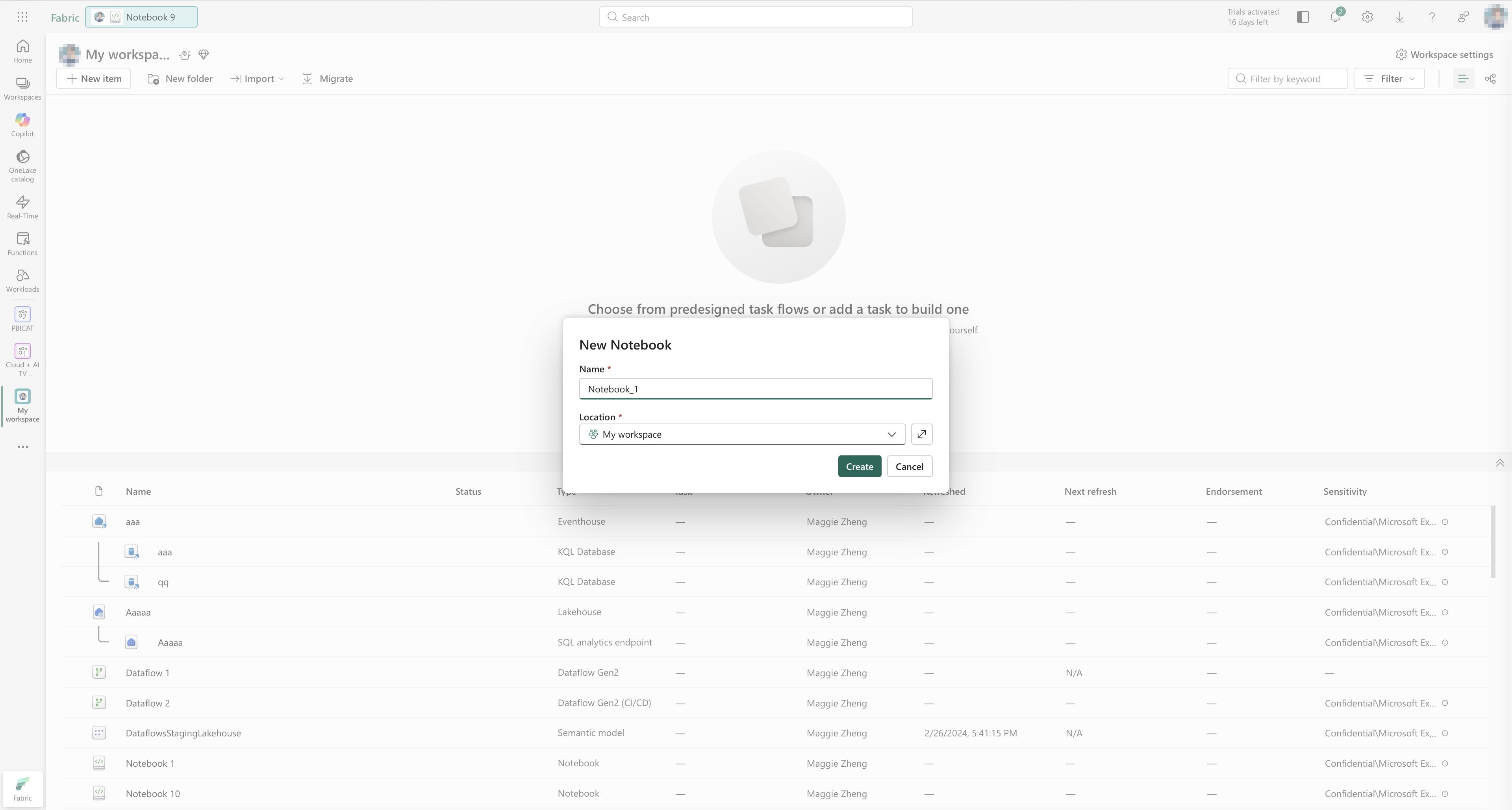
File explorer: a universal, scalable component
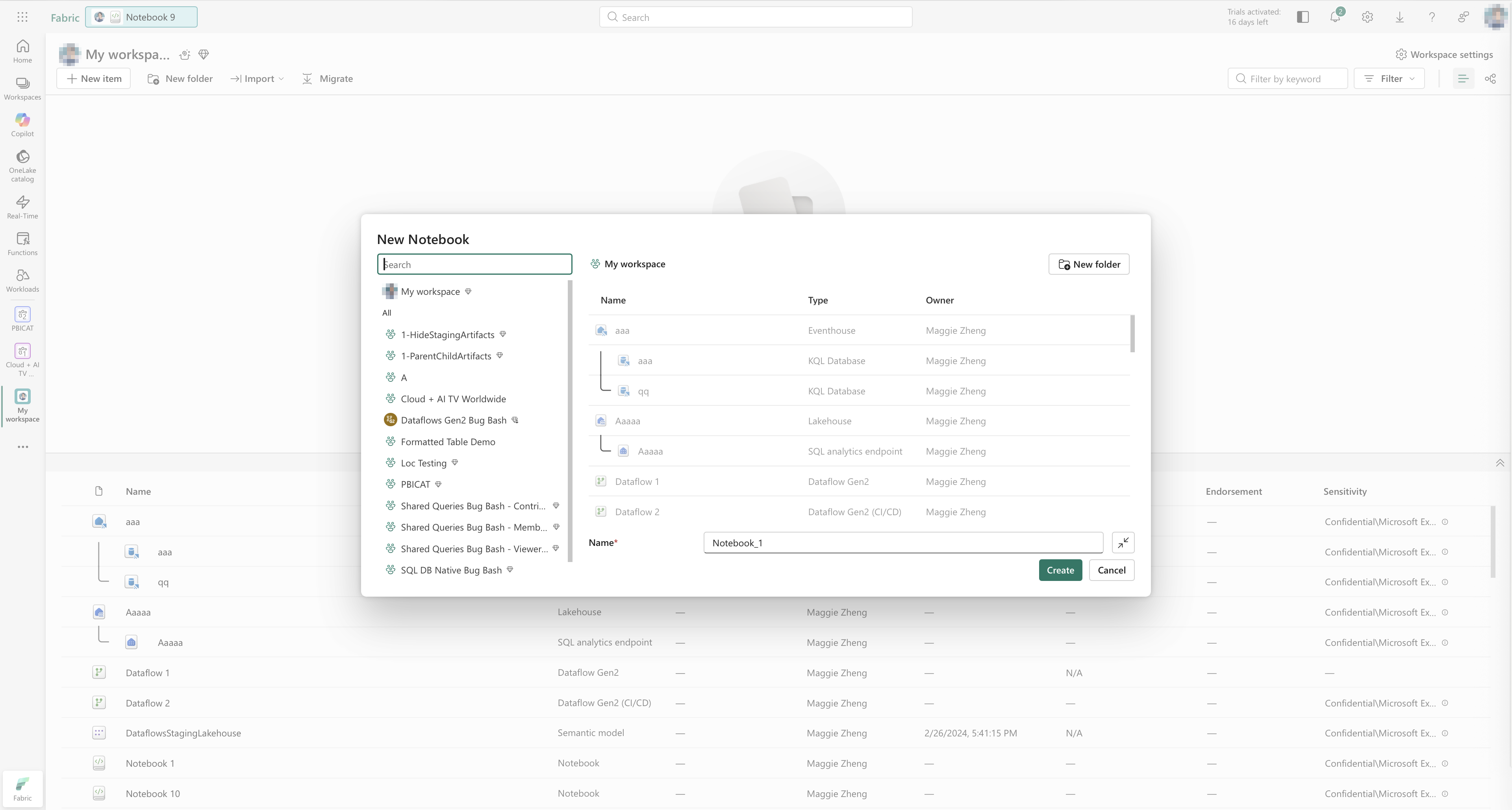
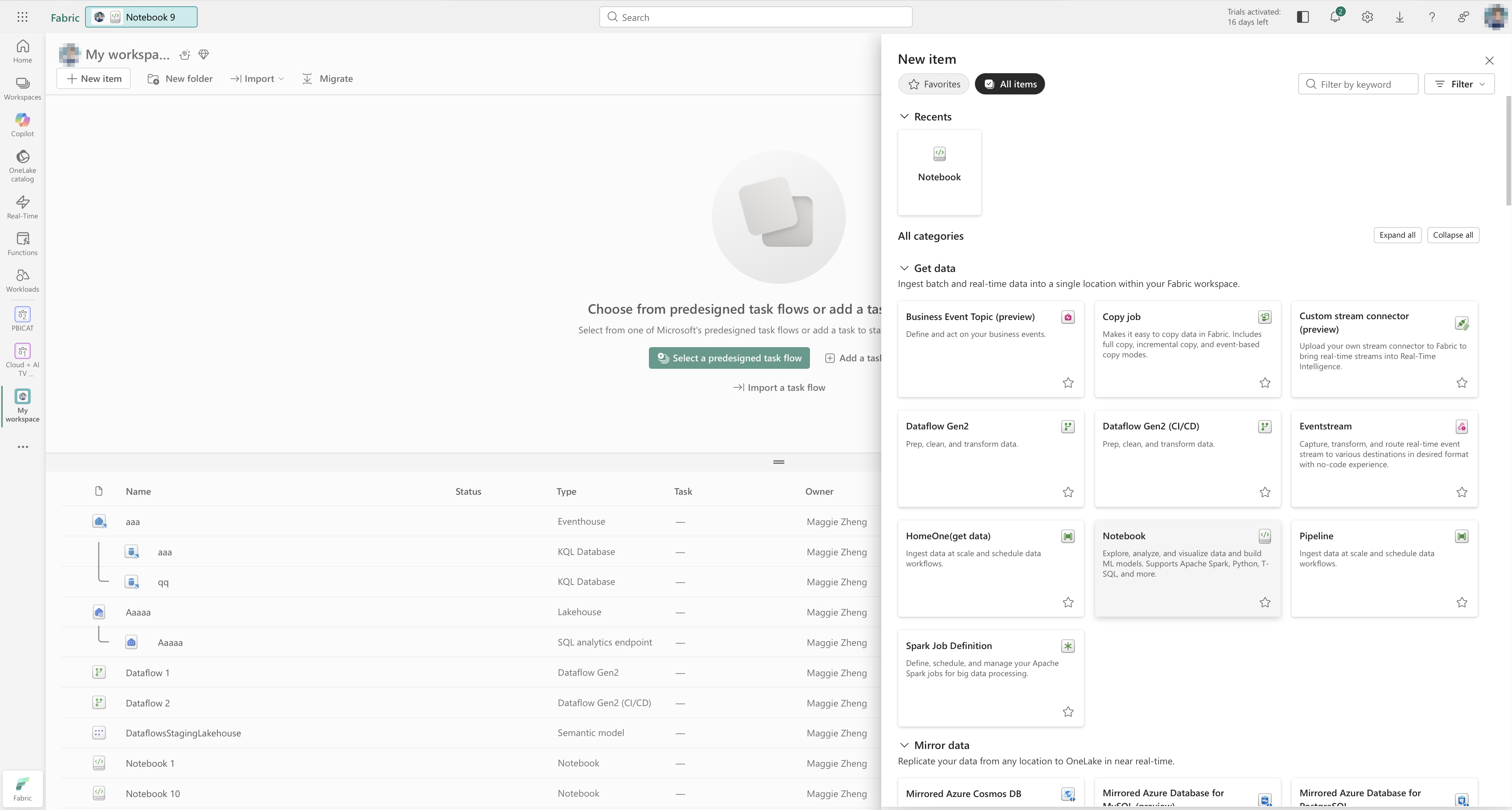
I owned the file explorer component end to end:
- Designed it to be universal across workloads and scalable to large numbers of artefacts.
- Worked closely with engineers across multiple iterations to handle edge cases and performance constraints.
- Defined a dual-mode model:
- Compact mode for quick scanning and simple actions.
- Advanced mode for precise navigation, rich metadata, and complex operations.
The ability to switch between compact and advanced modes lets users choose between speed and control without leaving the component. This reduces the need for separate “simple” and “advanced” tools and gives teams a single, flexible building block.
Patterns that unblock teams
Beyond core components, I work on Fabric-specific patterns that sit on top of Fluent 2 and are used by many workloads across Azure and Fabric.
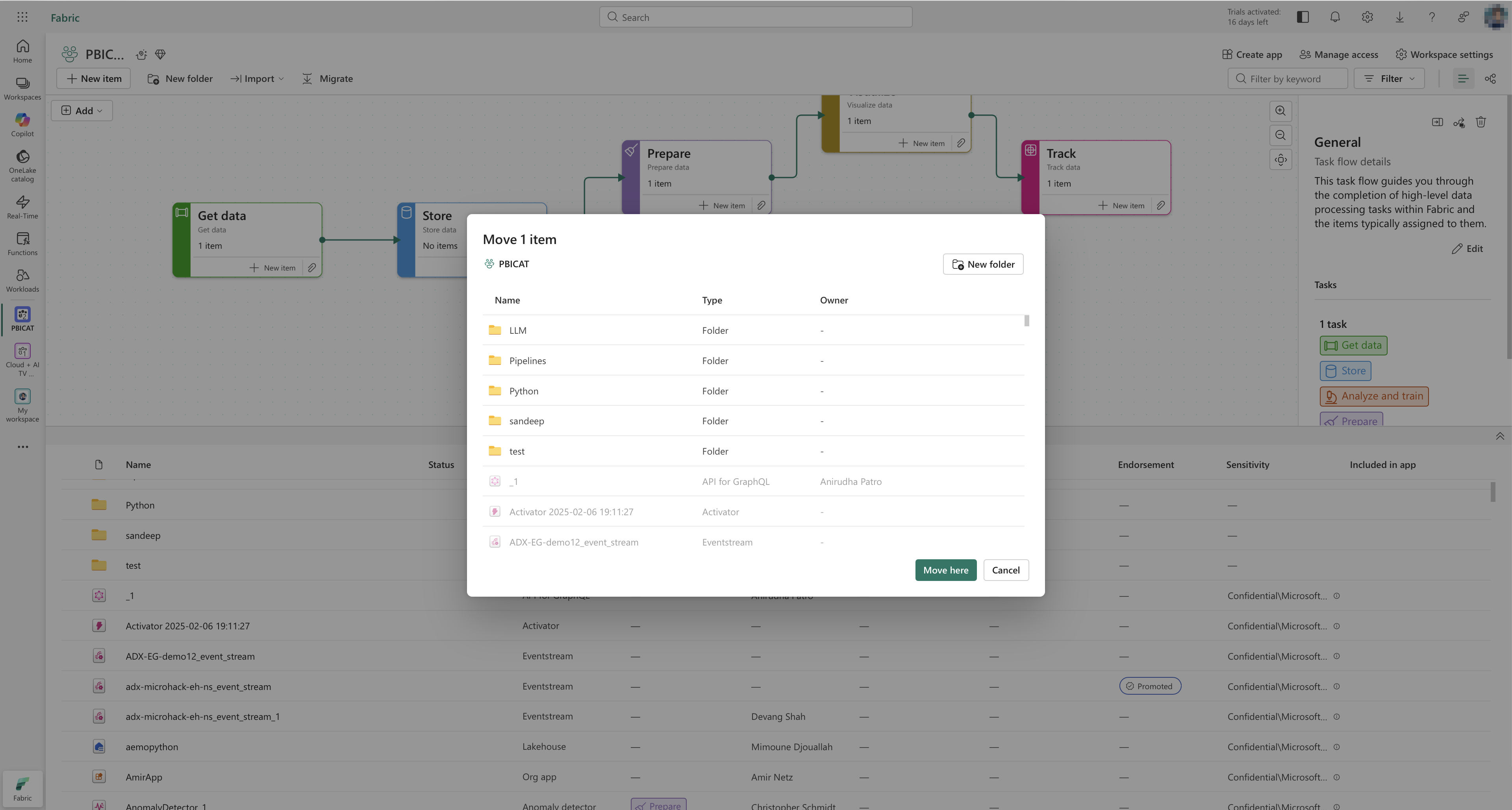
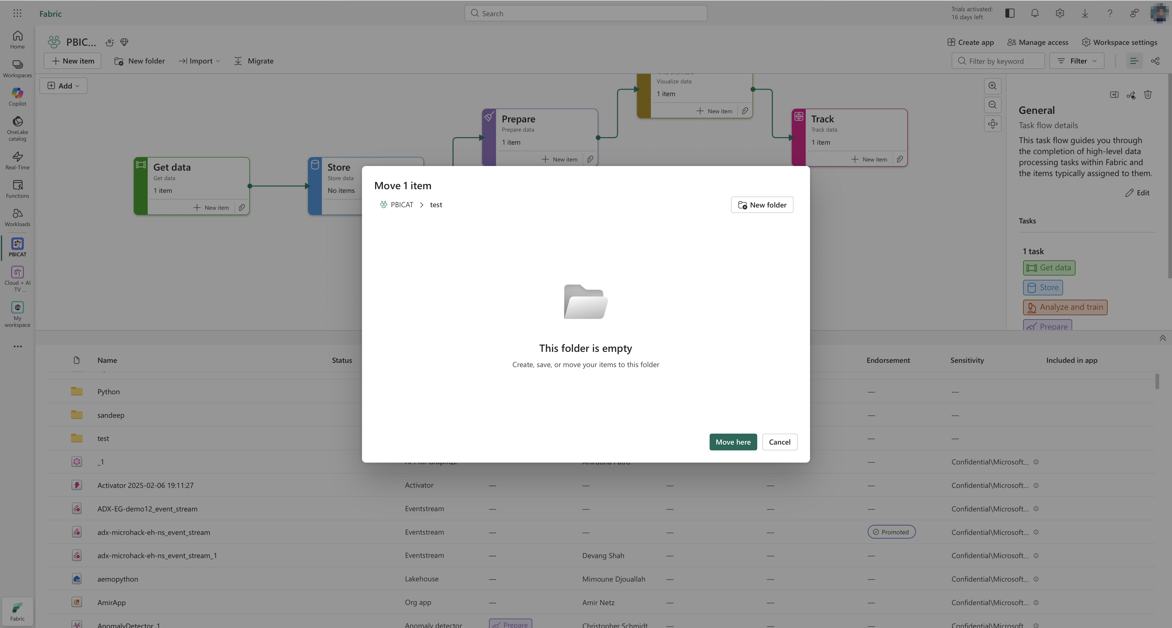
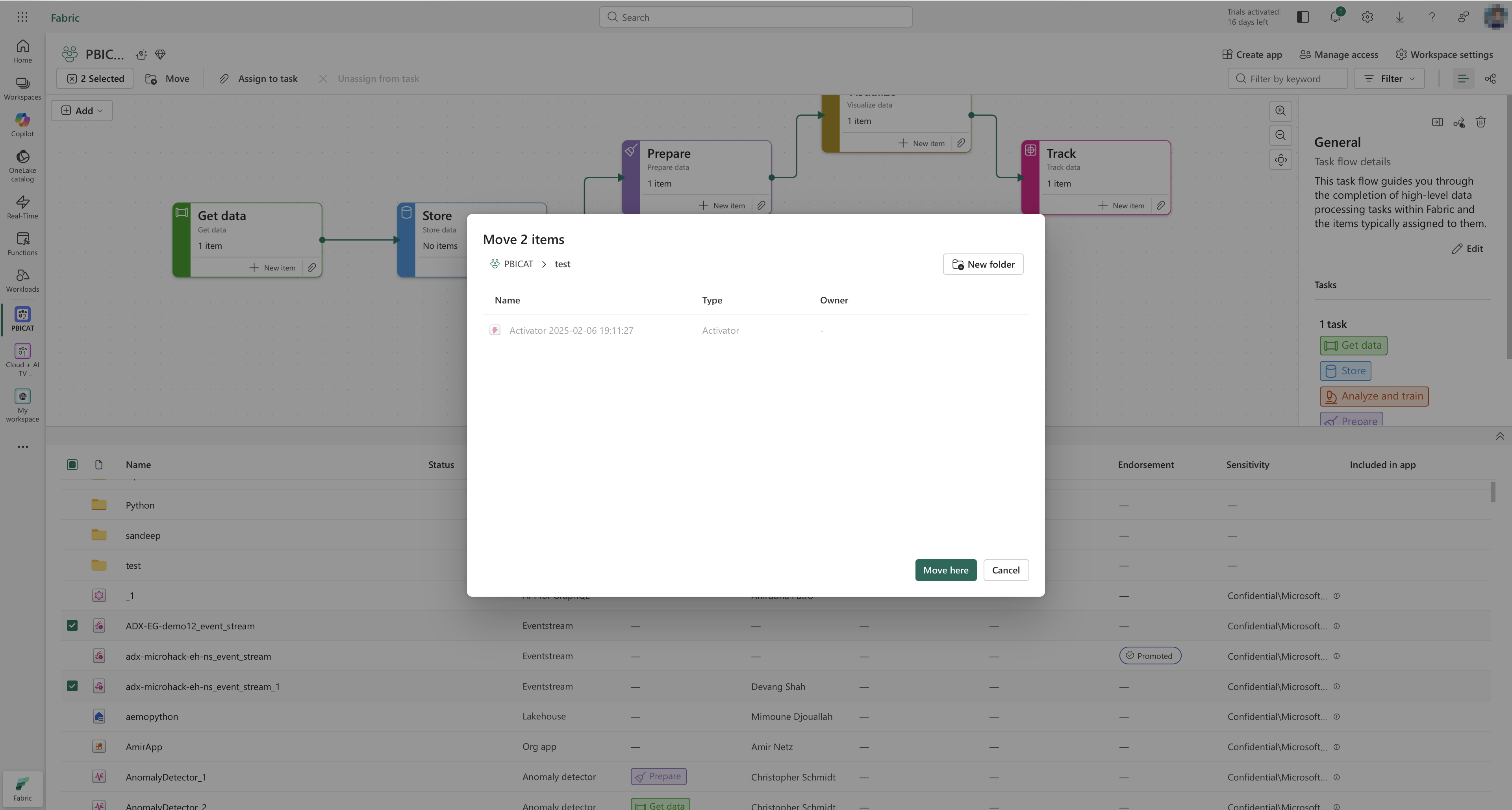
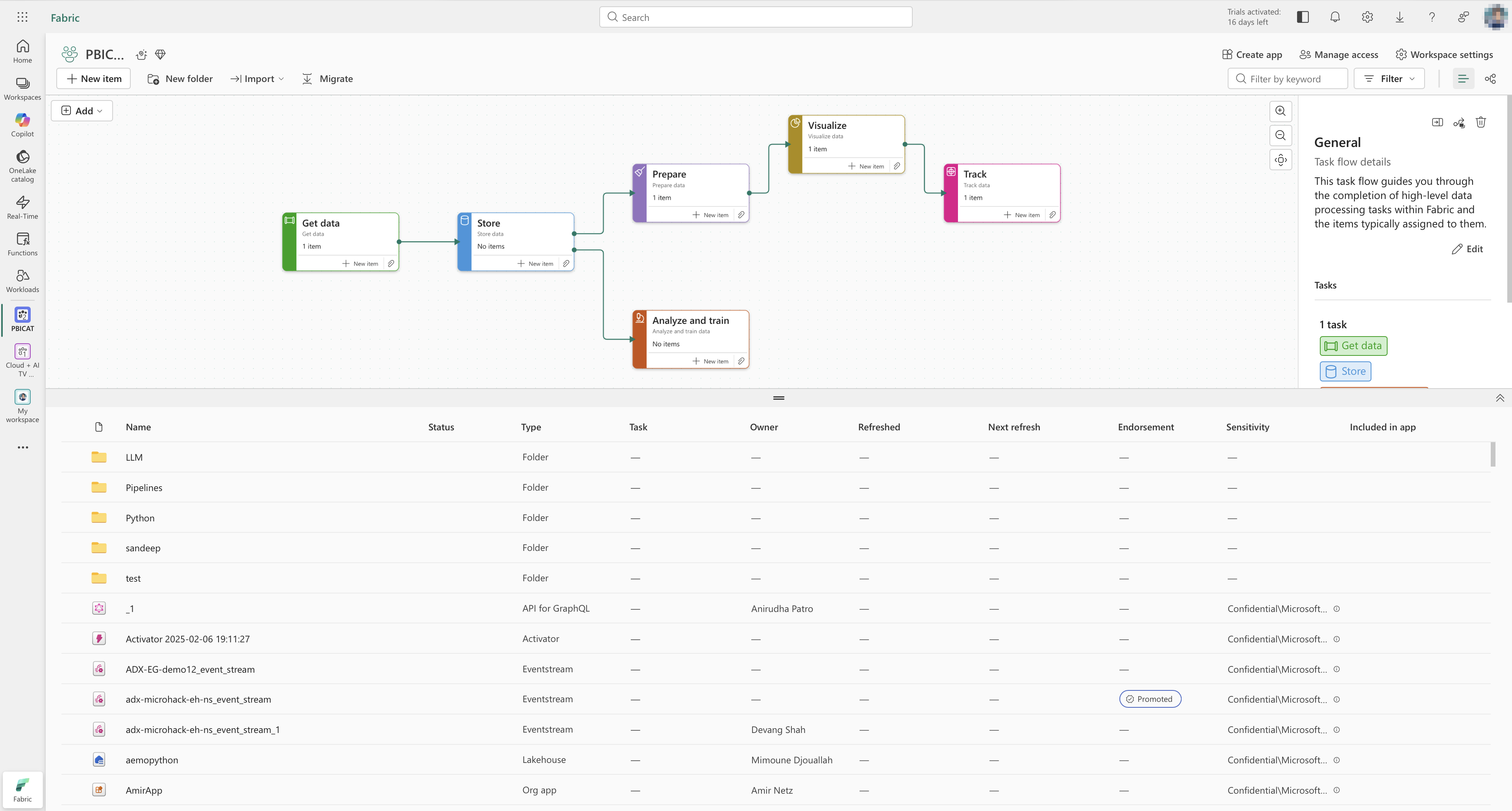
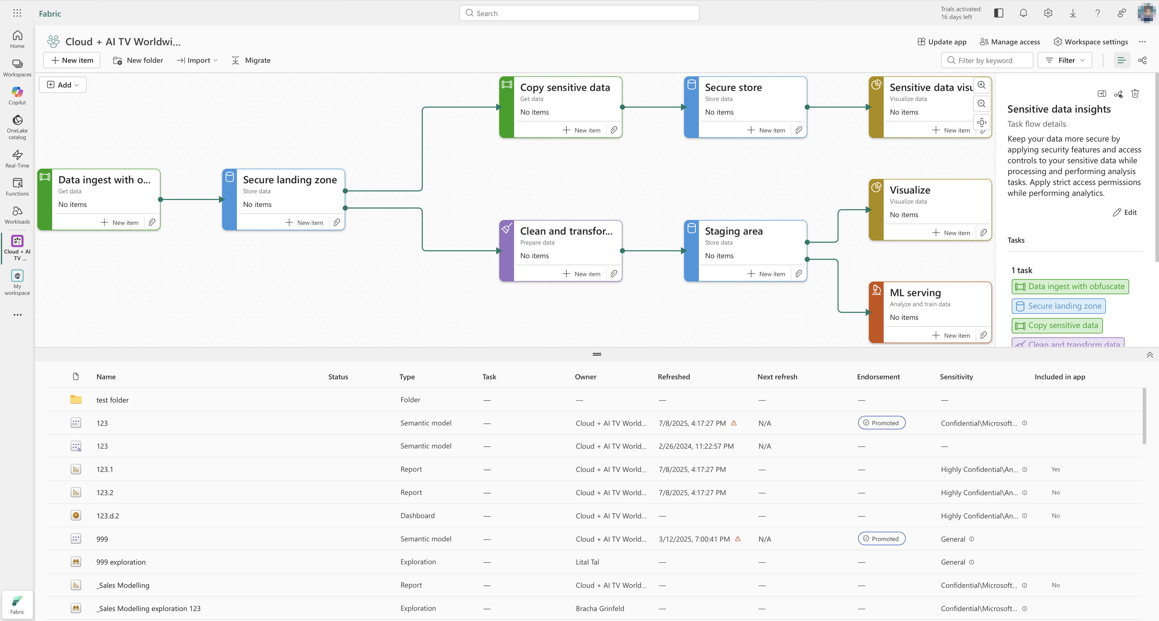
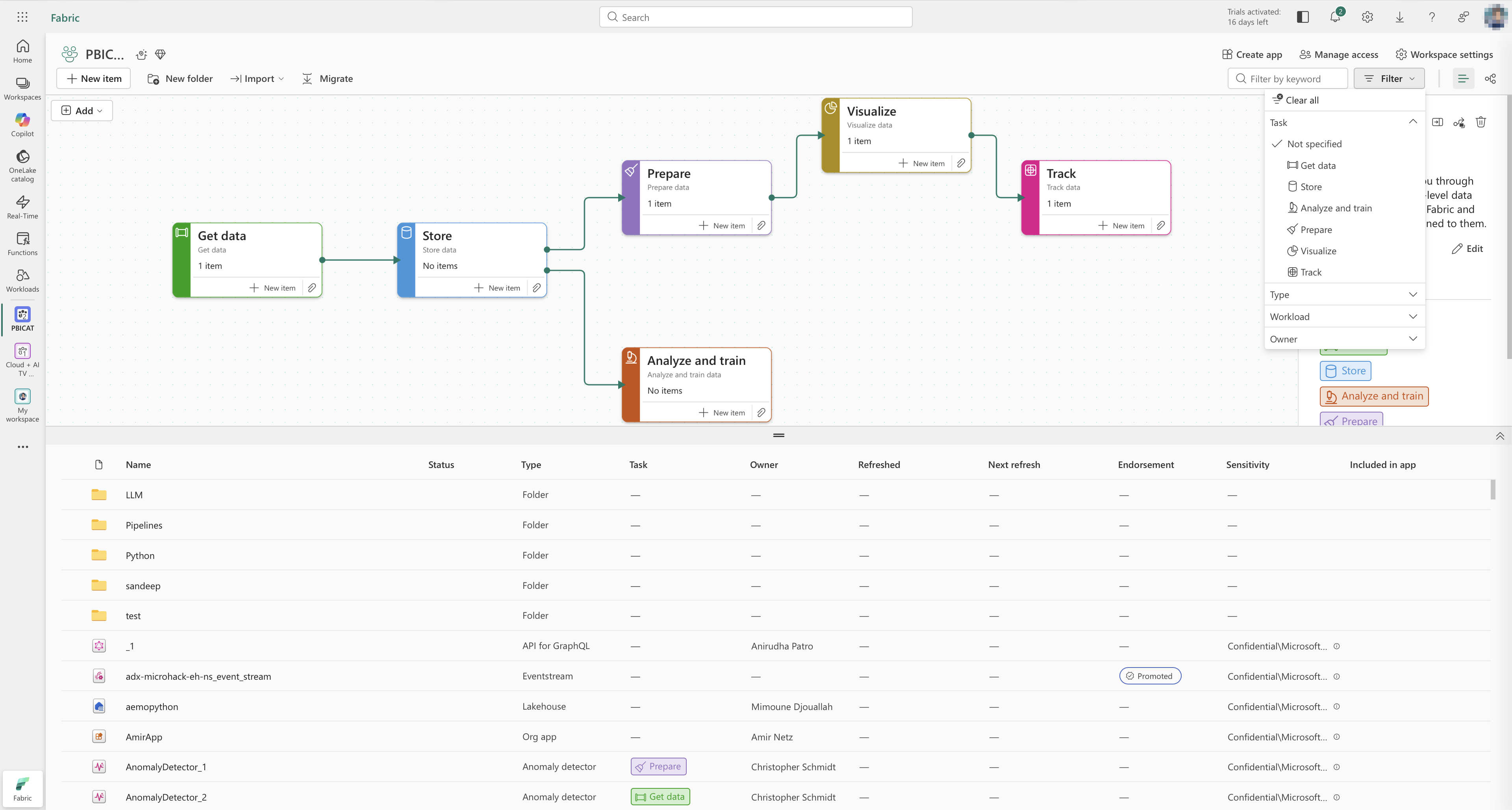
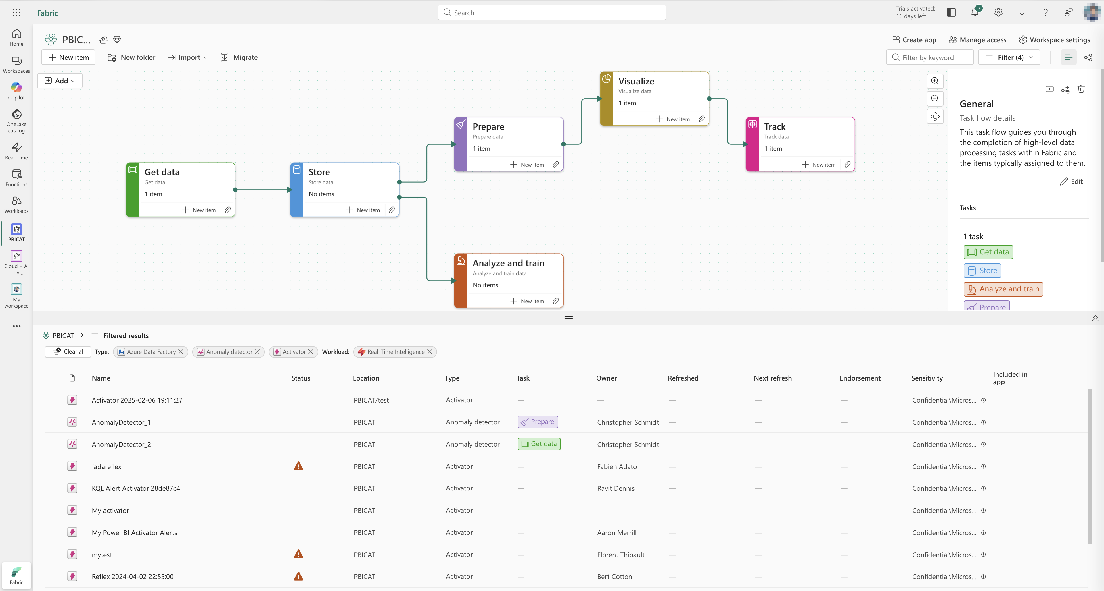
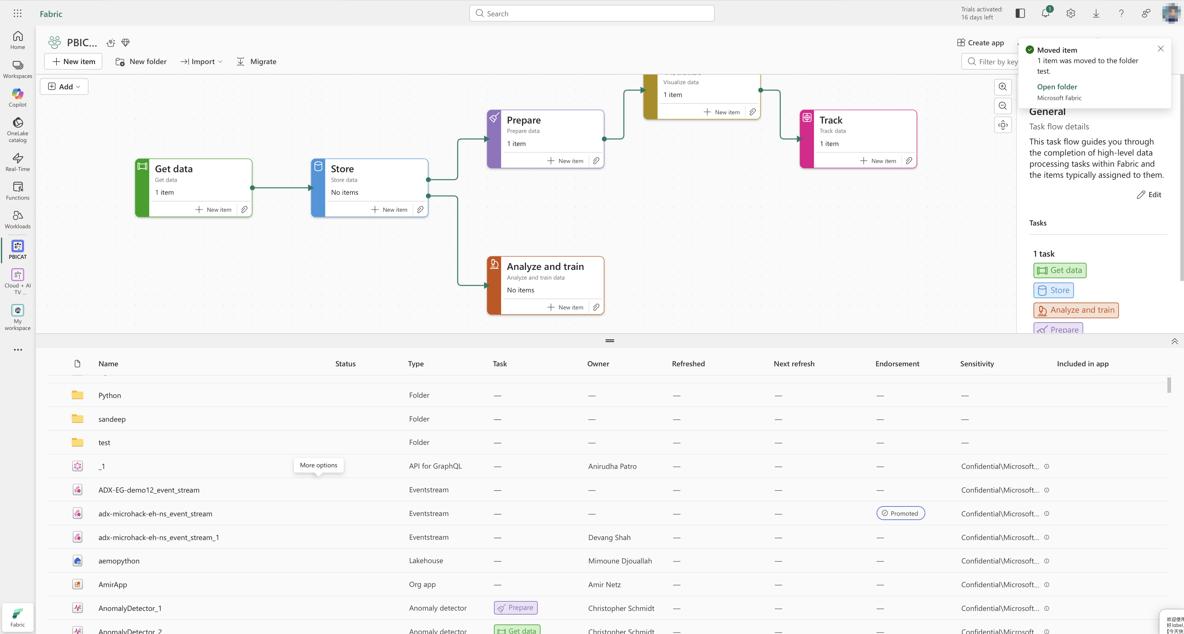
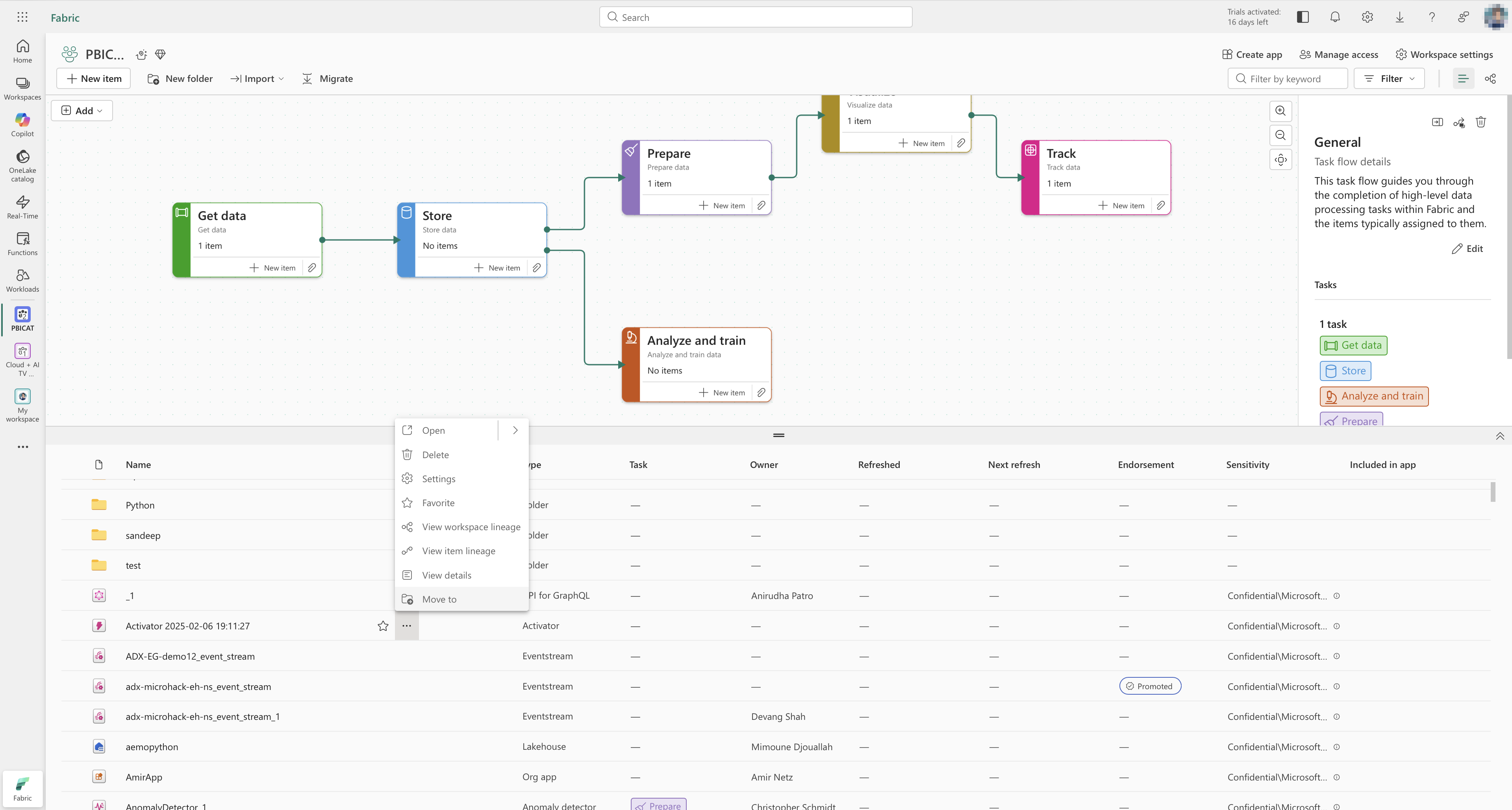
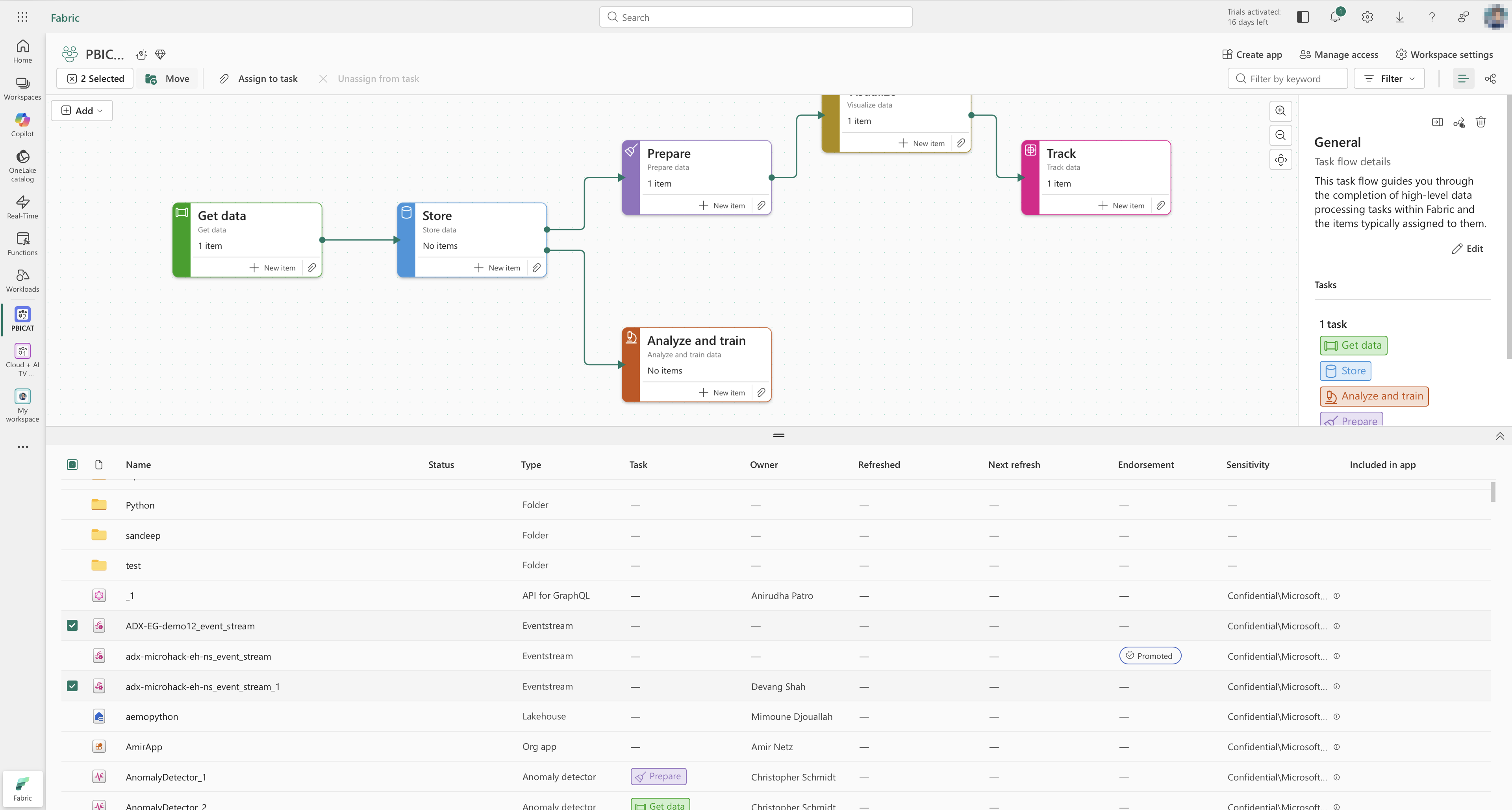
Workspaces, workflows, and folders
Workspaces are the primary collaboration unit in Fabric: a shared place to create and manage items such as lakehouses, warehouses, pipelines, and reports. Within a workspace, users need to organise artefacts and also understand how they connect to each other in real processes.
I focused on three related areas:
- Clarifying the role of workspaces as the central organisational layer.
- Designing workflow views that connect artefacts into task flows.
- Introducing folders inside workspaces so users can structure large collections of items and keep workflows readable.
Before
A common onboarding story was a new team member trying to understand “how things are organised” in a workspace. To build a mental model, they had to:
- Read through internal documentation where each team described its own storage conventions.
- Jump between multiple files and artefact pages to reconstruct how items related to each other.
- Ask existing team members to confirm whether they were looking at the right versions.
Even with that effort, people still made mistakes: duplicating artefacts, editing the wrong item, or missing a critical dependency. Items were hard to find, hard to relocate, and the logic behind the structure often lived in people’s heads and private docs.
We even had internal training sessions specifically on “how to store and name things” in workspaces. New joiners needed a dedicated walkthrough to become productive.
After
With workflows and folders, the item organisation and flows are visualised in an interactive view:
- The workflow view shows how artefacts relate to each other along a chain, so users can see where data comes from and where it goes.
- Folders give teams a way to cluster related artefacts, so workflows stay readable even as the number of items grows.
- Users can find and relocate items from the same surface instead of hunting through multiple lists and docs.
In user sessions and internal pilots, people described this as “the feature we’ve been waiting for.” Teams that previously ran full training sessions on item storage now use the workflow view as a five-minute visual explanation: they open a workspace, walk through the main flows once, and new joiners can explore the details themselves.
In beta testing, the workflow feature received consistently positive feedback and strong satisfaction scores. Users appreciated being able to see how artefacts relate to each other in a visual, navigable way, instead of keeping that knowledge in separate documents or scripts.
Notifications and Monitoring hub: from small request to shared pattern
The Monitoring hub is a central place where users can monitor Fabric activities (pipelines, dataflows, warehouses, notebooks, semantic models, Spark jobs, and more) across workspaces.
I was initially pulled in for what looked like a small request:
“We need some system feedback for export and import actions.”
Once I started digging, it became clear that the problem was wider.
-
Audit of existing patterns
- I audited Azure and Fabric experiences and found no consistent notification pattern: different products used different types of toasts, banners, inline messages, and custom solutions.
- This made it hard for users to build reliable mental models about what actions had succeeded, failed, or required attention.
-
Reframing the problem
- Instead of designing a one-off export/import feedback, I proposed a unified notification system for Fabric.
- The goal was to define one set of notification patterns that could be reused by many teams, starting with Monitoring hub.
-
Convincing leadership and securing resources
- I worked with a PM to formalise the problem statement, risks, and potential benefits:
- Clearer feedback across workloads.
- Less custom code for each team.
- Better alignment with accessibility and error-handling standards.
- I partnered with an engineering lead to estimate the cost and technical scope.
- Strategically, we bundled the notification work with Monitoring hub, which was already considered a high-priority feature:
- This gave us bargaining power: building a universal pattern would unlock Monitoring hub and benefit other workloads.
- I worked with a PM to formalise the problem statement, risks, and potential benefits:
-
Designing the system
- Defined notification types (toast, inline, banner) and when to use each.
- Created a decision tree to help designers and PMs pick the right pattern based on severity, persistence, and required user action.
- Specified placement, timing, and stacking behaviour so users would not be overwhelmed.
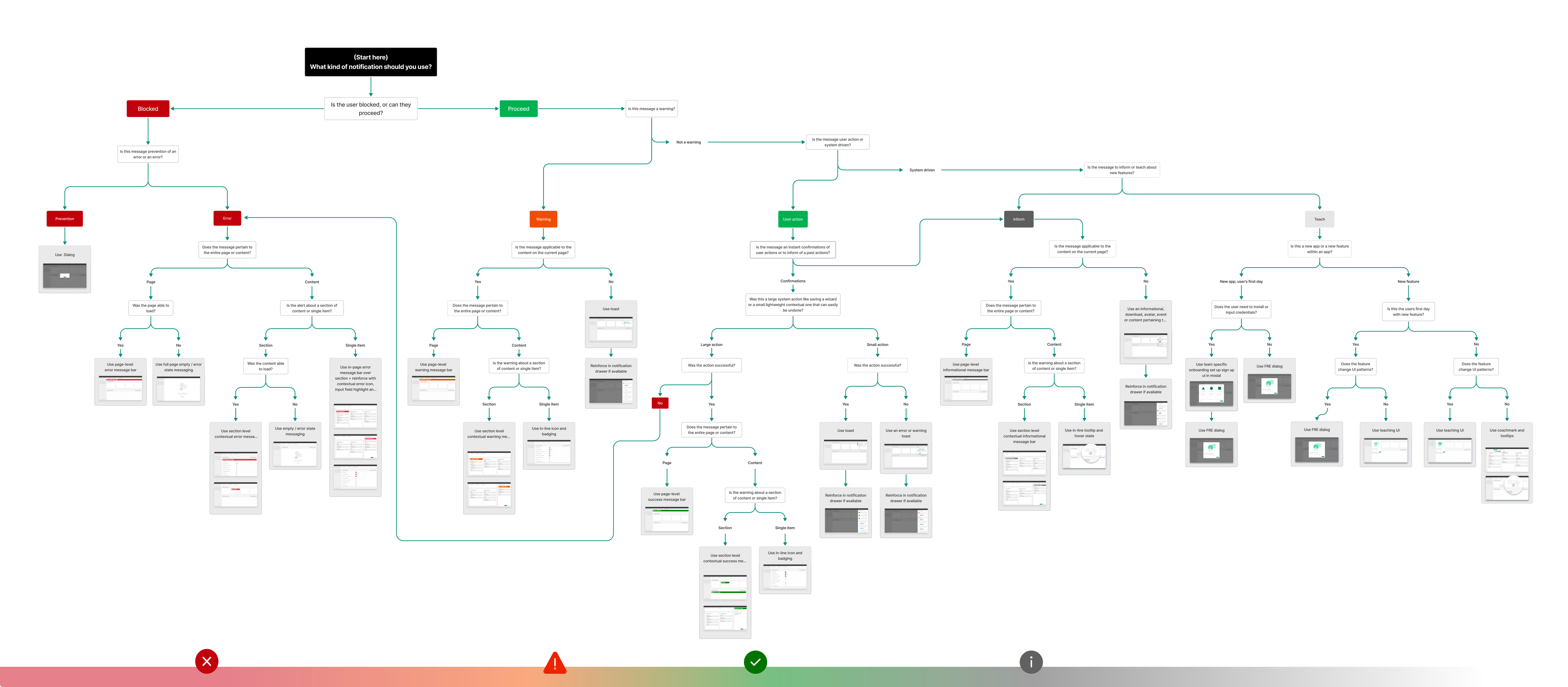
Result:
- The Monitoring hub team, which had been blocked by the lack of consistent system feedback, could ship with a clear, reusable notification model.
- Other workloads adopted the same pattern, gradually replacing ad-hoc notification solutions.
- In beta testing, the combined Monitoring and notification experience tested well with users, especially around clarity of “what just happened” after long-running operations.
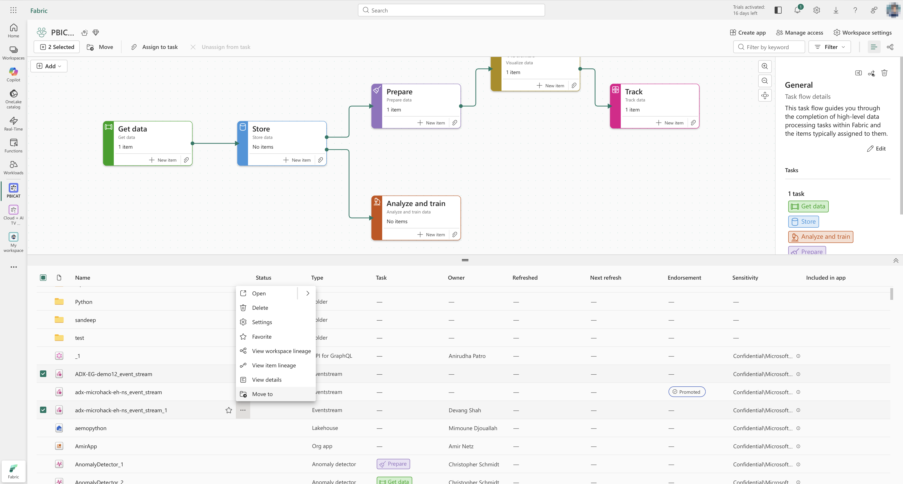
Contextual menus and settings
I also worked on contextual menus and settings, which appear across many surfaces.
For contextual menus, I defined guidelines for:
- Grouping actions (navigation, destructive, configuration).
- Structuring secondary menus.
- Handling multi-selection versus single selection.
For settings, I helped define the information architecture so product teams could plug their settings into a predictable structure rather than inventing their own patterns and pages.
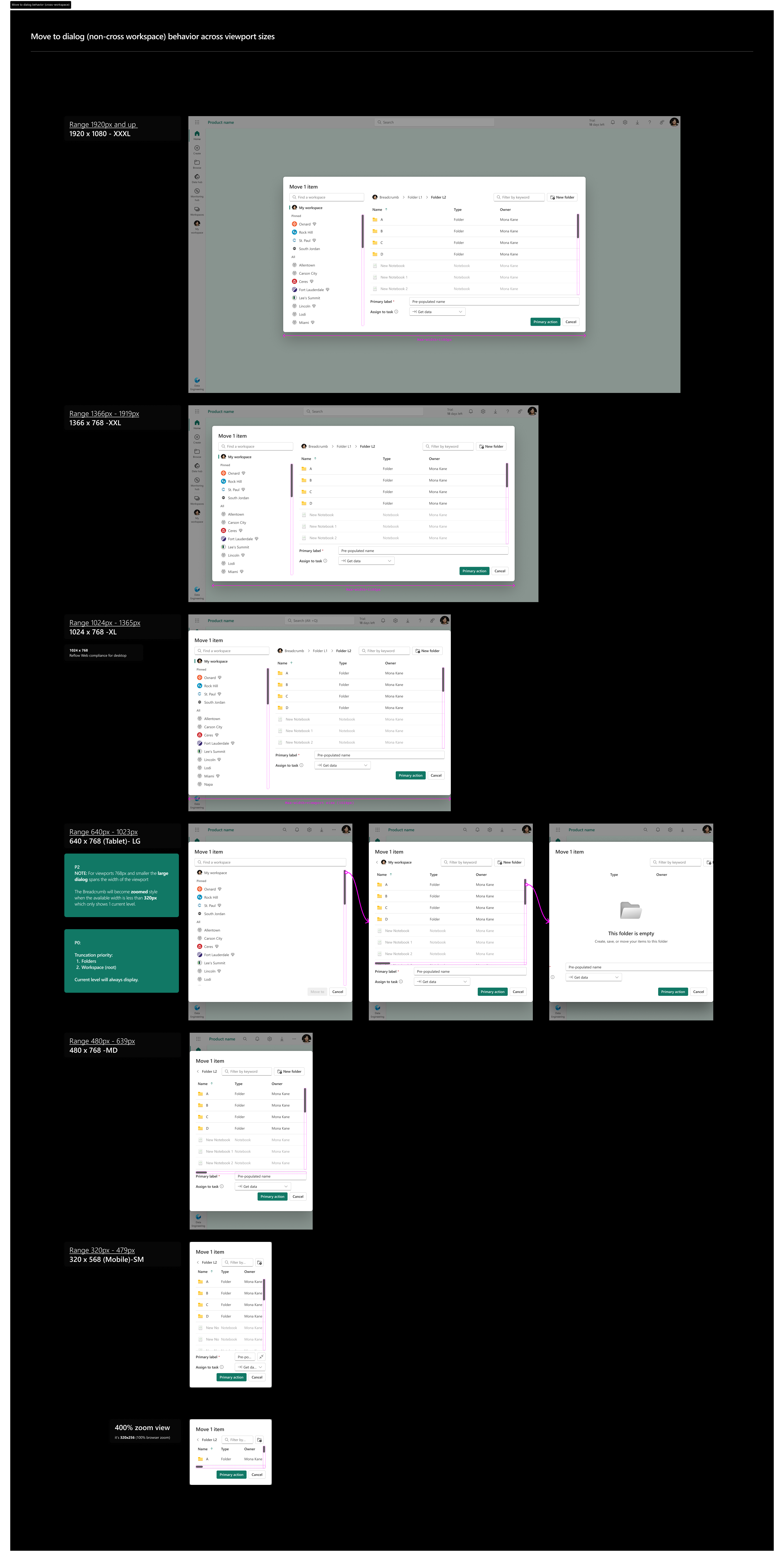
Accessibility and responsive guardrails
Accessibility and responsiveness are core requirements in Fabric.
I worked on:
- Defining keyboard navigation patterns (Tab order, focus states, escape routes) and testing them across shared components.
- Ensuring layouts reflow down to small viewports (as low as 320×256 px) while remaining usable.
- Partnering with engineers on ARIA roles, landmarks, and headings so assistive technologies can interpret screens reliably.
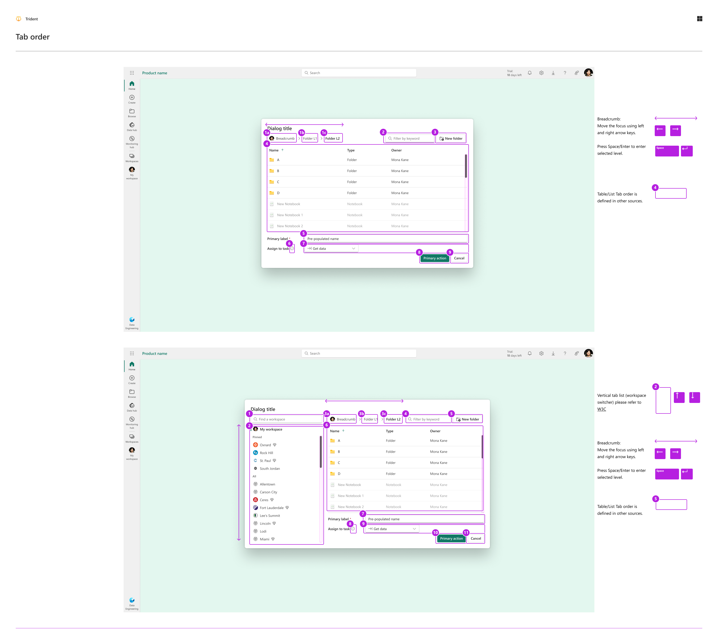
These guardrails are documented so teams do not have to re-solve accessibility or responsive behaviour from scratch each time.
Outcomes and impact
Shared UX work is rarely tied to a single feature launch, but it has clear impact across teams and workloads:
-
Adoption across workloads
Shared components and patterns (Tree, file explorer, navigation, workspaces, notifications, monitoring) are used by over ten workloads across Azure and Fabric experiences. -
Fluent 2 and Fabric design system integration
Components I helped shape, such as Tree behaviours, explorer patterns, and dialog/drawer and picker usage, are part of the Fluent 2 library and Fabric’s product-specific design system, making them available to other teams by default. -
Unblocking Monitoring hub and workflows
Monitoring hub, which depends on clear system feedback, shipped with a consistent notification model instead of a one-off solution.
Workspace workflows and folders made it feasible for Power BI users and other heavy users to migrate without being forced into command-line tools or endless manual reorganisation. -
Faster, more consistent decisions
Decision trees, component usage guidelines, and accessibility guardrails reduce design churn and “what should we use here?” loops, especially for newer teams.
I spend less time redrawing the same patterns, and more time making sure the system behind them helps other teams move faster with fewer surprises.
What I would change and what comes next
Not every decision aged perfectly.
Contextual menus
When we first defined contextual menu patterns, we optimised strongly for cross-product consistency: strict ordering, grouping rules, and secondary menu structure. In practice:
- Many complex real-world scenarios stretched or broke those rules.
- Unlike the file explorer, which is intentionally universal, contextual menus serve many different purposes and surfaces.
If I were designing this again, I would:
- Be less rigid about cross-product consistency for contextual menus.
- Allow more flexibility per workload while keeping a small set of shared principles, for example for destructive actions and keyboard behaviour.
Next bets: automation and AI
Given how fast AI and automation are evolving, my next priorities for Fabric would be:
- Designing more automation into Monitoring hub, so users do not have to manually watch long lists of runs or read long tables of metrics.
- Reducing manual workspace switching and repeated scanning of metrics by surfacing anomalies and recommended actions proactively.
The goal is to move from a centralised dashboard to something closer to a central, intelligent assistant for data operations.
Self-reflection
Impact metrics
Before I left Microsoft, I had already started working with my manager on a telemetry template that would help designers better measure the impact of their work. The idea was to standardise how we track the outcomes of shared UX and design system changes, and to make it easier to use those signals to guide future iterations. Even though that project was unfinished when I left, it reflects how I want to be more proactive and structured about connecting design decisions to measurable results.
Conflict stories
The notification system story shows how I reframed a narrow request into a shared pattern and secured resources by bundling it with a high-priority feature. There are other conflicts, for example around workspace structure or contextual menus, that I can surface more clearly when I tell this story in person to show how I navigate trade-offs with peers and stakeholders.
System depth and readability
Shared UX work naturally invites a lot of detail. When I talk about this project, I focus on a small set of high-leverage areas—Fluent 2 primitives, file explorer, workspaces, workflows and folders, notifications and Monitoring hub—and let other patterns play a supporting role. I want to keep improving how I choose and frame those examples so they stay understandable to people who are not specialists in design systems or Fabric.