
How I made tracking vital signs a better experience for patients
Medopad rebranded to HUMA Due to rebranding, old and new designs are presented together, designs may appear inconsistent
You can right-click “Open Image in New Tab” for larger images) (可以右键“新窗口打开 ”放大图片)
Note that some designs and documentations cannot be made public due to NDA
Product Background
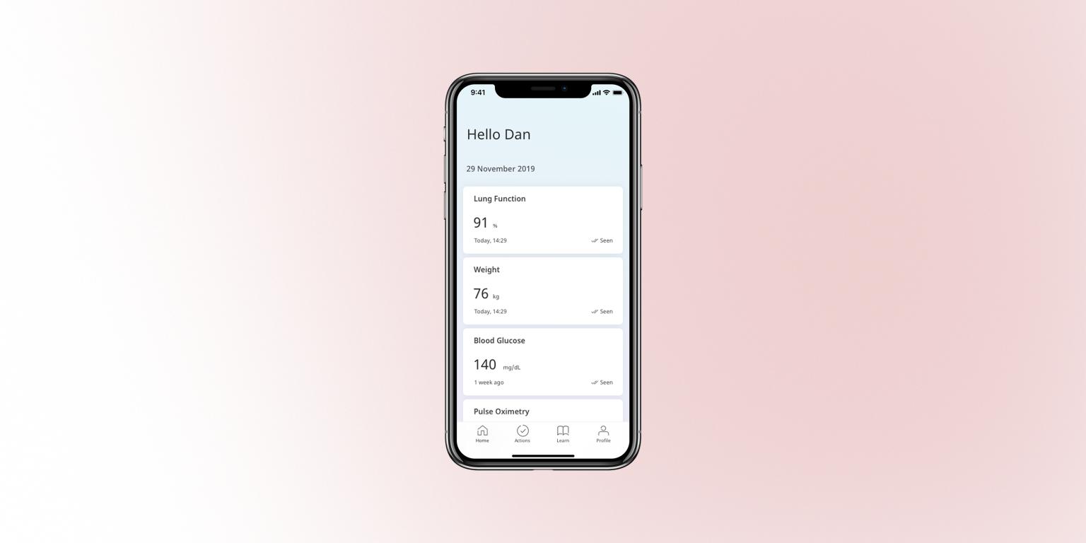
Our product aims to help doctors collect health information when patients are outside of the hospital via a mobile app.
The information we are collecting includes but not limited to blood glucose, heart rate, blood pressure, medical exam reports (image), medication, journal, etc.
This case study focuses on a series of module on the tracking of vital signs.
The development of this app is modular, meaning we create parallel modules that collect different types of information. This ensures that we can mix and match modules for different diseases.
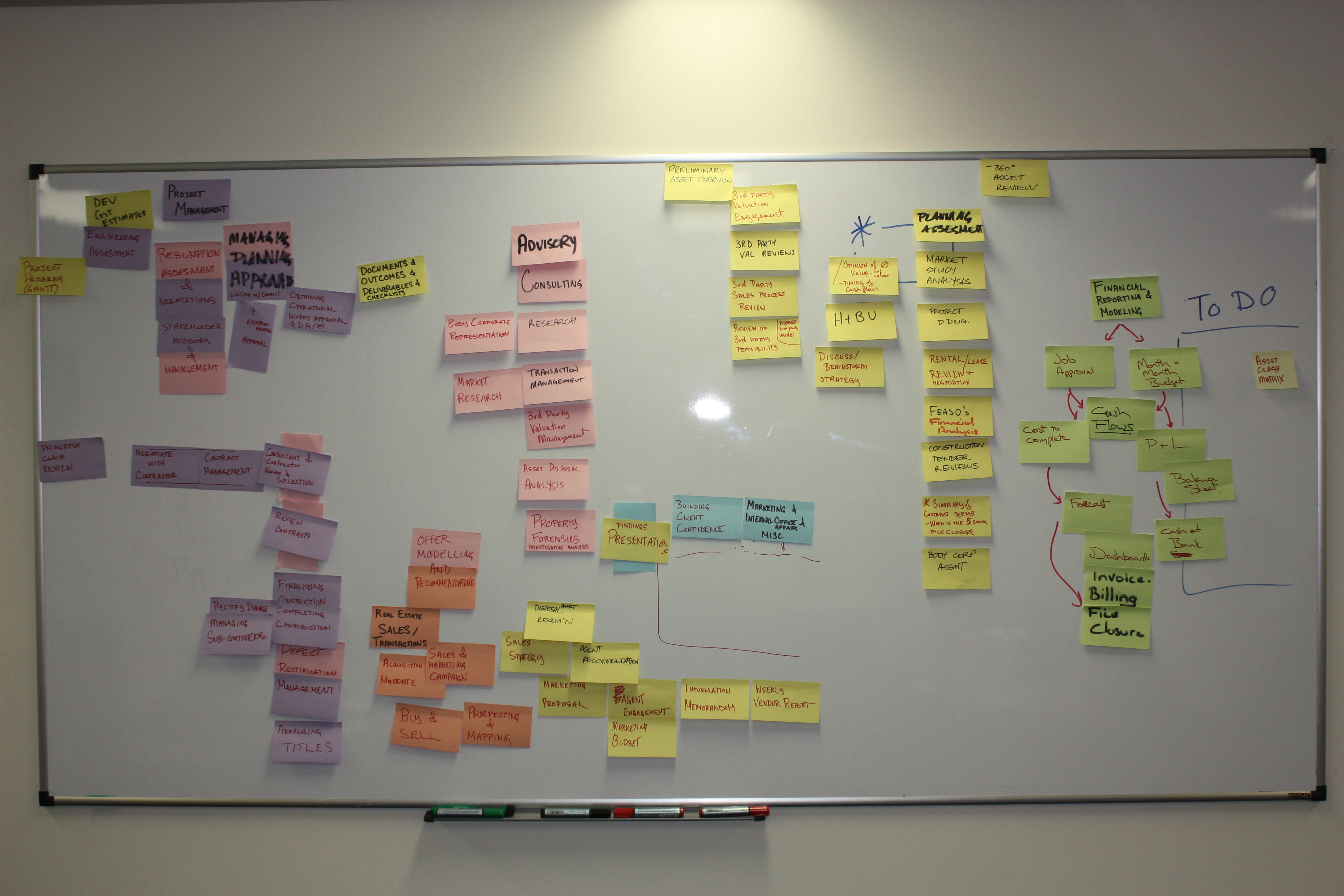
Since our product is a health system, we cannot iterate frequently, each version affects patients’ life quality. Therefore, we tend to do thorough research, detailed planning, and testing for each public release.
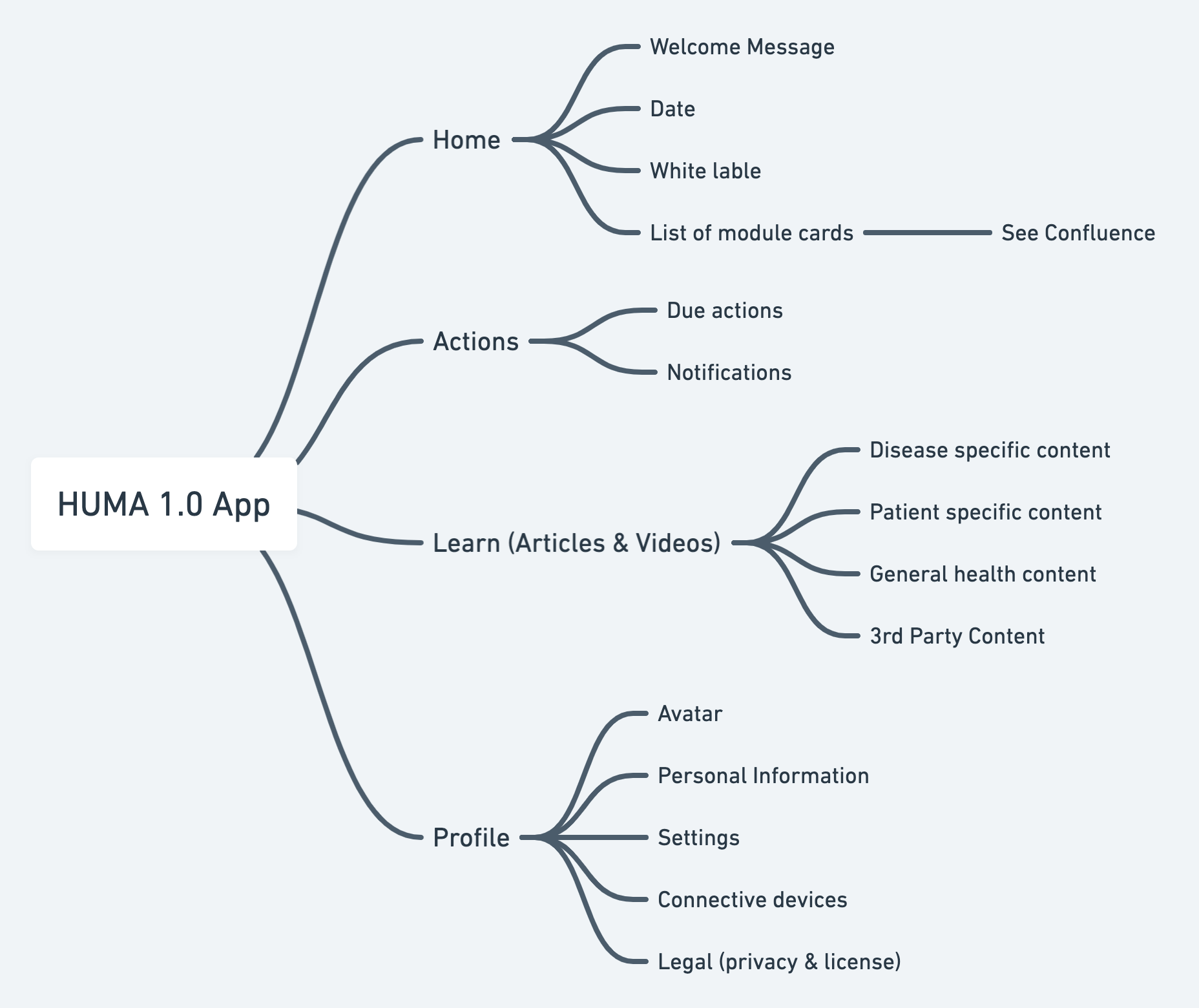
App Structure
Our solution has 3 parts, a mobile app for patients, a web portal for doctors, and an admin console for administrators.
I will focus the app in this case study. It has a modular structure so that we can mix&match modules to create bespoke versions for different diseases.
The app’s structure is shown below:
1. Glucose Tracking
User needs I realised through research with medical professionals
-
Tracking glucose is tedious and repetitive. Patients with diabetes may need to track glucose as often as possible, up to 6 times a day
-
Glucose value alone is not a good indicator, it’s much more useful when paired with eating habits, e.g. “after breakfast”, “before lunch”, “after lunch”, “after dinner”, “before bed”, etc.
-
A significant part of our users use small devices therefore need to consider showing all fields in one screen
Solutions I proposed during design reviews
The solutions were not only applied to this module, but to other input modules as well, making user experience consistent throughout the app.
-
Simplify the process and make everything fit in one page (even for smaller devices)
-
Add a prominent “complete and thanks” screen, with animated checkmark to give users a sense of achievement (with lottie on iOS, VectorDrawable on Android)
- Animated icons are now part of our design system
-
Add “eating status” segmented control, and then pair it with time of the day. If time is not edited, then changing eating status will change time too. By default, time is pre-filled with current hour and its corresponding “eating status”
- However, according to later doctor feedback, I removed pairing eating status with time of the day. According to the doctor, controlling time to eat is also part of their treatment, and there’s doubt in the data collected –– we don’t know if they actually had lunch or not. Therefore, users need to manually select eating status so that the data collected are more reliable.
Problems I found through internal focus group (pre-flight)
-
Adjusting time picker is inaccurate and often gives the wrong answer if spinning too fast
-
Too many inputs, and filling in them doesn’t feel consecutive
Solutions I proposed
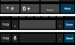
- Replace the native time picker with Numpad key input for more accurate and more efficient input. And change the font to Monospace so that they are immediately recognisable and can be distinguished between “zero 0”, Letter “O” and letter “o”.
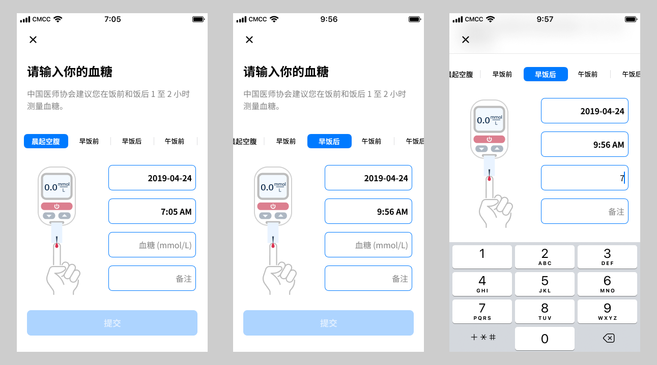
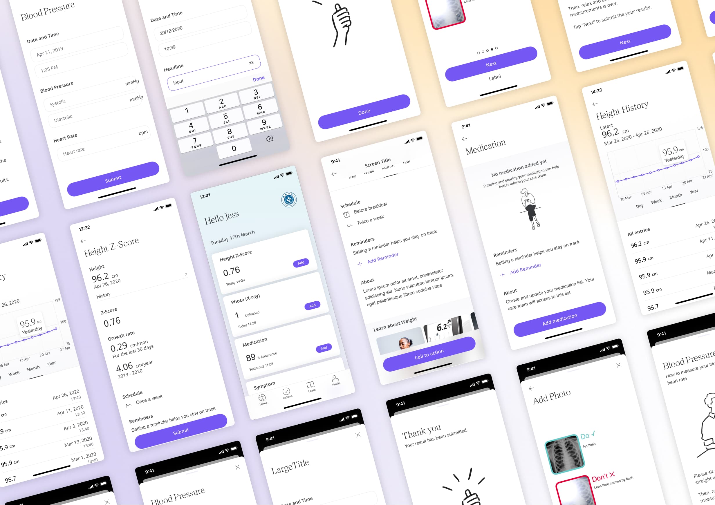
Glucose Module (Old)
To zoom, right-click “Open Image in New Tab”
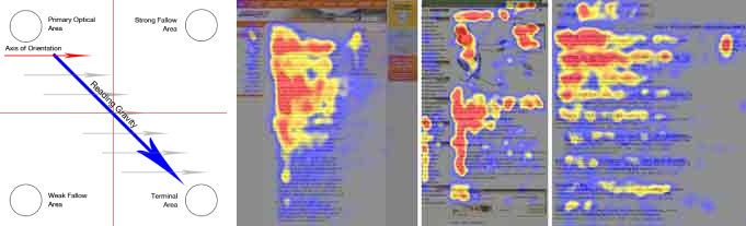
- The layout used the GutenBerg Diagram as a reference.
- Switch to the next input field upon completing the previous one, and change keyboard “Enter” key to Next to hint users to move on. When the last input is done, keyboard collapses and user can just go hit the primary button. (Current Android only)
the solutions above were refined and tweaked during a few the internal design reviews, until most internal testers feel the process makes sense and smooth
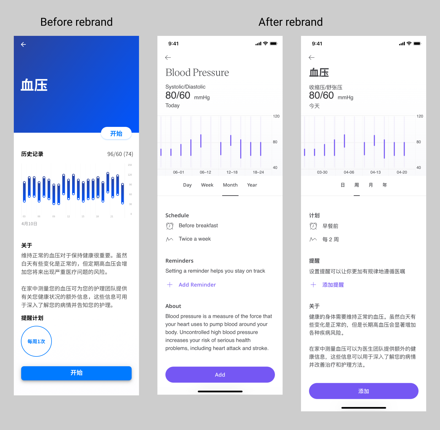
- After rebranding, I redesigned glucose module and further improved user experience according to user and doctor feedback. The glucose meter illustration was removed due to business reasons.
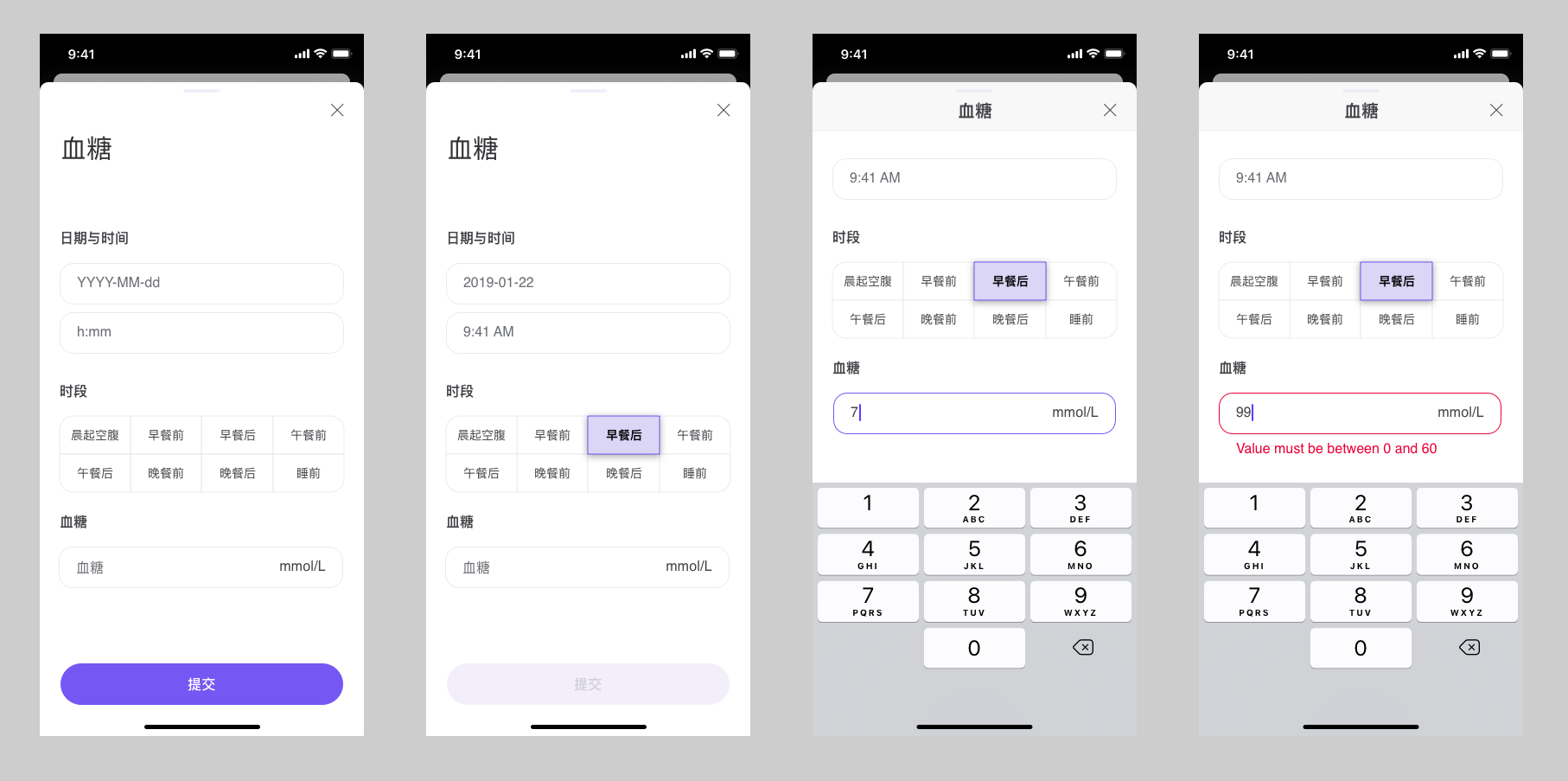
Glucose Module (New)
To zoom, right-click “Open Image in New Tab”
User feedback
- Stats shows an increase in the completion rate of this module (comparing to previous versions)
2. Blood Pressure & Heart Rate Tracking
(Illustration & voice guidance)
Problems I found through research with medical professionals
-
BP and HR values are heavily affected by multiple factors, including time of the day, activity level, mood etc. It also depends on if the person is talking, which posture, and whether relaxed
-
We need to make sure every measurement is taken under similar conditions
Solutions
- I created an illustration to help users maintain similar posture for every measurement. In later iterations, the illustration was made into animation by 3rd party animator.
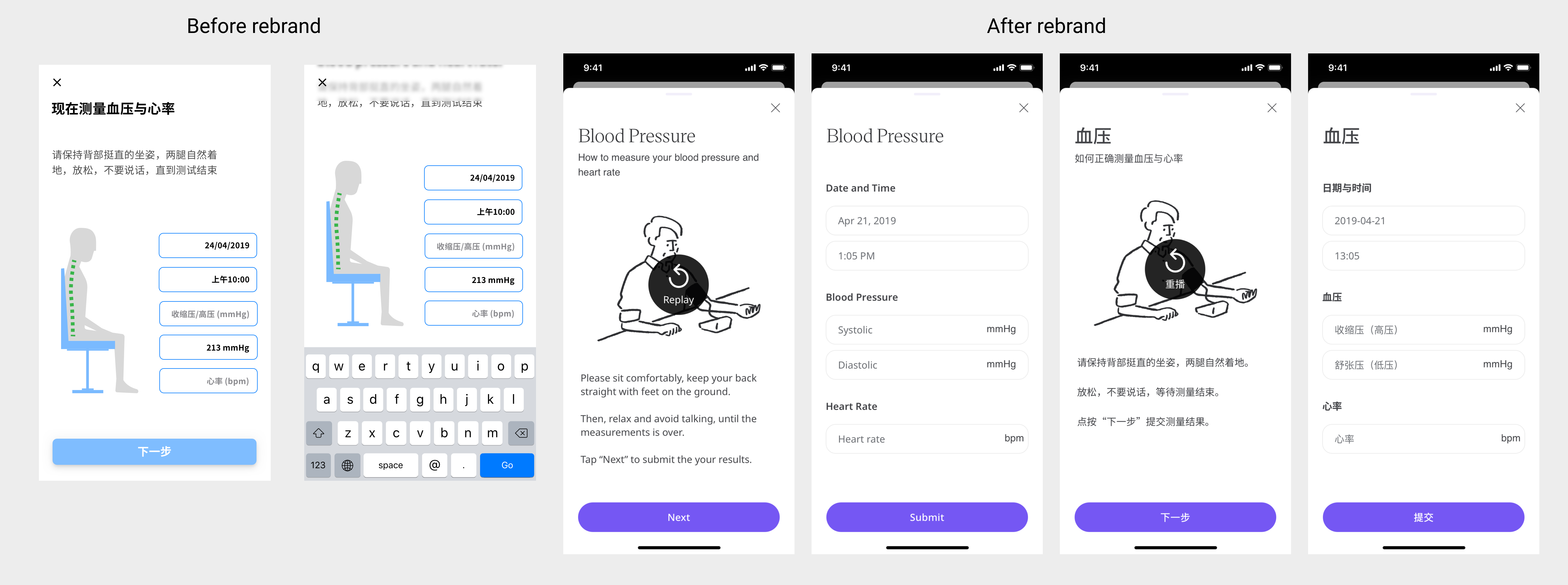
- I proposed to add a voice prompt to help users follow the instructions
- In general, this module received positive feedback from our phase 1 testers, some specifically commented that the voice prompt being helpful.
User feedback
-
Stats shows an increase in the completion rate of this module (comparing to previous versions)
-
For 1st iteration we used text-to-speech, which is a slightly robotic voice, but we quickly updated it with professional voice actor, and received a number of positive feedback saying the calm voice and tone helped me to relax, and hope to see more of it.
3. Growth Hormone Deficiency (GHD) Syndrome
About the project
GHDS is a medical condition resulting from not enough growth hormone (GH), generally showing the symptom of short height. Most patients are recommended to be treated with synthetic human growth hormone at young ages (mostly between 1-15). Once synthetic human GH injection started, height needs be traced along with injection frequency (varies between patients) to monitor the effect of medication, and normally this regular injection will last 10-12 months.
This project aims to create an app on the backbone of our existing app, with 1 new module and other customised features on other modules.
I worked closely with a product manager on this project. The PM helped sets up a general framework with his medical background, and I design flows, interaction, rationale, etc. for each module.
List of Modules (will elaborate items in bold):
- Height Z-score (NEW)
- Photos (for X-ray films)
- Medication tracker
- Symptom tracker
- Journal
- Activity tracker
and
- Push Notification
3.1 Height Z-score Module
Height Z-score is also called Height-by-Age Z-Score / Z-Score / height SDS, it is the number of standard deviations of the actual height of a child from the median height of the population of the same age and gender.
This module is the core to this GHD project, because doctors use it to track how effective are the injections, and adjust treatment accordingly. Users will need to submit data with this module periodically.
I designed this module as well as the calculation methods and logic behind it. I considered error states, historical submission, display value and calculation value, etc.
Height Z-Score Wireframe
Height Z-Score Module Screenshots
To zoom, right-click “Open Image in New Tab”
BDD (Behaviour-Driven-Documentation) for Height Z-Score (Part)
To zoom, right-click “Open Image in New Tab”
3.2 Photo Module for X-ray films
X-ray films are also important factors in determining a patient’s condition.
Problems I found through research with medical professionals
-
Taking photos of X-ray films using a phone is often problematic because x-ray films are made of special materials and are meant to be viewed by medical specialists.
-
However it is not impossible if users are given instructions and opportunities to redo.
Solution
Best solution: connect to hospital’s HIS system and acquire source image. This is currently impossible due to legal and technical limitation
Second best: Shoot photos of x-ray films from a backlit panel, with clear instructions
- To create an instruction with clear examples to help users understand what could go wrong, and more importantly, how to avoid mistakes.
Challenge
- During phase 1, the actual outcome was not ideal. More than half of photos were unusable according to the doctor (we cannot pin-point patient’s photo thus no analytics can be done). The reason behind is that we cannot provide immediate feedback on the quality of photos, hence users do not know if they have followed the instruction correctly.
Solutions
-
I proposed a possible solution which is to allow doctors to markup the photo so that the patient knows where to pay attention next time.
-
In the future, we plan to use algorithms to pre-judge the quality of the photos.
Instructions on how to take photos of X-ray films
To zoom, right-click “Open Image in New Tab”
3.3 Medication tracker
Improvements I designed:
- Search dropdown
- Fuzzy search
- Adding multiple medications at once (bulk operation)
![]()
Medication tracker and search
To zoom, right-click “Open Image in New Tab”
“In other apps, I had to scroll a long list to locate what I’m looking for, but now this needs only a few characters”
3.4 Push Notification
All modules above (and many doctors) share one common challenge, which is how to motivate users to take their measurement at the required time and record them in the app as they do.
Our previous solution is simply a timed notification with text to remind users to open the app and complete actions. I believe it has much room for improvement, so I started with some research.
Research topics on psychology
- there are 3 main parts involved according to psychology theories built from Maslow, Deci, etc.
- Intrinsic motivation (most sustainable)
- Extrinsic motivation (strong in the short term)
- Ease of completion (the catalyst)
Our users are referred by doctors, so they tend to have a strong extrinsic motivation at the beginning. Therefore, we use this extrinsic motivation as a head-start, then build their intrinsic motivation by providing a visualised and tangible path to better health. Meanwhile, reduce the ease of completion to smooth the entire process.
The notification/reminder system acts as an extrinsic motivation to remind users of what needs to be done. This system aims to require minimum efforts from users to complete the task of recording vital signs.
I researched on how iOS and Android handle notification, and how to support in-line reply, and in-line actions.
In-line reply allow users to complete certain action without opening the app. It makes some repetitive actions less boring, and takes less time.
BDD (Behaviour-Driven-Documentation) for Push Notification
To zoom, right-click “Open Image in New Tab”
Solution I proposed
For medication tracker module, once users have set up routine medications and reminder. They will received a push notification with two options: “taken” and “remind me in 30min”.
If they have taken their meds already, then they can tap “taken” without opening the app. Alternatively they can snooze the reminder.
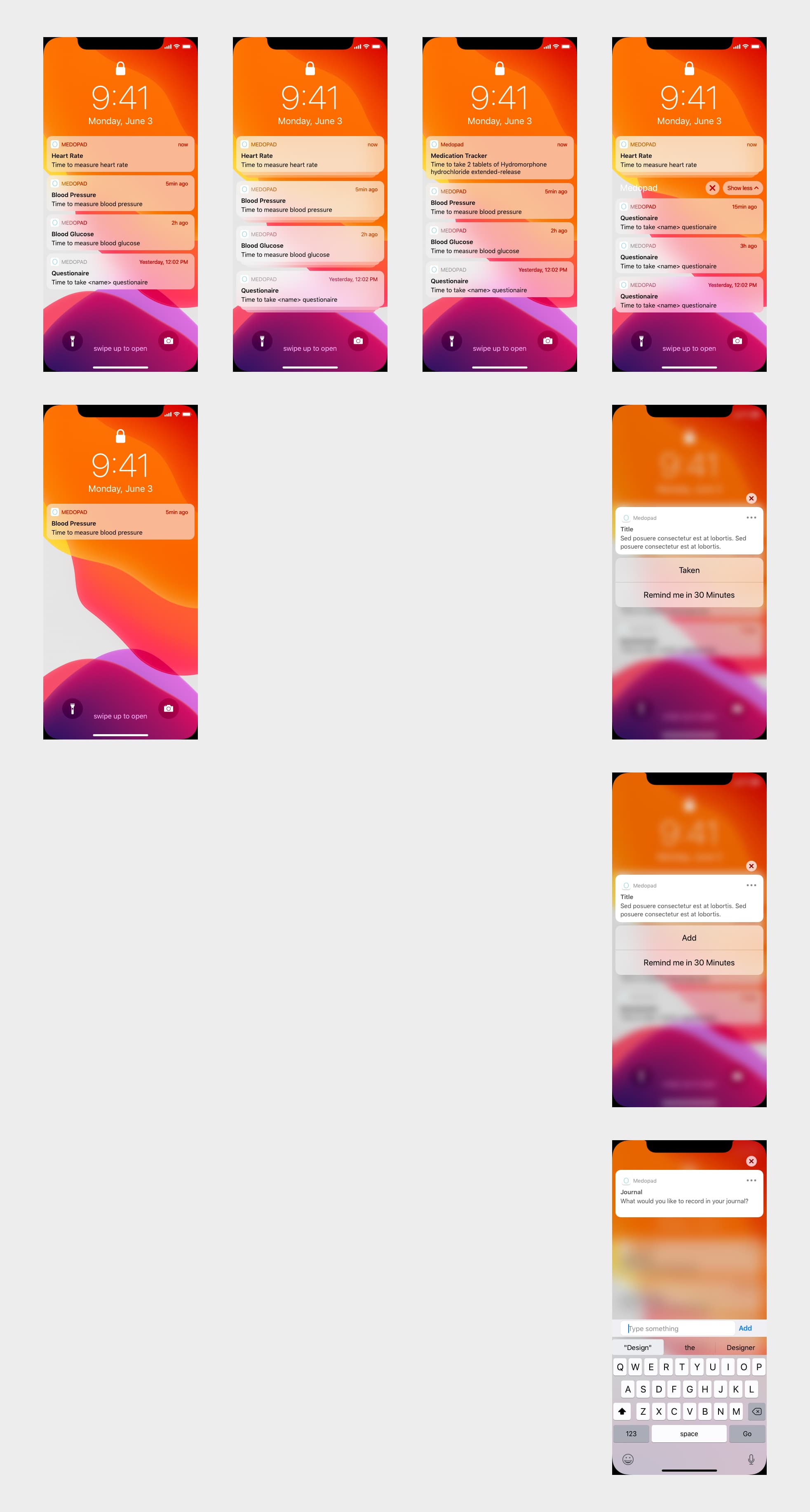
iOS Notifications
To zoom, right-click “Open Image in New Tab”
I added in-line reply for users to quickly submit their journal, because most of the time patient only need to write a few words.
For modules that require external devices, users can snooze the notification. If they are ready, they will be taken to the specific screen respectively.
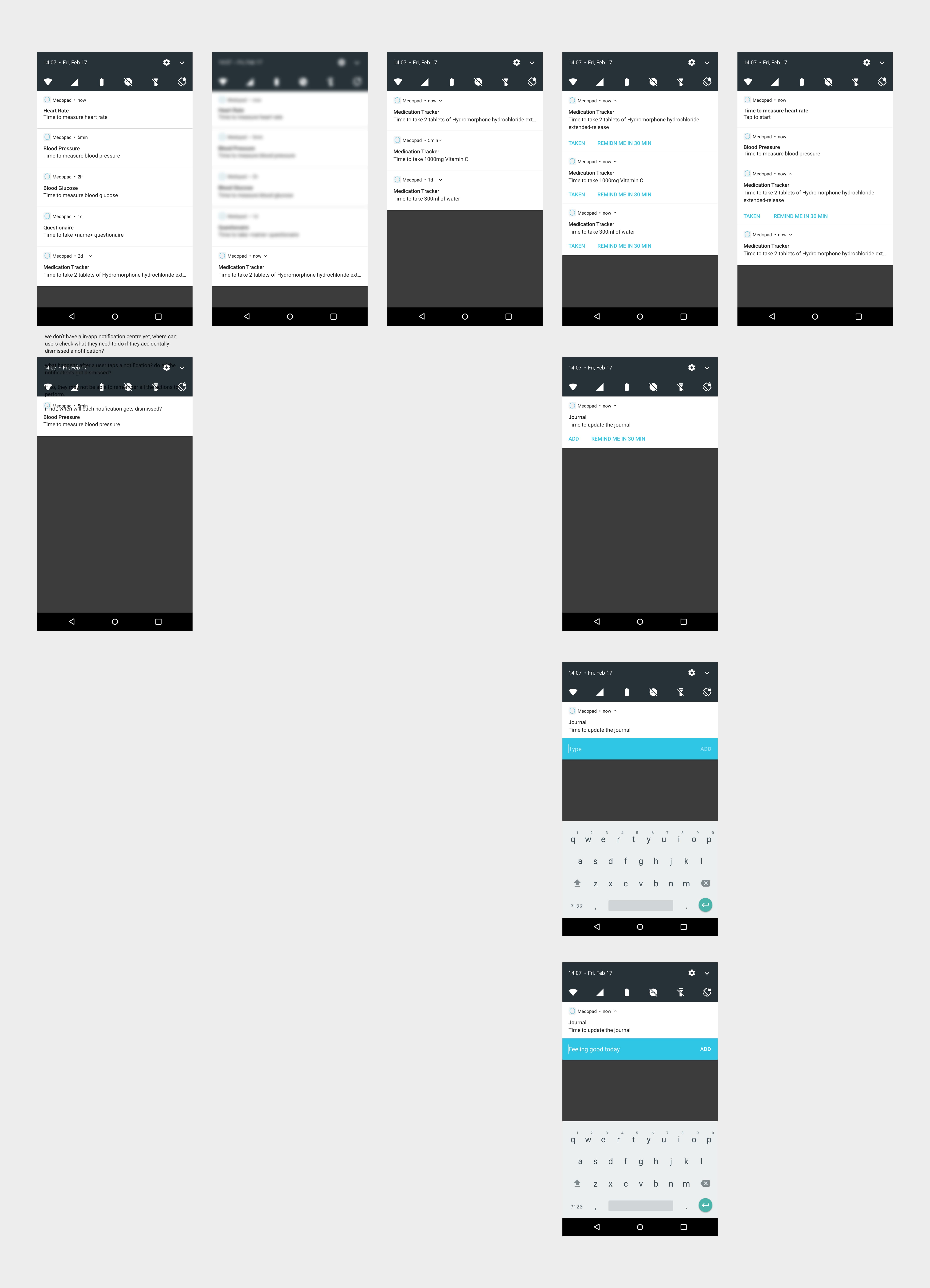
Android Notifications
To zoom, right-click “Open Image in New Tab”
Learnings
-
Taught in school so many times but still relevant, “understanding user and their motivation is the key to good design”.
-
There are many ways to understand users, and sometimes they don’t even know themselves very well. For example, medical experts know patients more than anyone, and they can provide valuable opinions.
-
Even if it’s impossible to test with real users, internal testing with colleagues, families, other team-members can still provide useful feedback.
-
A user flow can be repeated many times, and then users may not flow as intended afterwards.
-
Need to keep track of new features and changes released to each platform, sometimes they provide better and native solution than your hacks. (e.g. iOS 14 Numpad key replaced time picker in some places)