
You can right-click “Open Image in New Tab” for larger images) (可以右键“新窗口打开 ”放大图片)
Fortunately enough, I have experience in the building of 2 design systems, which helped me to dive deeper into the core of each business and contribute to it.
Medopad/HUMA Design system
Note that due to Non-disclosure Agreement, I cannot make public the entire design system documentation
HUMA design system was built in Sketch. The system has a heavy focus on a variety of inputs, which is due to the nature of the product being a health information collector.
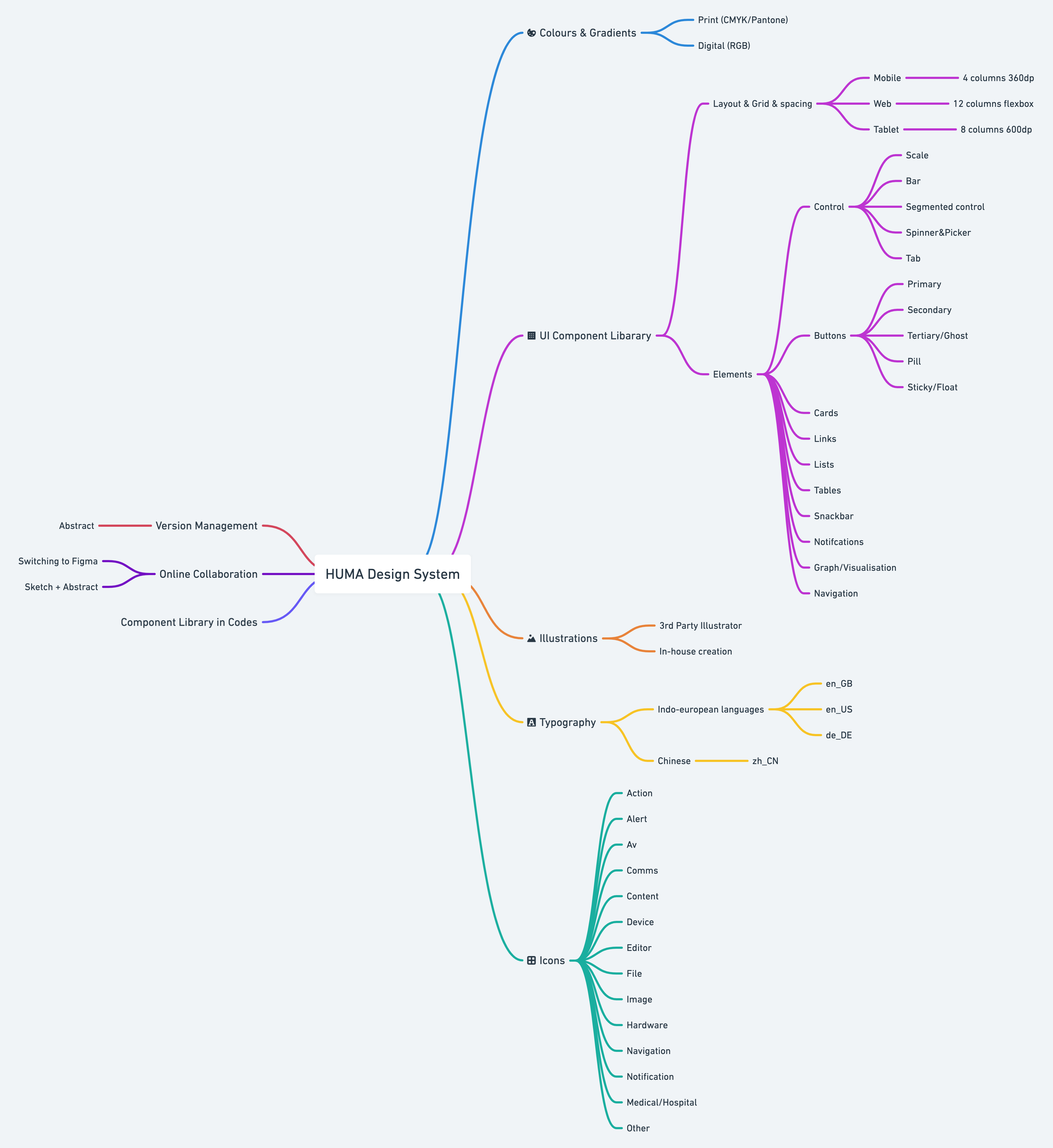
Design System Structure
I consolidated this structure to help the team clean up documents and drafts. It also helps front-end engineers to navigate through the system and build accordingly.
Maintenance
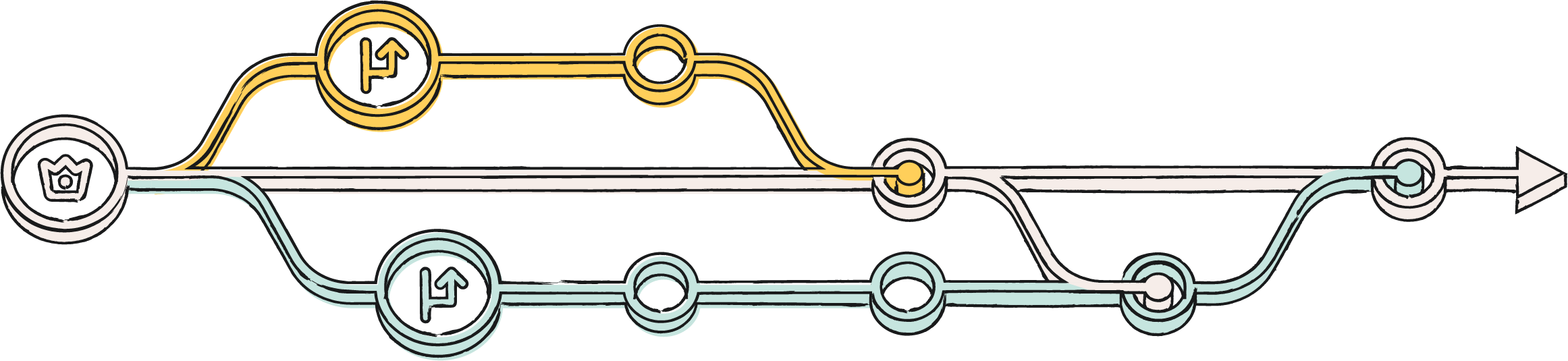
To make sure Design System is the source of truth, we used Sketch + Abstract to manage versions and updates. Simply put, it’s like GitHub for designers. There’s a master branch on cloud, and we can create branches to edit it locally, then submit merge (pull) requests to a system owner.
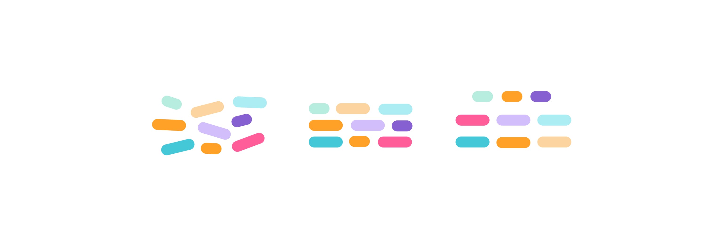
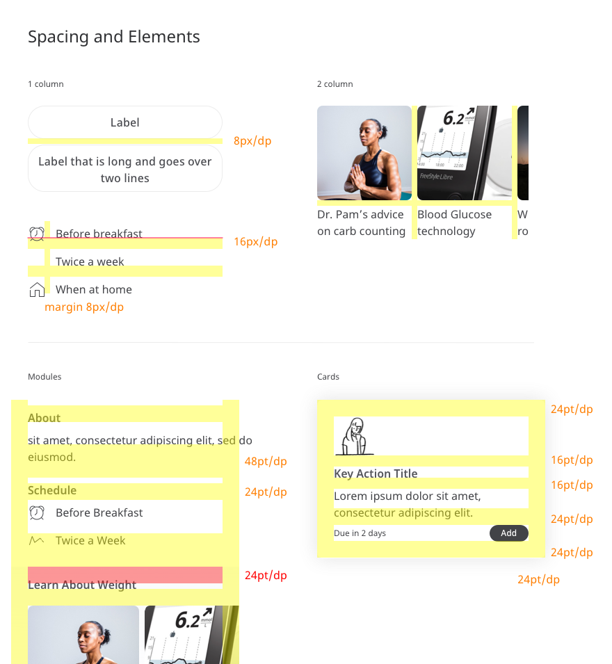
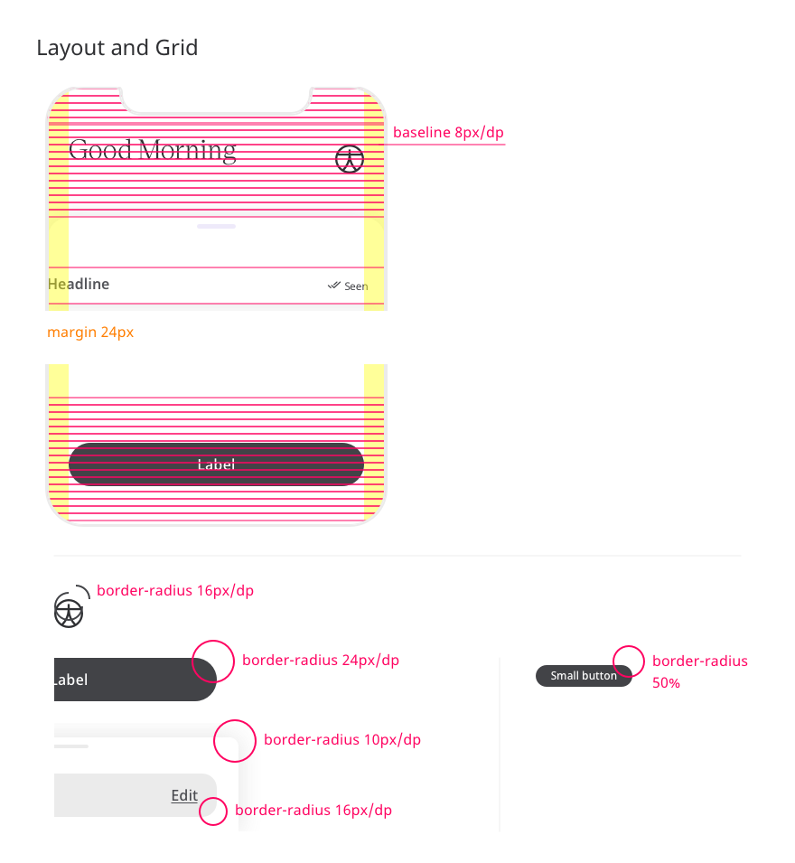
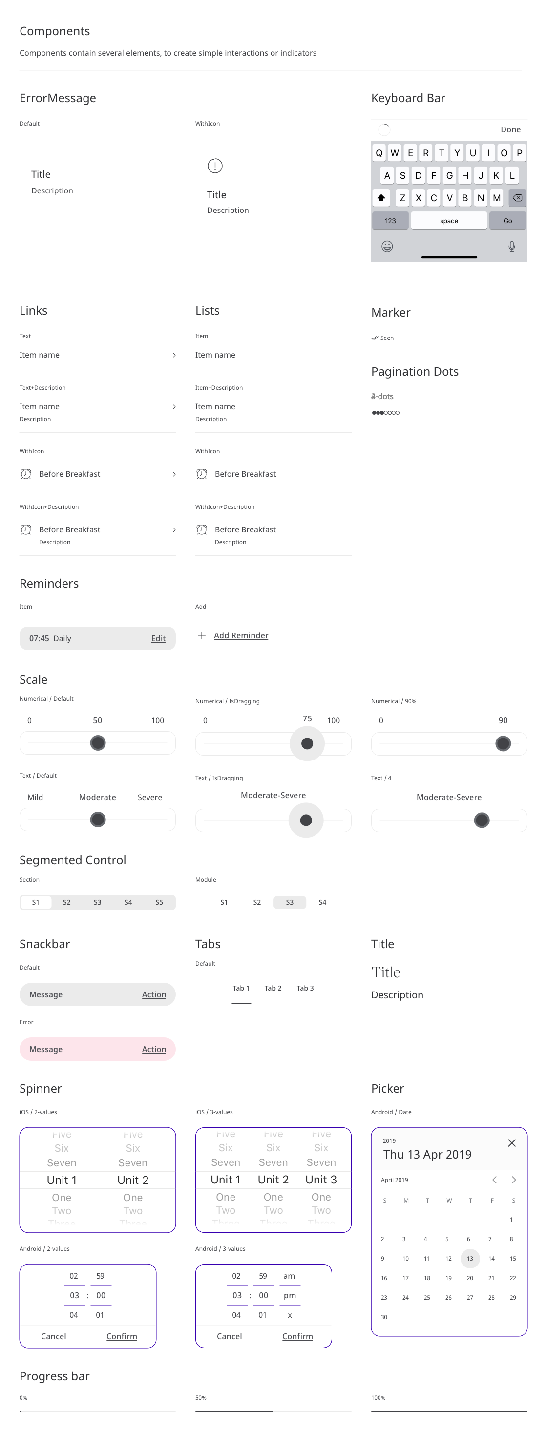
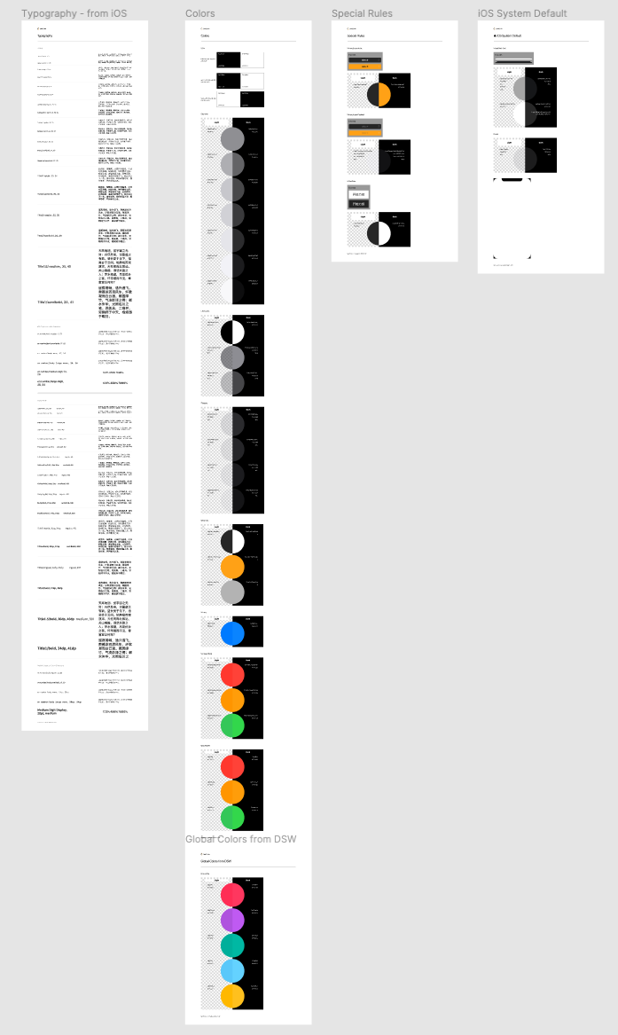
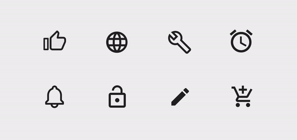
Component Library
Here’s a glimpse of the component library I have contributed.
I defined the corner radius according to Fibonacci Sequence (1, 2, 3, 5, 8, 13, 21, 34, …), not only because it represents the golden ratio and mathematically beautiful, more importantly, it actually helps corners look visually consistent on different scales.
For example, two rectangles in different sizes, but both with a corner radius of 5 doesn’t look balanced out. Using Golden Ratio numbers can solve that issue.
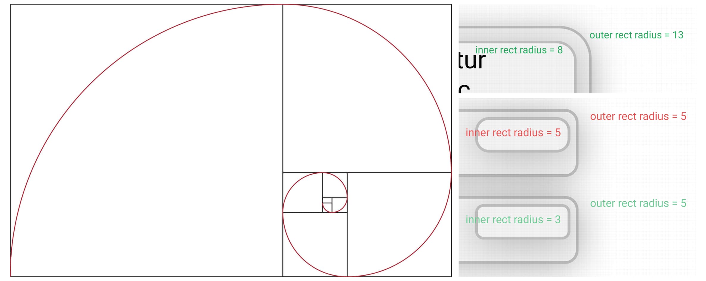
After all, this is a principle but not a fixed rule, so when platform has its own guidelines, we will have prioritizations. e.g. iOS often uses 10px radius; and Android tends to use multiples of 8 (dp). Fluent UI rarely uses rounded corner.
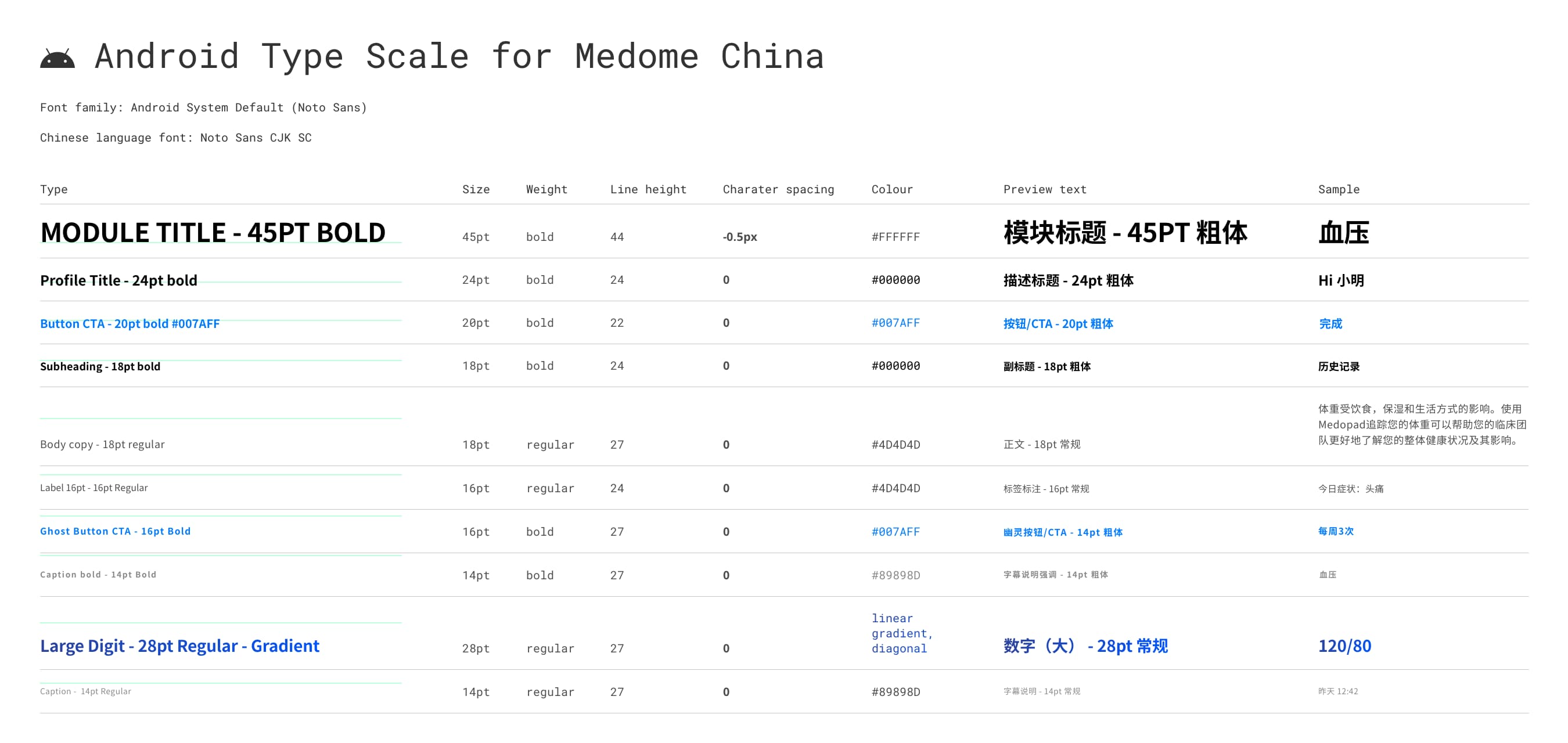
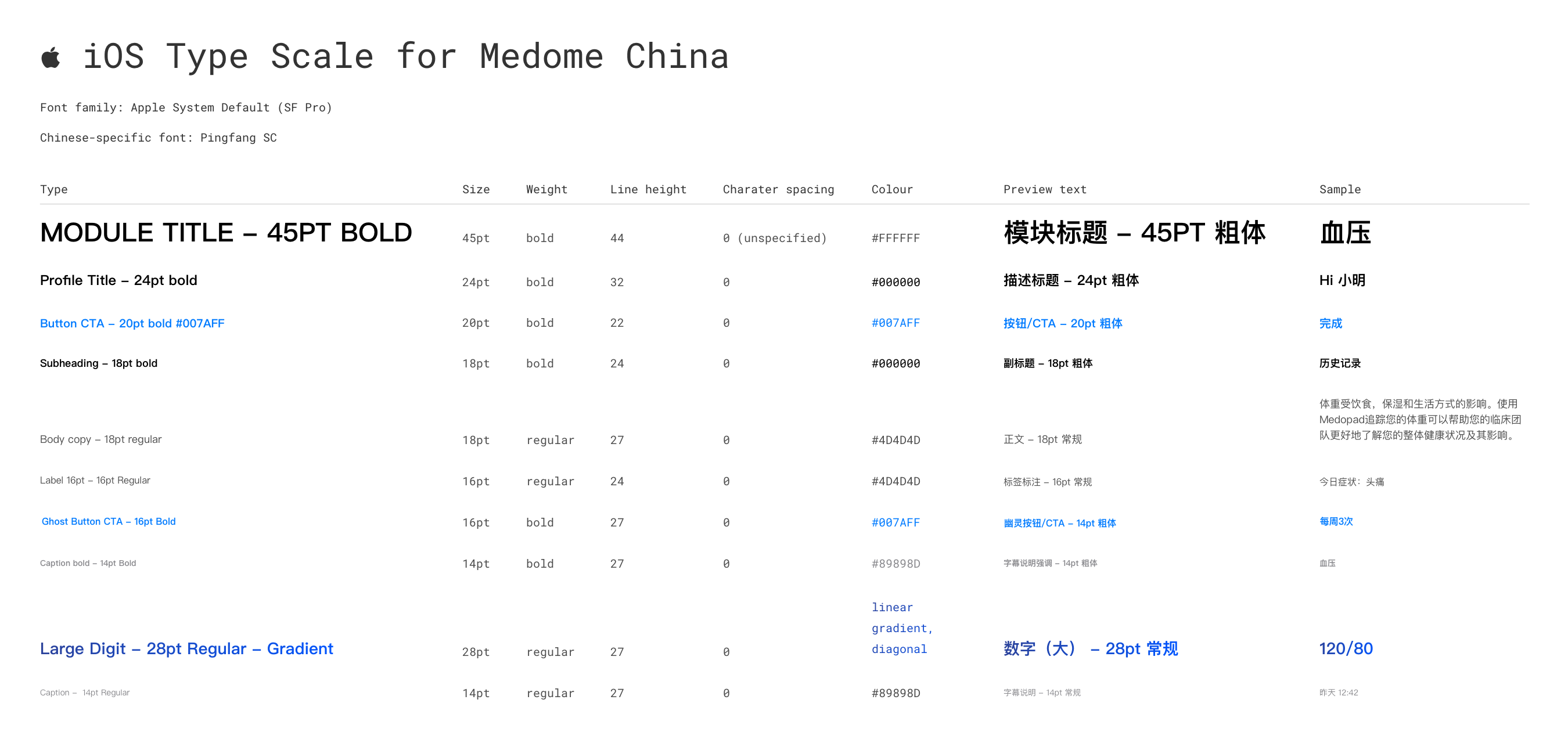
Typography
As a key part of localisation process, I also had some research in typography.
I proposed Noto Sans as our primary font because:
-
It supports most languages in the world, since we plan to launch our product in multiple countries, this font significantly reduces localisation cost
-
Noto Sans is built-in in Android. Therefore, it can reduce app package size. This is particularly important as east asian language font files are significantly larger than their Latin counterparts (e.g. Chinese, Japanese, Korean, etc.).
-
Visually, Noto Sans looks neutral and calm, and gives users a sense of familiarity, hence a sense of trust, which we – as a health app – desperately need.
My proposal was accepted and I lead the localisation process in China.
-
Most system default line heights were designed for Cyrillic and Latin script. However, normally a larger line-heigh is required for Chinese characters.
-
Since Chinese characters are naturally monospace, in most cases, character spacing remains 0.
-
In Android, Noto Sans Simplified Chinese has only 2 weights, regular (400) and bold (700). If a higher value is specified, the system draws outline to the characters to simulate bolder fonts, which produces an ugly result. Therefore, before a perfect solution is found, only two weights are used.
For iOS, due to OS restrictions and high development cost, we used iOS system default font at the beginning (SF Pro and PingFang SC). The next step is to build typography components in iOS that includes specified font, line-height, and character spacing.
Localization (L10n)/internationalization (i18n)
Initially, launching of China projects required L10n, I helped analysing needs and requests to help engineers sort out priorities and flow.
Then L10n was carried out at both frontend and backend, from text translation to the handling of format, text, data, semantic relations, etc. During phase 2, me and engineers together optimised formatting and layout, and created a automated process to help localise to other languages. In the end, a scalable process was tested and built.
During COVID-19 outbreak, we got a great opportunity to work the German Public Health Department. Since we had this L10n process built and tested in China, it took us much less time and effort localising it into German.
LeetCode App Design System
I also participated in building the design system for LeetCode app (in development).
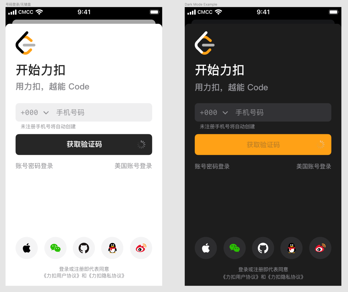
This design system started with support for Light and Dark mode, which helps to reduce future rework.
It also considers overriding rules when switching between Light and Dark mode. The principle is to make background elements darker while key elements lighter, but not to make dark colour lighter, light colour darker.
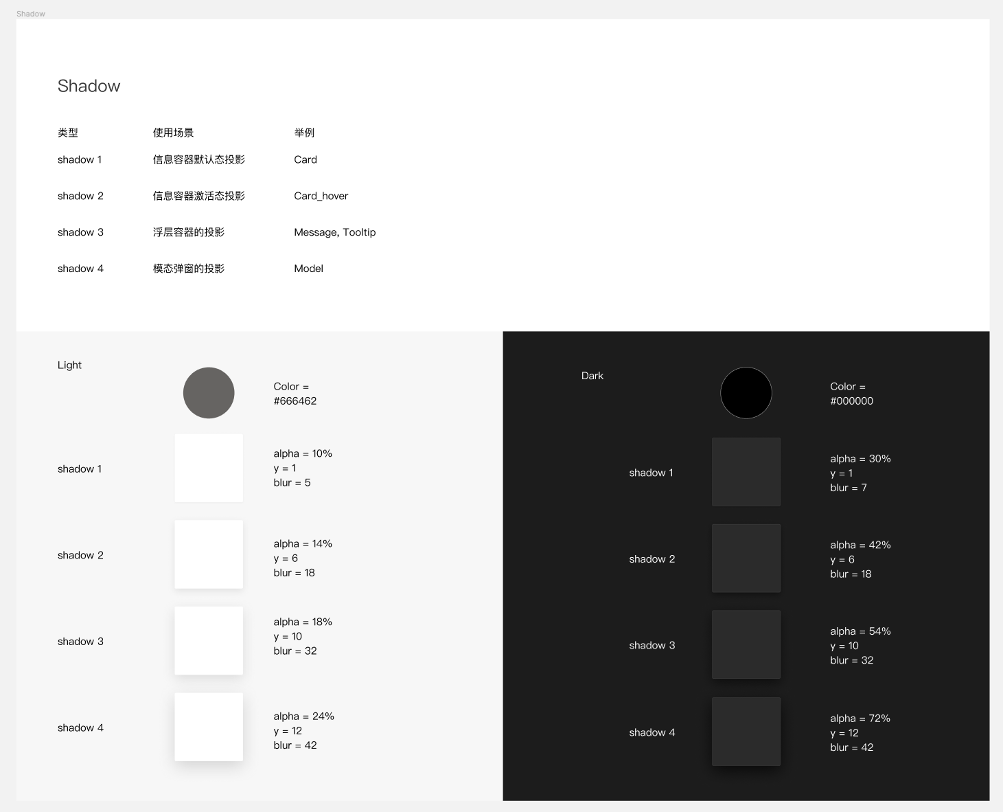
Shadows are also made into components (Light and Dark) so that engineers can invoke them accordingly.
And other parts of the design system (work in progress)
Motion choreography
This is also a part I tried to componentize. However, the communication is different from other design hand-off, because instead of creating animated prototypes, it is more time-efficient to use a set of standardised Bézier curve and other specs such as damping, spring physics, fling, morph, etc.
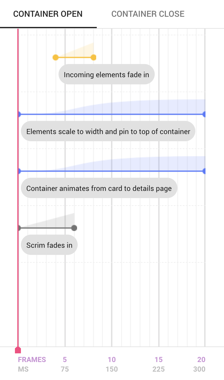
A Material Design Example - Incoming Element
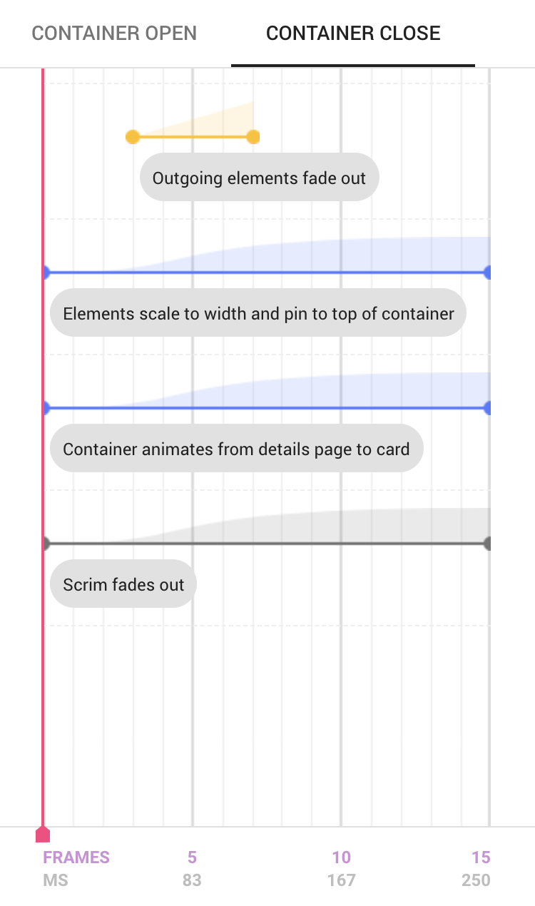
A Material Design Example - Outgoing Element
I’m also planning on making existing static icon library animatable, so that the transition between vector icons can be automatically drawn by OS. (Work in Progress)
This is what it would probably look like, animation being completely natively drawn by the OS.
A Material Design Example - Animated Icons